

The difference between a useful app and one you uninstall immediately often comes down to the quality of its user experience (UX). Your app UX is the specific, subjective experience a user has as they use your product.
If you want your app to be successful on the market, UX design needs to be an integral part of your product strategy—not just another step in your design process. There are many things to consider when designing an app. This article outlines the most important things you need to know to design great app UX in 2021. Let’s get started.
Build apps for Shopify merchants
Whether you want to build apps for the Shopify App Store, offer custom app development services, or are looking for ways to grow your user base, the Shopify Partner Program will set you up for success. Join for free and access educational resources, developer preview environments, and recurring revenue share opportunities.
Sign upDesign useful apps
“Does this solve my problem?” That’s the question users ask when choosing an app. If it doesn’t solve their problem, it isn’t valuable to them, so they won’t use it, no matter how beautiful it is. Before anything else, the app you design must fulfill the users’ needs.
A beautiful but ineffective app won’t satisfy users’ basic needs.
"A beautiful but ineffective app won’t satisfy users’ basic needs."
So how do you know if your app is useful? Focus on the value it provides to your target user base. Here are three ways you can build into your app UX design process:
- Conduct user research to understand users’ needs. Good design starts with a strong understanding of your users. Explore your users’ needs, prioritize specific functionality, and ensure that people are willing to pay for the solution to their problems. Techniques like user interviews and contextual inquiries can help you with that.
- Follow the “build-measure-learn” approach. Practice iterative design—the more iterations you build, the better your outcome will often be (to a point—you can overdo this). Prototype and test your solutions regularly to understand which parts of your app need improvements.
- Make it easy for users to provide feedback. Build a feedback mechanism right into your product. This could be as simple as a feedback form with a call-to-action that says, “Leave feedback.” Just make sure it works seamlessly.
You might also like: 9 Steps to Establish Strong Design Principles for Your Team.
Understand the advantages and disadvantages of the platform
Different platforms have different benefits and downsides. By optimizing your app design for a particular platform, you make user interaction more efficient and intuitive.
"By optimizing your app design for a particular platform, you make user interaction more efficient and intuitive."
Consider screen size. When you design for a desktop, you have large screen “real estate,” so you can organize content in multiple columns. Plus, on a desktop, it's much more comfortable to switch between apps and websites. While for mobile, you have limited screen real estate and need to prioritize content and features carefully.
Respect platform guidelines. Each platform has its own specifics and guidelines that outline specific design recommendations. Check Apple’s Human Interface Guidelines if you need to design iOS apps and Google’s Material Design Guidelines if you need to design Android apps. Polaris is Shopify’s design system that helps seamlessly integrate your app into the platform, streamlining both UX and UI, making it easy for users to understand how your app fits as part of their online store.
Design for the users’ environment.Knowing when and how users interact with your product is essential to design a strong app UX. For example, if you design a mobile app, you need to be aware that people can use it outside, so it’s vital to ensure that your user interface remains legible in the sun glare.
Seamless transitions between platforms. If your app is available for multiple platforms, you should strive to create a seamless experience across all devices. Users should be able to switch to a different device and continue the journey. One typical example is switching from mobile to desktop to complete a purchase—people often browse items on mobile but switch to desktop to order a product because it's more comfortable.
Minimize cognitive load
Cognitive load is the amount of mental processing power needed to use your product. You can think of cognitive load as "brain power” that users have to invest in interaction. High cognitive load can lead to bad app UX.
While there's no way to eliminate cognitive load entirely, it is still possible to do a few things to minimize it:
Don’t overload users with too much information. Any information you put on a screen that isn't essential to user tasks adds cognitive load. Be selective about information you want to show your users.
Keep interactive elements familiar. Predictability is a fundamental principle of user experience design. When things work in the way we predict, we feel a stronger sense of control and it helps us build trust in the system. That’s why when you design buttons and other interactive elements, it’s essential to think about how the design communicates affordance. Ask yourself, “How do users understand an element like a button?” Design objects so they tell users how to interact with them.
"Design objects so they tell users how to interact with them."
Reduce visual clutter.People can't keep much information in their short-term memory and too much content is easily distracting. Get rid of anything in your design that isn’t absolutely necessary because reducing clutter will improve user comprehension. Clutter is terrible on desktop, but it’s far worse on mobile (simply because we don’t have as much real estate on mobile devices as we do on desktops). Use techniques like minimalist web design and progressive disclosure to help you beat visual clutter.
Simplify common operations. Identify parts of your design that require users to read and remember information. Then, look for alternatives that can make this process easier. For example, instead of making users read plain text descriptions, you can use a combination of visuals and text or use a video format. These formats make it easier for the brain to decode the message.
Write clear, descriptive messages. Write in a plain, easy-to-understand language so everyone can understand the meaning. Removing jargon will also make it much easier to localize your product to a different market.
You might also like: Don't Get Lost in Translation: What is Pseudo-Localization and Why You Should Care.
Minimize interaction cost
Interaction cost is the sum of efforts—mental and physical—that users have to invest when interacting with a product. High interaction costs usually lead to lousy app UX—the more effort users have to invest in interactions, the less comfortable the experience becomes. That's why it's crucial to reduce obstacles by minimizing pain points that users face throughout the journey.
Here are a few popular ways to minimize interaction cost:
Simplify the navigation. Helping users easily navigate their next steps should be a high priority for every app. Your app's great content and cool features won't matter if people can't find them. For example, if you design a mobile app, it's better to use standard navigation patterns, such as the tab bar or the hamburger menu. The majority of users are familiar with both navigation patterns and will intuitively know how to get around your app.
Offer feedback on user interaction. In the physical world, objects respond to our interaction. People expect the same behavior from digital user interface (UI) controls. When users press a button, they expect to see visual feedback that acknowledges their input. Without this feedback, the user will wonder if the app has frozen or if they missed the target.

Minimize the need to type. If your user has to type anything, such as their address when inputting shipping details, you can make this process more comfortable by offering auto-suggestions and prefill some information based on user geolocation. You can use tools like Place Autocomplete Address Form, which uses both geolocation and address prefilling to provide accurate suggestions based on the user's exact location.
Use visual weight to convey importance. Visual weight is a force that attracts the eye of a viewer. Every object on the page has its weight. The more weight an object has, the more the eye is attracted to it. The most important element on the page should have the most visual weight. For example, if you want users to click/tap on the call-to-action button, it should be a contrast color.

Use inline validation for user input in forms. It’s frustrating when, after clicking Submit in an input form, you have to go back and correct mistakes. Whenever possible, check user input immediately after entry so that they can correct it right away.
Measure performance
Users care about speed in interaction design—response times must be fast enough that users don't have to wait for the app to provide information or complete actions. Jakob Nielsen defined three response-time limits:
- 0.1 seconds gives the feeling of instantaneous response. Ideally, your app should respond in 0.1 seconds.
- One second keeps the user's flow of thought seamless. While users can sense a delay, they don’t think of it as a big deal.
- 10 seconds is about the limit for keeping the user's attention. After 10 seconds, users start thinking about other things, and can abandon a product.

But no matter how fast you make an app, some things will take time to process. A bad Internet connection could cause a slow response, or an operation itself could require some time to complete. If that happens, concentrate on loading content in the visible area of the screen—load just enough content to fill the screen when a page opens, while the content available on scroll should continue to load in the background.
"Concentrate on loading content in the visible area of the screen—load just enough content to fill the screen when a page opens, while the content available on scroll should continue to load in the background."
Design for accessibility
Accessible design allows users of all abilities to use products without any problems. Consider how users with vision, hearing, and other disabilities can interact with your app. If we focus specifically on people who suffer from color blindness, that’s 4.5 percent of the global population (one in 12 men and one in 200 women).
It can be easy to forget that we’re designing for this group of users because most designers don’t experience these challenges. As the W3C’s guidelines state, color shouldn’t be used as the only visual means of conveying information. It’s important to use other visual signifiers to ensure that users will be able to interact with an interface.
Humanize digital experience
App UX isn’t only about usability; it’s mostly about feelings. When we think about what makes people feel great and introduce such changes in our design, we improve our chances of designing a well-crafted app.
Here are a few things that can help you humanize a digital experience:
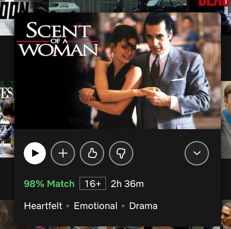
Personalize content. Aim to provide users with information that is tailored to their needs. It's possible to offer personalized content depending on the user's location, past searches, and past purchases. One good example is Netflix—if users prefer to watch particular types of movies, the service tracks that and offers them relevant options.
Add delightful details. "Delight” is a word we use to describe pleasurable moments in an experience. Delightful details help designers create an emotional connection with their users, so they fall in love with their product. Asana, a task management tool, provides a good example. One of Asana's four celebration creatures (a unicorn, yeti, narwhal, or phoenix) sometimes flies across the user screen as users complete tasks. What makes this little design detail great is that animations are randomly generated and won't occur each time a user completes a task.

Great app UX: the perfect combination of beauty and functionality
A great app UX is the perfect combination of beauty and functionality, and that is exactly what you should be aiming for when working on your project. Design your app so it consistently performs well for your users, and invest in creating a positive emotional response when your users interact with your app.
Build apps for Shopify merchants
Whether you want to build apps for the Shopify App Store, offer custom app development services, or are looking for ways to grow your user base, the Shopify Partner Program will set you up for success. Join for free and access educational resources, developer preview environments, and recurring revenue share opportunities.
Sign up