

Designing buttons with care is crucial when producing effortless user experiences for your clients, especially within the context of ecommerce where badly designed buttons can result in lost sales. Call-to-action buttons allow merchants to drive visitor engagement to specific products, or carry out a specific activity, like creating an account or accessing content.
Creating intuitive call-to-action buttons can be outside the scope of many merchants, so it’s important to consider a call-to-action strategy when building custom themes or doing freelance work for clients. An ideal call-to-action button will direct customers to a desired action, improve conversion rates, and ultimately help your client’s website achieve its defined goals.
In this tutorial, I’ll show you how to create a section with a call-to-action button that you can include on a landing page. I’ll also show you how this call-to-action button can then be customized from the Theme Editor to add button text and a link.

Learning Liquid: Getting Started with Shopify Theming
Get this free guide and learn practical tips, tricks, and techniques to start modifying, developing, and building Shopify themes.
By entering your email - we’ll also send you marketing emails related to Shopify. You can unsubscribe anytime. Note: the guide won't be delivered to role-based emails, like info@, developer@, etc.
Adding a call-to-action button on a landing page
Landing pages are generally applied when you or a client run a marketing campaign, and you’re directing potential customers to a specific point. You could create a unique landing page on Shopify, that would have distinct differences to regular pages, by setting up an alternative page template for your landing page. Our help center documentation shows how you can edit your theme to construct an alternative template for pages.
1. Create a new section
The first step here is to create a new section titled call-to-action.liquid that you can later connect to your alternative page template. When you create new Shopify sections from the theme file editor, a “scaffold” is automatically created for each new section with schema, CSS, and JavaScript tags. Within the schema tags you would add JSON, which defines how the Theme Editor “reads” our content.
The HTML that you’ll add to this section would be placed above the schema tags. If you’re using a text-editor like Atom to create a new section, then you would need to manually add this scaffold. (Note that you can extend the functionality of the editor using Atom packages if you want to customize it past what it natively allows.) The code for this is below:
2. Add HTML for the button
In this case, I would like to have a header above the call-to-action button to give visitors a description of the button, and it would also be important to add text inside the button itself. You will want to enclose the button within a container and give the button a class for styling later. Here, I’m assigning a class of button to this button, but you could use any class that suits your theme structure. For the title above the call-to-action button, I’m assigning an h3, and this header will link to the schema below the HTML using the Liquid tag {{ section.settings.text-box }}.
We’ll also add a href attribute to specify the link's destination, a class of button that we‘ll style later, and a text field to add text to the button itself. Finally, we’re wrapping all this in hr tags that will add a horizontal line above and below the button for greater definition to the section. Once you have added all these elements, the HTML for this call-to-action button would look like this:
3. Using JSON to define settings
Next, you’ll need to add JSON within the schema tags, so that the elements will render on the Theme Editor, and you’ll be able to assign text and links.
Each Liquid tag in the HTML is referenced by its ID in the schema object. Now, you can assign what kind of input this is. In this case, the heading will have a type of text, a label to demonstrate some instructions on the Theme Editor, anddefaulttext placeholder.
The link would have a type of URL and the link text would have a type of text. The labels will describe the purpose of the fields, for example Heading or Button link, while the defaults will display placeholder text. You would not assign a placeholder for the button link, since there would be no default here. This is how the schema array would appear in your section file:
You might also like: How to Create Your First Shopify Theme Section.
4. Styling your button
Now we can move on to the exciting part — styling! In the page.landing.liquid file, I assigned a class of button to my call-to-action button, so when I’m adding CSS to the stylesheet, I’ll be using .button as the selector. Within the main stylesheet, you can assign different properties and values to the button’s class, and personalize the button to look exactly how you would like.
Properties like padding, font-size, and border-radius are particularly important to give character to your button, while a carefully chosen color will help the button stand out against other elements on the page. You can also experiment with properties like cursor to change how the user’s mouse will behave when they interact with the button.
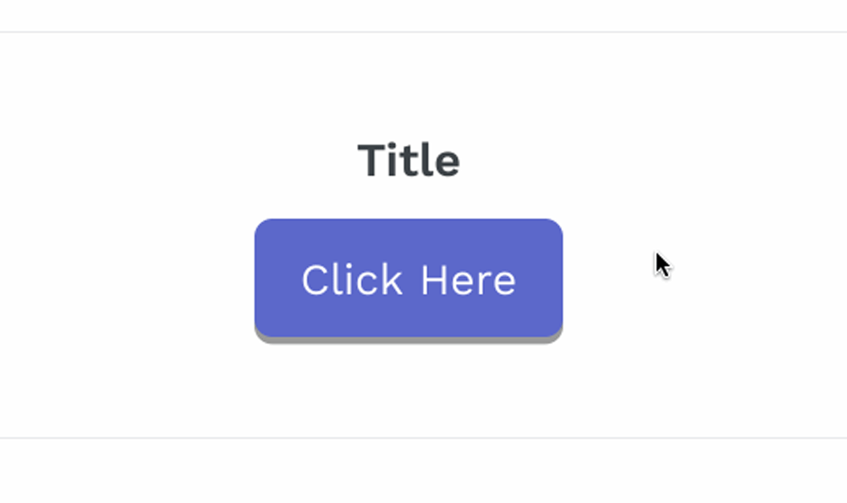
In my case, I would like a medium sized button with slightly rounded corners and a slight shadow on the bottom. I also want a contrasting purple color, and a hand pointer icon to indicate a link, so my styling for .button-click looks like:
This will output to a button that looks like this:

However, you might want to make this button more realistic, and an animated effect would show that this button is a multi-state object, much like a real-life button. To achieve this, you can use CSS pseudo-classes to change how the button appears when a visitor to your landing page hovers over the button, and also when they activate or click the button.
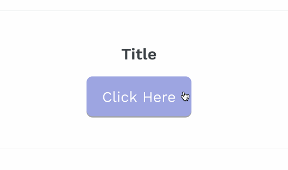
First of all, I’d like to display a reaction when the visitor hovers over my button, by revealing a lighter color. I would be using the .button-click selector with the hover pseudo-class to assign a specific color when a cursor is on the button, so the styling would look like this:
Now you will see an effect like this:
There are a range of other CSS hover effects you could use on your clickable call-to-action buttons, such as opacity, which would make the button slightly transparent when the customer hovers over the button.
Next, you can show some movement when the button is actually clicked, by moving the position of the call-to-action button slightly, and adjusting the box-shadow accordingly. This technique provides visual feedback to the visitor by demonstrating that an interaction is taking place and confirms a button is being pressed.
The pseudo class you’ll use to define changes when the button is clicked is called active. Within this class you can use the transform property, which allows you to change the position of the button when it’s active or clicked.
In this case, I’d add transform: translateY(0.25em);, which will drop the button vertically by 0.25em when clicked. Using translateY is more performant than moving with positioning in CSS, and you can learn more about this process from Paul Irish. I’m also going to reduce the box-shadow by half, and return the color of the button to it’s darker shade.
Now, when you hover and click on the button you will see an effect like this:
5: Including the call-to-action section on your landing page
The final step is to add the call-to-action section to the landing page template, so that it will appear in the Theme Editor, and you will be able to assign text and links. All you need to do is return to the alternative page template you created and add code to include the call-to-action.liquid section within that page.
I would like the call-to-action button to appear at the bottom of the landing page, so within my page.landing.liquid I will add {% section 'call-to-action' %}. The full page.landing.liquid template would look like this:
For this call-to-action button to appear, you’ll need to change which template a page is assigned to. You can easily switch a page template from the admin when you’re editing the page.

Now when you go to your Theme Editor, and move to the landing page, you would see this:
6. Do your own thing!
While this specific call-to-action button might fit well on my test store, it’s important to consider the kind of colors, shapes, and sizes that would be suitable for the different projects that your clients might have. A truly unique and complimentary styled button, that’s achieved with a bespoke solution, is usually going to look and work more effectively than a one-size-fits-all approach.
Look at the existing layout of the page you’re working on, and see how your buttons can have matching consistency, distinct labeling, and appropriate positioning. Call-to-action buttons should be eye-catching and easily recognizable, for a natural flow when customers visit your client’s pages.
Grow your business with the Shopify Partner Program
Whether you offer marketing, customization, or web design and development services, the Shopify Partner Program will set you up for success. Join for free and access revenue share opportunities, tools to grow your business, and a passionate commerce community.
Sign upAdding a dynamic call-to-action button to your homepage
It’s also possible to add a call-to-action button as a dynamic section that can be included on the homepage. Since the button could be a dynamic section, this button could be moved to different points on the homepage, empowering your clients to be creative with personalizing their store.
Another advantage of a customizable call-to-action button on homepages is that it gives an opportunity to quickly draw attention to any special offers, or top of funnel incentives that clients may have.
1. Creating Presets
The main structural difference between a static section and a dynamic section is the addition of “presets” within the schema settings of a dynamic section. When these presets are included, the theme will automatically recognize that this section is a dynamic section that can be added to the homepage.
Presets will define how the section appears in the Theme Editor, and the presets must have a name and a category. These presets are not included in the base file when you click Add new section, but adding them manually is straightforward.
For example, if you wanted to give dynamic properties to the call-to-action section you previously created, you could add the code below within your schema tags, after the existing settings:
2. Reviewing the section
Once you have added the presets within the schema of your existing call-to-action section, the full Liquid file would look like this:
In this case ‘am happy with the styling of the button, so I can keep the CSS the same. But if you would like to set up new classes or IDs for this specific button, you can do this too, and add new styling within the stylesheet.
3. Rendering on the Theme Editor
Since the presets have been added, the Theme Editor will pull this section as a possible new section, under the category Call To Action. Now, if you wanted to add a call-to-action button to your homepage you would take these steps:
You can assign a URL and text, but most importantly, you can change the positioning of the section on the page.
Responsible design
Building compelling call-to-action buttons will give your clients a competitive edge when they need to direct customers to specific points, and by considering the most appropriate styles you can unlock a website’s potential.
Whether merchants use call-to-action buttons to promote free gifts, drive customer engagement, or simply make a sale, it’s your responsibility as designers to provide purposeful and user-friendly buttons.
Have you experimented with different styles to develop interactive and functional buttons? We would love to hear about your experiences in the comments below.
Learning Liquid: Getting Started with Shopify Theming
Get this free guide and learn practical tips, tricks, and techniques to start modifying, developing, and building Shopify themes.
By entering your email - we’ll also send you marketing emails related to Shopify. You can unsubscribe anytime. Note: the guide won't be delivered to role-based emails, like info@, developer@, etc.
