

One of the hot topics in front end development this past year has been the addition of a new layout system called CSS Grid. Now that all modern browsers support CSS Grid, developers have the perfect opportunity to experiment with Grid on Shopify themes.
For those new to CSS Grid, it is a relatively recent addition to web development that makes working with page layouts more intuitive and dynamic. At its most basic, Grid allows developers to define columns and rows on a page, as well as place elements within cells, or groups of cells.
Grid’s component-based model for grouping and laying out page elements allows for full page responsiveness without using complex CSS, which is especially important in a world that is increasingly mobile-first and performance-aware. Pages using Grid generally tend to have “cleaner” HTML too, since many of the more convoluted methods for positioning (looking at you, clearfix) are avoided.
CSS Grid introduces a range of new styling properties, which can be used to determine cell sizes, item placement, alignment control, and more. In this post, we’ll look at how some of these new properties can be employed on Shopify themes to create dynamic new structures for your clients.
You might also like: What is Progressive Enhancement and Why Should You Care?
Thinking inside the grid
CSS Grid is considered a very significant advancement by the web design community and is especially helpful for graphic designers, who may sketch out page layouts in terms of rows and columns, since this kind of “blueprint” logic is what CSS Grid achieves. Smashing Magazine's Chen Hui Jing describes her experiences coming to grips with Grid as a revelation in simplicity.
“After playing around with Grid for a bit, I realized my approach to designing layouts had changed. I found myself sketching on paper, thinking about the layout design in its entirety. By the time my fingers were doing their dance across the keyboard, I already knew exactly how my layout would look.”
Up until now, placing objects onto different parts of pages required creative manipulation, since the process was built primarily for one dimension. This vertical system of arrangement meant that splitting pages into left and right, sometimes resulted in a labyrinth of containers within containers, making code bloated and unreadable.
By giving web developers two dimensions to work with, CSS opens up a range of new options, and the ability to place elements in any defined cell or group of cells means that designers can focus on making a page look exactly how they would like, with a fraction of the effort.
Learning how each of the new CSS properties can be used is key to unlocking Grid’s potential for easier custom theme work, and I’ll be exploring some of that in this tutorial. My examples and focus will be on the Debut theme, but the process should be the same whether you are tweaking an existing theme or building one from scratch with Slate.
Using CSS Grid in a Shopify section
When working on custom themes, one application for CSS Grid and Shopify could be with theme sections, since grid containers could be populated with section blocks. This could be an alternative way to make your theme responsive, as well as give your clients more flexibility when customizing their store.
One of the simplest ways to demonstrate how Grid works within a theme section, would be to first create a basic group of four containers, within one parent container. Inside these containers you can add some demo content and sample numbers, for instance. It could look like this:
Since we’re creating a dynamic section, we would need to add some schema settings and presets, so that the section will render correctly on the theme customizer. The overall section would appear like this:
Now we can add our CSS to the main stylesheet of the theme, which is where the magic will happen. Once the parent container is set to display a grid, it will automatically become a grid-container:
.grid-wrapper {
  display: grid;
}
You will not see any visible change at this point, but the container is now ready to be laid out. The next step would be to create columns, which is where the very powerful grid-template-columns property comes in. grid-template-columns allows us to assign how the container is divided within this section, and also introduces a new value fr.
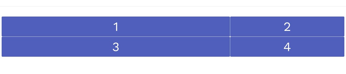
fr stands for “fraction” and can be used to define the size of each grid cell. For example, if I want the list of numbers to be a square grid of two numbers above and two numbers below, I would set up the wrapper like this:
.grid-wrapper {
  display: grid;
  grid-template-columns: 1fr 1fr;
}
This means there will be two columns, of equal width, one fraction each, and the next two cells would fall below, following the same rule of one fraction width each. I can improve this even further by adding some gaps between cells with other new grid-column-gap and grid-row-gap, which are also new properties, meaning the styling for both the grid container and grid items would look like this:
Finally, when we look at this from the home page, we would see this:

Another nice feature of the fr value, is that the size of the cells adjust to the size of the page, since it’s not a fixed value, but always a fraction of the available width. You can also change the fraction amount, so that some cells take up larger amounts of the grid container. For example, you could double the size of the first column like this:
.grid-wrapper {
  display: grid;
  grid-template-columns: 2fr 1fr;
}
And the result would look like this:
The grid-template-columns property can also be used to make cells and layouts responsive by combining a few different rules. If we change grid-template-columns in our CSS to be:
grid-template-columns: repeat(auto-fit, minmax(200px, 1fr));
Our cells will now fit along the page horizontally, but will begin to stack up and change position as the screen size is adjusted:
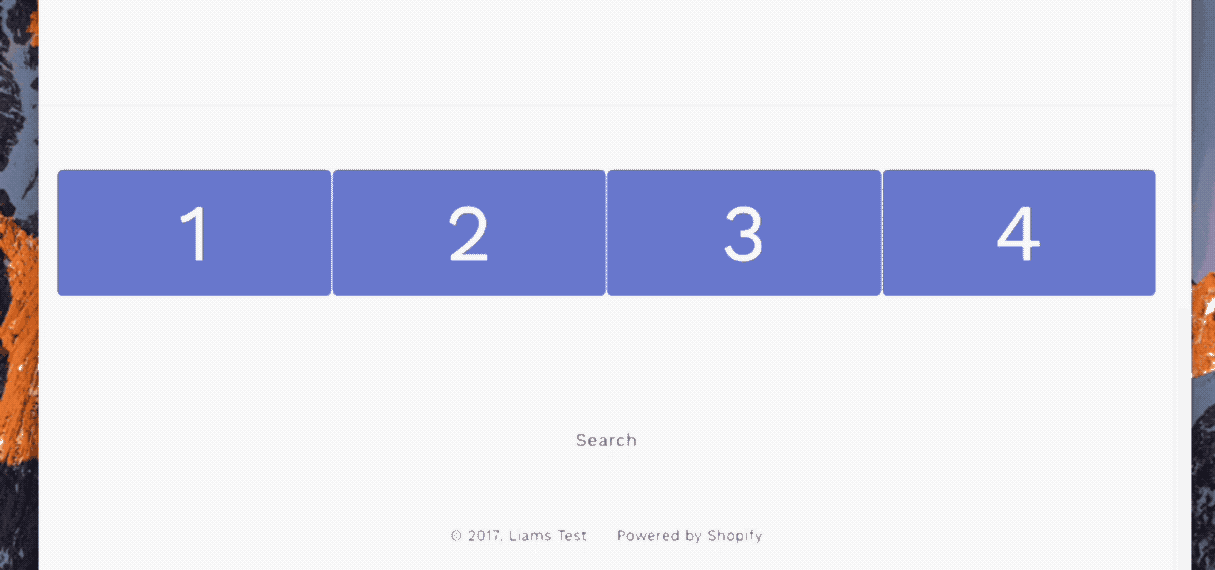
In the style above, the repeat notation is creating a rule that our cells should appear as many times as they can fit, based on my original HTML markdown. Next auto-fit is displaying as many items on the line as possible, so on a full screen we are seeing the four cells. Finally, with minmax we are setting up a rule that each cell should be a minimum of 200 pixels and a maximum of one fraction of the grid-container.
This means when the screen is reduced, and the cells width become less than 200 pixels, one of the cells will drop below, and each of the cells will adjust to have larger width. As the screen becomes smaller and smaller, the cells will respond to the limits set by the minmax rule.
Using media queries here to set up responsive layouts would be an alternative option, and we’ll see how these could be used in the second part of this tutorial.
You might also like:How to Build a Customizable Related Products Section.
Creating a basic Shopify page layout with CSS grid
CSS Grid can also be used to design full pages on Shopify stores, and this could be really useful if your clients are looking to set-up custom landing pages on their store.
Working with Grid on a basic Shopify page will operate in very much the same way as when we looked at how Grid works on a section. In fact, it’s even easier, since we won’t need to include the schema settings for rendering the page.
Our first step will be to create an alternative page.liquid file within the the template folder of our theme. If you have not created alternative template files before, our help center has a comprehensive guide on how to set these up.
Once you have created an empty page template you can add your HTML markdown to the page. Here is a very basic example of what you could use for a simple page layout:
Now we can move to our theme.scss.liquid file and add our styling. Two very important new CSS properties that Grid has introduced are grid-area and grid-template-area and these will both play a huge role in how we will lay out our elements.
grid-area allows you to assign names to different grid-items, while
grid-template-area allows you to define how these named elements should appear. This means it becomes every easy to “group” together different parts of a page, and assign how and where these “groups” of elements should appear.
Using grid-area to assign names to grid items is straightforward, so we can add the following to the theme.scss.liquid file:
Grid Template Areas allow us to create sets of rows that contain our named grid areas, and in this example you can apply the property to the .page-grid selector. You can use media queries with grid-template-columns to define the sizes of the columns and grid-template-areas to define which grouped items appear where, based on display rules. This could look like:
Once we have added additional styling to the various elements of the page, our layout will appear in a very coherent way, as they are mapped out by grid-template-areas. This is how the page would appear, along with the code:
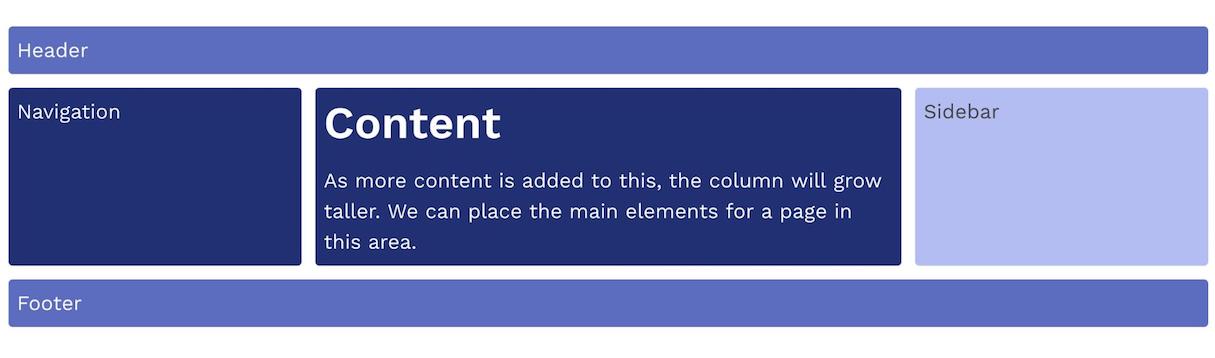
Since the Navigation, Content, and Sidebar elements are connected as a grid template area, when you add text to the content section, the columns for Navigation and Sidebar will increase, too. This process of grouping grid items allows developers to quickly and cleanly set up page layouts for custom themes.
CSS Grid is the future
As you can see, CSS Grid is a very powerful tool for quickly building clean layouts, and the examples above are just the beginning of what is possible when using CSS Grid in your custom themes. With so much scope to build accessible and efficient layouts using just CSS, there is no doubt that Grid will have a huge part to play in the future of front end development.
Thirsty for more knowledge on CSS Grid? Check out these additional resources:
- Rachel Andrew’s Grid By Example is the best place to start when learning the basics of CSS Grid. With tonnes of pattern examples and video tutorials, you’ll be an expert in no time!
- The Firefox Inspector Tool has a Grid Inspector that displays grids, and allows you to test and debug your creations.
- Jen Simmon’s beautifully designed Experimental Layout Lab showcases a range of different types of layout methods, and even has a monopoly board built with Grid.
- Brandon Brule has compiled a highly comprehensive guide containing all the different properties and options for CSS Grid.
Have you experimented with CSS Grid layouts recently? Let us know in the comments below!
