
Evan Williams, co-founder of Twitter, once said, “UX is everything. It always has been, but it’s undervalued and underinvested in.”
Ecommerce UX is no different. Stores pour thousands into Facebook ads, into product research, into design. Yet, UX goes undervalued and underinvested in.
It’s a big problem. One that affects your visitors, your customers, your profits. One that affects you. Because if you’re not optimizing your ecommerce UX yet, know that your competitors are.

Free Reading List: Conversion Optimization for Beginners
Turn more website visitors into customers by getting a crash course in conversion optimization. Access our free, curated list of high-impact articles below.
Get our Conversion Optimization reading list delivered right to your inbox.
Almost there: please enter your email below to gain instant access.
We'll also send you updates on new educational guides and success stories from the Shopify newsletter. We hate SPAM and promise to keep your email address safe.
First, what is UX and why should you care?
User experience (UX) is the overall experience of a person visiting your store, from start to finish. Typically, UX is gauged based on how easy and enjoyable it is for visitors to navigate your store, find what they’re looking for, and make a purchase.
When you think of UX, I’m willing to bet design comes to mind. It’s important to note that a lot more goes into a positive user experience than design. For example…
- Does the site load quickly?
- Is the site easy to navigate?
- Is the site as easy and enjoyable on mobile devices?
- Is the copy simple, specific and clear?
- Are icons labelled and easy to decipher?
- Have unnecessary steps been removed?
The list could go on forever. There are so many elements that impact how easy and enjoyable your store is to users. Design is just one of those elements.
Karl Gilis of AGConsult explains...
“Most people think that UX only has to do with the design. I think UX is much more than that because it’s about the experience the user has when visiting your website. That means that every aspect of your website and what you have to offer influences the user experience.
This makes it clear why you should care: a bad experience will most likely result in the visitor leaving your website. And he’s not just leaving, he’s leaving with a negative feeling about your brand.
I must admit that, as a usability person, I’ve never liked the word ‘UX’. Partially because even when I have a very bad experience, I still have a user experience. But mainly because most designers focus on the word ‘experience’, and that word seems to trigger their more artistic and creative personality. And they forget about the ‘user’.”
This slide from one of Karl's UX talks really visualizes that point...

Why does all of this matter? Because shoppers have options… a lot of options.
There are over 500,000 Shopify merchants in ~175 countries. Together, they’ve generated over $34 billion. Add in all of the merchants who aren’t using Shopify yet and you’ll find yourself overwhelmed by how many stores there are out there.
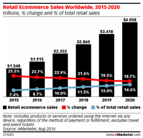
eMarketer estimates that retail ecommerce sales will top $4 trillion in 2020, making up 14.6% of total retail spending that year.
With so many other options, if your UX is frustrating or just plain bad, shoppers won’t hesitate to go elsewhere.
Don’t underestimate how willing shoppers are to go elsewhere if your UX is subpar. 57% of shoppers already abandon carts to comparison shop, regardless of the quality of your UX.
As Talia Wolf of GetUplift.co explains, UX finally puts customers back in the driver’s seat…
“UX is everything that old school graphic design and UI aren’t. It’s data- and customer-driven, focused on helping customers accomplish their goals. The other is focused on looking nice.
UX is built on research and validation. Most importantly, it puts the user in focus.
While design and UI focus on what looks nice on a page and the brand, UX focuses on better understanding the customer’s intent and how to help her fulfill those goals. The entire purpose of UX is to make sure that the product and user experience you’ve created are producing the results your customers need.”
4 Ecommerce UX Guidelines to Keep in Mind
1. Prioritize function above all else.
Are you familiar with some of these design trends?
- Parallax scrolling. (Elements in the foreground scroll more quickly than elements in the background.)
- Automatic image sliders.
- Ghost buttons. (Transparent buttons.)
- Video backgrounds.
These types of trends tend to take off quickly because they look nice. The problem is they don’t always function well, depending on the quality of the implementation.
- Parallax scrolling is often implemented unnecessarily and poorly.
- Automatic image sliders are distracting, slow to load and proven to perform poorly.
- Ghost buttons live up to their name, often appearing unclickable and going overlooked.
- Video backgrounds distract attention and slow load times.
As Karl explains, it’s not about how the store looks, but how it functions...
“Of course design is important. But it has to be functional. It’s not about being fancy.
Look at Google, AirBnB or Amazon. Those websites aren’t the most creative when it comes to design. But they’re probably slightly more popular than your website.
Design-wise they have one thing in common: very functional and no visual distraction.
And that’s what good UX design is about. Design isn’t about adding elements. It’s about only keeping those elements that add to the bottom line. Remove the fluffy stuff.
Every element on your page needs to support the visitor in reaching his or her goal.
By the way: that’s something you need to realize first. People visit your website or landing page or product page or blog article with a reason. Not because they have nothing else to do.
Your design should focus on those goals.”
Death Wish Coffee, for example, clearly prioritizes function by making the product front and center, even on the homepage…
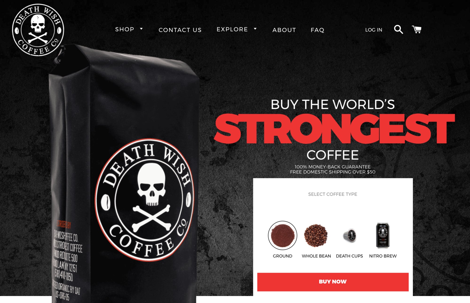
...not a distraction or nice-to-have in sight. Every element of the site is completely focused on one goal: sell more coffee.
2. Customer-centric copy should always lead design.
Should you…?
- Write your site copy first and then design (or find) a theme that complements the copy.
- Design (or find) a theme first and then write copy based on the flow of the theme.
This, of course, is the seemingly everlasting debate of copy first vs. design first.
If you want a good UX, you’re going to have to let copy lead design. You’re going to have to go with option number one.
Why? Because design should support and empower the copy, not the other way around. After all, no one buys a t-shirt or fidget spinner because the site looks nice. They buy because the copy convinced them.
Karl explains in more depth...
“I think this is one of the biggest mistakes. Starting with the design. Without really knowing what the content will be.
News flash: it’s your value proposition and your content that will convince your customers. So you have to start with that.
Don’t just buy a theme and then try to fit your content into that. Don’t make a design with ‘lorem ipsum’ text and placeholders for images. If you do that you’ll be frustrated when you’re filling your website with real content.
First find out what the needs of your visitors are. Then make your content (copy, images, etc.) Then make your design. That way you’re sure everything fits and your design enhances your content. Form follows function.”
When writing ecommerce copy, don’t forget to focus on the customer. That means conducting copy research ahead of time to understand your audience, how they experience your site, how they value your products, how exactly they describe your products, etc.
Chubbies is a perfect example of customer-centric ecommerce copy, copy that adds to the customer experience.
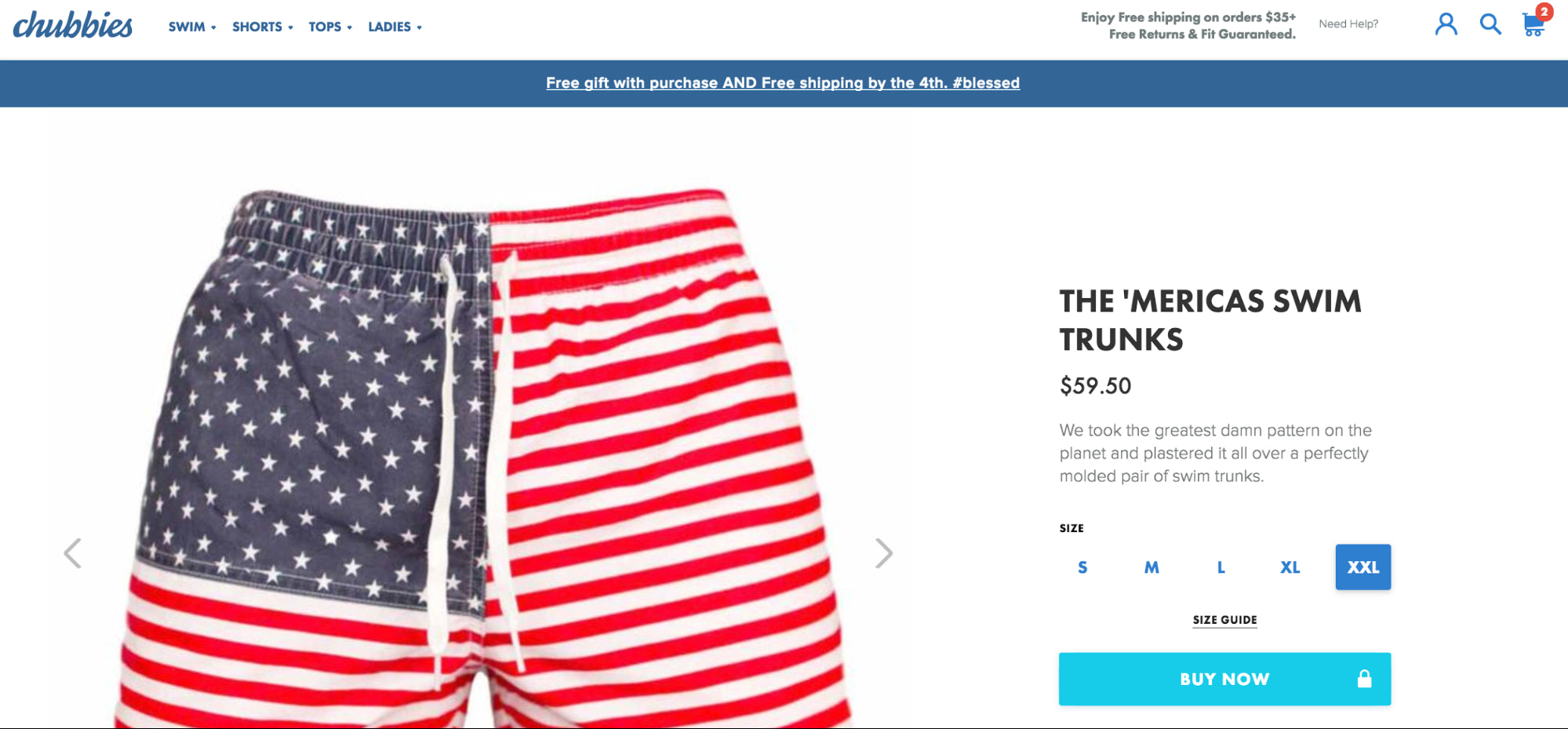
Check out the “Free gift” banner and the product description. That’s true voice of customer copy.
Karl explains why this is important and will continue to be as the way we experience ecommerce sites evolves in the future...
“I know most people don’t think this is part of UX. But it’s the core of UX.
Always start from the user, the potential customer. What are his or her needs, why do they buy your product or service, why do they buy it from you, what are they afraid of, how does your product or service make their life better?
Most organizations start from their point of view. And they want to show off with features they think are important.
News flash: it’s not about you. Your visitors and customers don’t care about you. They only care about themselves.
So don’t brag about your new, fancy technology. Just say your battery lasts for weeks and not hours.
If you think this is bullshit, think of how good salespeople convince you to buy something.
Is that thanks to how they look? Or thanks to what they say?
Yep, it’s their words that convince you. And as we’re moving to speech interfaces, that will be the core again. No fancy schmancy design can cover up your stupid copy in speech.”
3. Craft an intuitive navigation to promote discoverability.
According to Merriam-Webster, the definition of intuitive is: “readily learned or understood”. When a visitor can do what they want to do on your site without much effort or interruption, your site is intuitive. Seems simple, but very few sites are intuitive.
When a site (or even just one small element of a site) is not intuitive, UX suffers. This is especially true in ecommerce because of navigation.
Navigation, of course, is vital for helping visitors find products they’re looking for or might want to buy. If that ecommerce discoverability process isn’t intuitive, visitors will leave in search of a more user-friendly navigation. At the very least, they will be less likely to “shop around” your store and return for a repeat purchase.
When designing your navigation, keep in mind…
- Card sorting can help you better understand how visitors expect to find products and pages.
- Use familiar words when labeling. Don’t make people think.
- Use the prototypical ecommerce design. Visitors will expect their cart to be in the top right corner, for example. Keep things familiar.
- It’s ok to have a subcategory under two categories. For example, someone shopping for media unit might want to find the “TV and Media Unit” category under “Living Room” and “Storage”.
- Always include the internal search option for those who know exactly what they want.
- If you use icons, make sure they’re familiar and use labels.
- Make sure it’s easy to tap navigational links on mobile devices. Often, these links are too small to tap.
- If you have a wide selection of products, you’ll have to use mega menus. Make categories and subcategories clickable. Plus, those category landing pages will be good for SEO.
- Use breadcrumbs, please.
- Keep the navigation consistent. Standardize the process and design.
- Highlight the link to the page the visitor is currently on, wherever possible.
Sivana follows these navigation guidelines well...
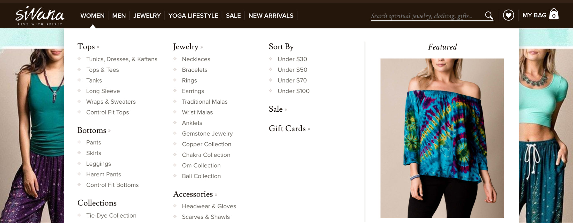
Every element of the navigation behaves as expected, the subcategories are clickable, the products are sorted in a meaningful way (plus the option to sort by price), etc.
When you click through to a subcategory, the intuitive navigation continues...
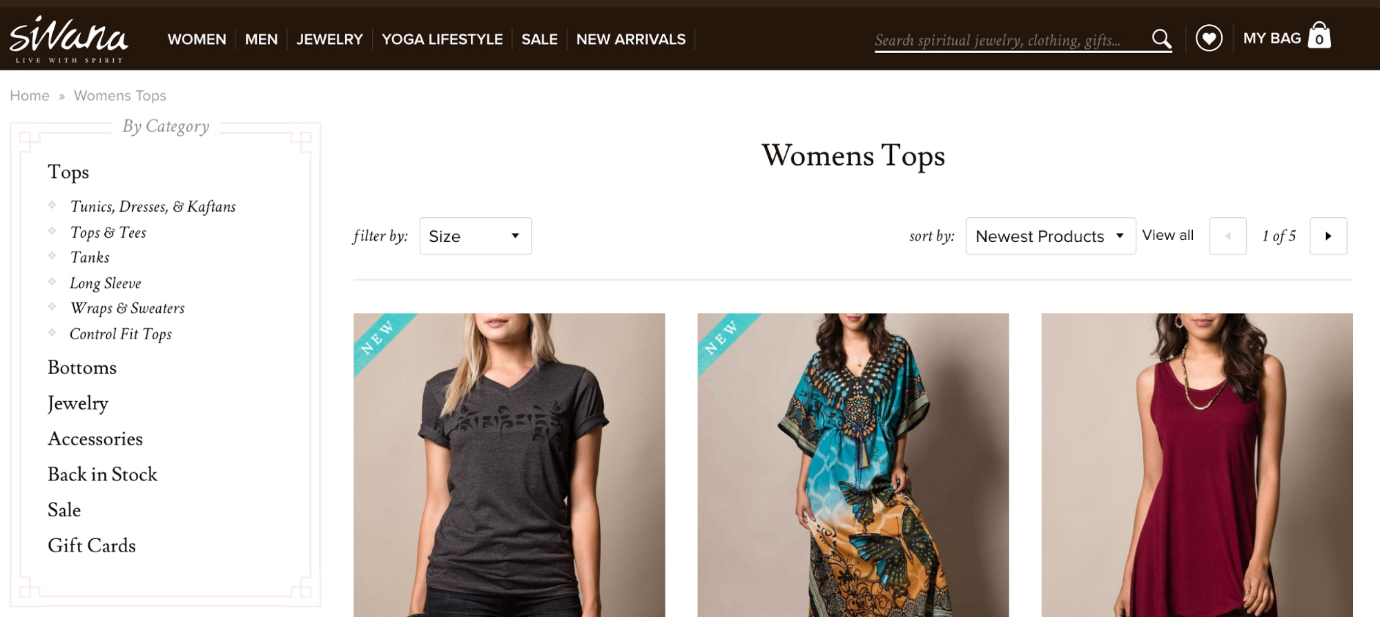
All of the top types are visible (predictably) down the left-hand side. There are also “sort by” and “filter by” options to help visitors find the top they’re looking for, which is important given the large product catalog.
4. Mobile ecommerce UX is different and should be treated as such.
So far, we’ve been talking about desktop ecommerce UX. What happens when visitors arrive on your site from a mobile device?
Just because you have a good desktop UX doesn’t mean you have a good mobile UX. Mobile is an entirely different beast. The context has changed, the intentions have changed, the motivations have changed.
Being aware of the fact that people want something very different from your store on mobile than they do on desktop is over half the battle. It’ll put you ahead of the competition.
That’s why throwing up a responsive theme isn’t mobile UX optimization. Offering the desktop UX on mobile is a bandaid, not a solution.
According to Baymard, mobile UX is something ecommerce sites are still struggling with. 78% of mobile e-commerce sites perform poorly when reviewing the combined mobile product finding experience.
A few things to keep in mind when thinking about mobile ecommerce UX…
- Make the experience feel native, natural. 40% of mobile ecommerce sites don’t allow their product images to be zoomed via the traditional mobile pinch or double tap.
- Choose the right keyboard. Don’t use a traditional keyboard if you know they’re going to be entering numbers, for example.
- Be clear, highlight important features. 80% of mobile checkouts offer users the option to do a “Guest Checkout”, but 88% make that option easy to miss.
- Disable autocorrect on checkout. Is there anything more frustrating than typing your address three times on your iPhone?
- 61% of all mobile users “sometimes” or “always” go to their desktop/laptop computer to complete their mobile orders. Make sure they can save their carts.
- Allow visitors to search specifically within the category or subcategory they’re currently viewing.
- Experiment with digital wallets to convince more of those mobile users to buy on mobile.
- Condense, condense, condense. If you can reduce the number of taps required to perform an action, do it.
- Pay very special attention to quality assurance and cross-device / cross-browser testing on mobile. Does your UX meet expectations for every browser on every mobile device?
- Speed is more important than ever as mobile users are particularly distracted and impatient. Make sure pages are loading quickly.
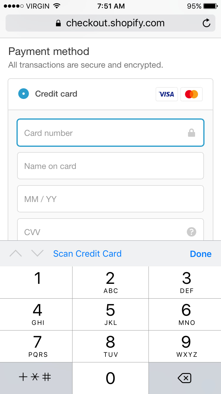
- Allow customers to scan their credit card so they don’t have to enter all of the information manually.
- Allow customers to save their information for future visits, reducing the amount of information they need to fill out on mobile.
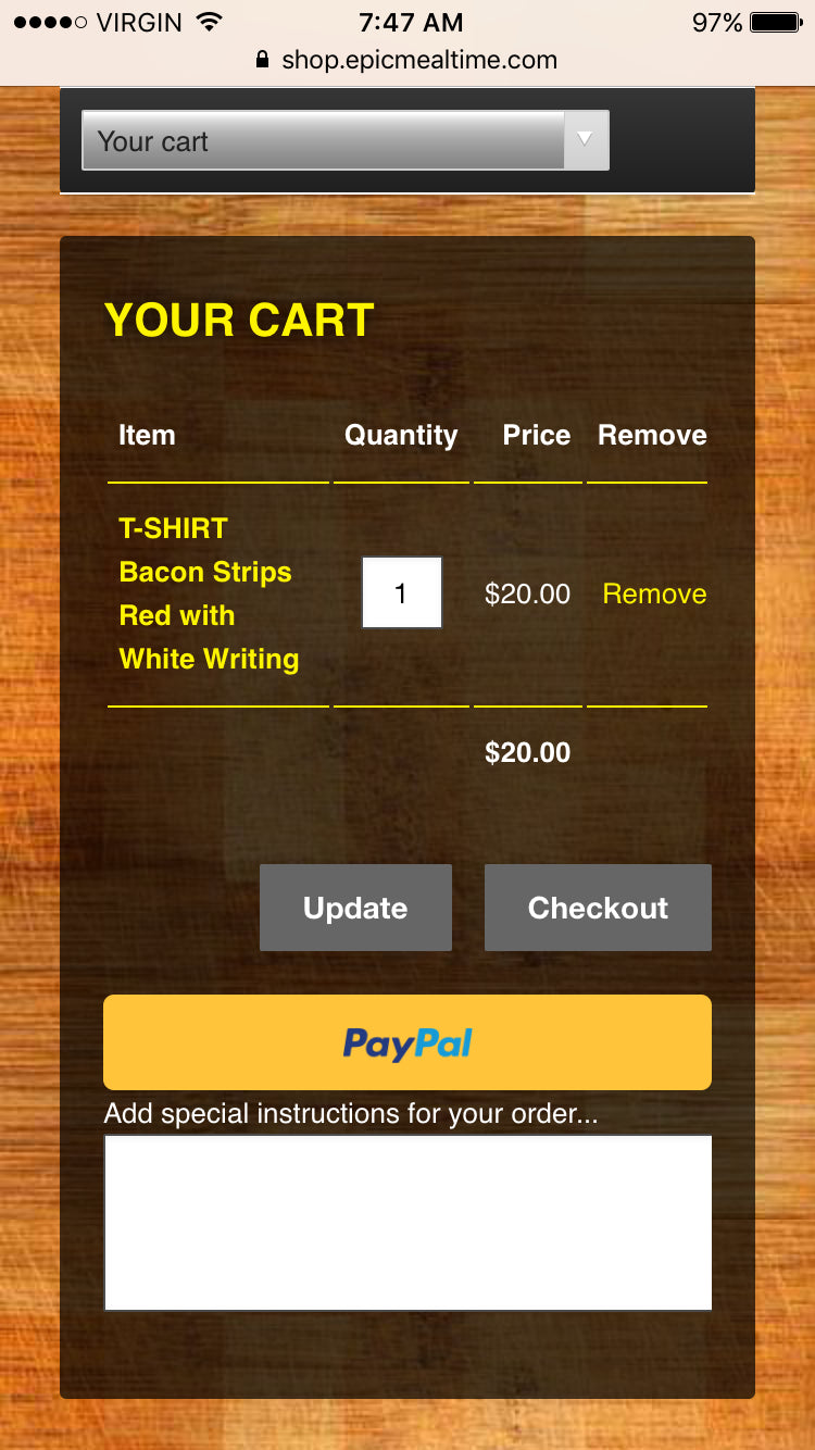
Epic Meal Time’s store is a great example of mobile checkout UX done right. First, you have the option to checkout with PayPal...
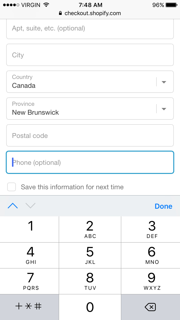
Then you’re shown the proper phone number keyboard and the option to save this information for next time…
When it’s time to pay up, the proper keyboard is visible (including the option to scan your credit card)…
Keep in mind that similar to how a good desktop UX and a good mobile UX are different, a good iPhone UX and a good Android UX are different. Put yourself in the visitor’s shoes and be aware of how contextual ecommerce UX can be.
How to Spot UX Problems on Your Site
Best practices are wonderful and all, but they can only take you so far. Every ecommerce site is different, meaning every ecommerce site has different UX problems. How can you spot those problems on your site?
As Karl explains, it’s all about the research…
Do user research. This sounds expensive and you can make it expensive, but there are some good tools available that can help you. Read this sentence again: can help you. They will not solve the problems, but they will help you to spot the problems.
First, define drop-off points. Where are visitors falling out of the funnel? Are they making it beyond the product page? Are they calling it quits when they see shipping prices? Or maybe when they have a full cart?
You want to focus your research as much as possible. If you go in with the goal of “improving UX”, you won’t get as much out of the process as you would if you went in with the goal of “reducing cart abandonment” or “increasing add to carts from product pages”.
As Karl said, there are a number of inexpensive research methods you can take advantage of...
- Scroll / Click Heatmaps: Look at scroll depth and click intent. Add links where people try to click, but can’t. If you see a sharp scroll color change, consider whether you have accidentally created a false bottom. Notice how far down people scroll and plan your messaging hierarchy appropriately. Try to encourage scrolling with visual cues.
- Session Replays: Watch as real people with real money navigate your site. What frustrates them? What are they struggling with? Where do they drop-off? Why?
- User Testing: Give people specific instructions (e.g. find a watch under $89 and add it to your cart) and watch as they try to follow those instructions, narrating their thoughts out loud.
- 5 Second Test: Show your site for a short period of time to see if your messaging and value proposition are clear.
There are more, of course. Use whichever method(s) you think will give you the most insight to achieve your goal.
How to Fix UX Problems on Your Site
Tools can help you identify problems, but they certainly can’t help you solve them. That’s up to you! Fortunately, you’re already well on your way to being able to solve your ecommerce UX problems.
- Prioritize the UX problems based on the expected impact and ease.
- Use your common sense. How can you improve the experience? Refer to your research, too.
Half the battle of UX is awareness and education. Knowing what to look for, putting your ego aside, putting what looks nice aside.
Georgiana Laudi, digital strategist specializing in optimization and inbound marketing, says it best...
“You think about your customer's experience with your company every day, whether it's the details of the products you sell or the packaging they tear into upon delivery. Wouldn't it make sense to think about their experience on your website just as carefully? Your competitors certainly do.”