

Shopify recently announced a new partnership with Monotype, which has made hundreds of beautiful new fonts available for free to Shopify merchants on their online stores. Having such a large selection of quality typefaces at your clients’ disposal will give them a strong starting point to communicate their brand identity.
The new Shopify font library includes fonts licenced from Monotype, a selection of Google Fonts, and web-safe fonts. Your clients will still be able to select premium fonts from the Monotype collection, including Avenir, Linotype Didot, and Charter as well as from the popular Google Fonts collection—including Open Sans and Montserrat.
A key component of this new feature is the font_picker setting type, which can be implemented into themes from the settings_schema.json file, and section files. Currently this feature is natively supported on the Slate starter theme, which is awesome news for developers working on new themes!
However, many clients may want to update their existing custom themes to gain access to the new Shopify font library. Once the font picker is set up, your clients can quickly and easily choose from a wide range of premium fonts, avoiding any licensing or difficult coding.
In this article, I’ll demonstrate how you can use the font_picker setting type in your client’s themes, and show you a few ways to set up a stylesheet using the new Liquid font filters. I’ll also show you how you can test and QA your themes to ensure each font variant is displaying correctly.
You might also like: Understanding Shopify Theme Styles and Presets With settings_data.json.
Getting set up with font_picker
Previously when fonts were applied to themes using the select setting type, each font would have to be added to the list of options in the setting configuration, and the theme would have to implement custom logic to load the font. While any Google fonts could be included here, the process of manually adding each font family is arduous and makes this file difficult for developers to navigate.
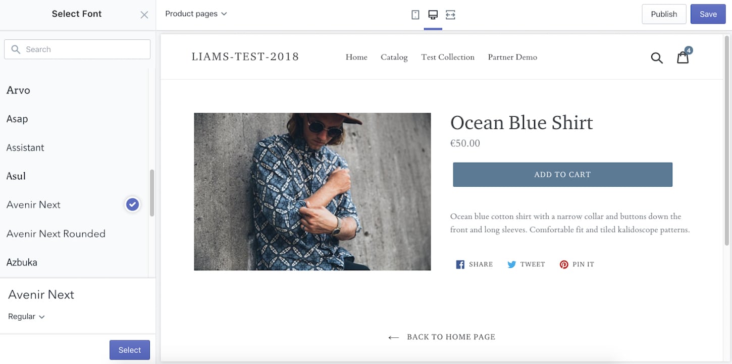
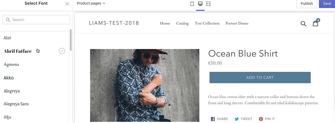
The new font_picker setting replaces embedded options by generating a dynamic selection interface, and allows you to chose from Shopify’s font library rather than having to manually specify available options. Once this setting is added to the settings_schema.json file, merchants can access Shopify’s font library from the theme editor, and choose their preferred font.
As an example, when the new font_picker setting is being applied to the headings and buttons of a theme, the array in settings_schema.json could appear like this:
{
 "name": "Typography",
 "settings": [
   {
     "type": "header",
     "content": "Headings and buttons"
   },
   {
     "type": "font_picker",
     "id": "header_font_new",
     "label": "Font",
     "default": "work_sans_n6"
   },
Here we can see that settings are being created for an area in the theme editor for Typography, specifically ‘Headings and buttons’. The settings for type, id, label, and default, were all present in previous iterations of Shopify themes, but we can see here that the font_picker setting type differs from select in that it doesn't require you to specify options.
Once font_picker is the declared type, we need to add an identifier. This setting value will be used later to set the CSS properties. The Setting ID that we add here is how these configured values are accessed from Liquid.
It’s highly recommended that developers use a new ID when implementing font_picker, so the settings don’t conflict with previous setting_data.json values. This will help to prevent issues when updating themes. In this example, I’m using the ID header_font_new.
The label field in this array determines how this element appears on the theme editor. For this, the simplest option here would be ‘font’.
The default setting acts as you would expect, and assigns a default font to load. In this case I used "work_sans_n6", but any of the fonts in the library can be used. It’s important to note that the correct naming format must be used—developers can find a list of possible defaults from the Shopify font library.
Once the new font_picker setting is implemented fully, this is an example of what settings_schema.json could look like:
In this example, you can also see that there are settings for defining the font sizes for heading and regular text. This is a technique from the Debut theme, which uses a range setting type to allow merchants to select a font size along a sliding scale.
The min, max, and step settings allow us to define parameters for this scale, while the unit setting declares the unit of measurement, in this case pixel. Our help docs cover how the range value can be used in greater detail.
Stepping up your font styling
Next on the theme’s stylesheet, we’ll need to set the CSS properties for our fonts, as well as style the text elements to use our configured fonts. We can assign a variable to the font setting ID we created, and then apply font filters to these variables. This could appear like this:
In the above example, we can see our two new Liquid font filters at work. The font_face filter returns a CSS @font-face declaration, which loads the font picked by your client on the theme editor. The output of the font_face filter includes the family, weight, and style of the font, as well as a URL from where this font can be accessed.
The font_modify filter allows us to access different variants of the same font, and set specific styles and weights. This ensures that Shopify’s custom fonts will load correctly for each formatting option. It’s also important to note here that not all font families have all these variants.
Now that the object settings.header_font_new has been assigned the variable header_font, we can use Sass to explicitly define which elements these new style settings apply to. As an example, our Sass variables could look like this:
$font-stack-header: {{ header_font.family }}, {{ header_font.fallback_families }};
$font-weight-header: {{ header_font.weight }};
$font-style-header: {{ header_font.style }};
In this example we are assigning our font settings, as well as web-safe fallback fonts, to the Sass variable $font-stack-header and declaring Sass variables for both weight and style.
Now when a header’s font-family property is given a value of $font-stack-header, the header will be assigned a font on the theme editor, using the new font picker feature. Similarly the weight and style is set up with Sass variables. For a main heading, this could appear on your stylesheet like this:
.h1 {
   font-family: $font-stack-header;
   font-weight: $font-weight-header;
   font-style: $font-style-header;
}
Once all filters are applied and variables are assigned, your clients will be able to easily select any of Shopify’s available fonts from the theme editor:
To get a complete view of how a stylesheet could be set up to work with the new font settings and filters, it’s useful to look at how existing themes have been set up. For example, below is the Typography section of Debut’s stylesheet, where you can see how filters and variables are implemented to connect with the Shopify font library.
By modeling your process off an existing theme that uses best practices, you can develop your own approach for safely implementing this new feature.
You might also like: A Beginner's Guide to Sass with Shopify — Part 1: Getting Started With Sass.
Quality assurance testing
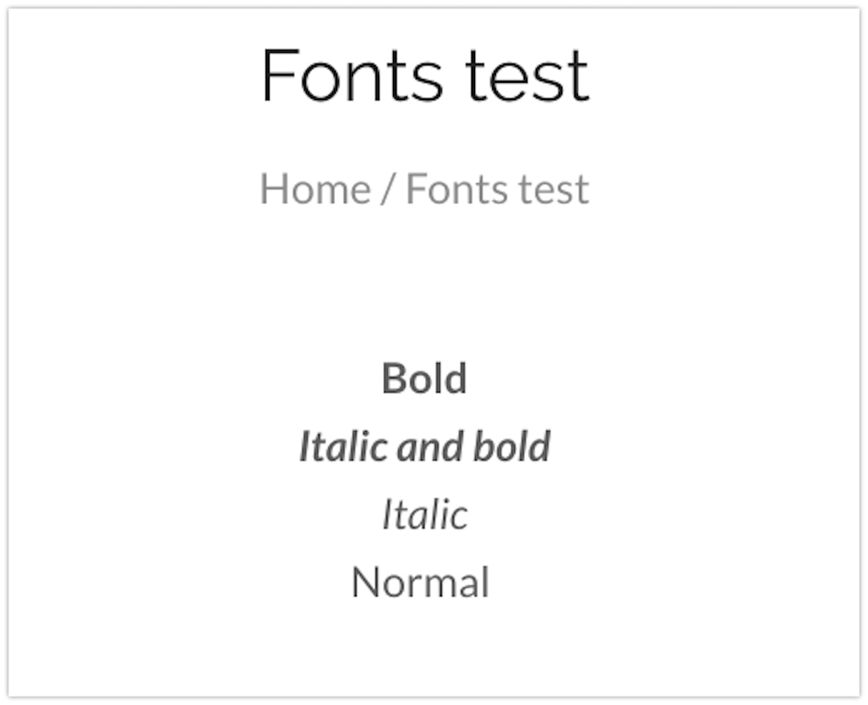
Once you’ve set up your client’s theme to use Shopify’s font library, it’s important to ensure that the CSS file is loading the bold, italic, and bold-italic variants for each font using the font_modify filter. These extra variants are a requirement for pages using the rich text editor, or if there’s a theme setting for adding different formatting types.
Not declaring these weights will force the browser to faux the the bold, italic, and bold italic versions, causing inconsistencies between browsers and poor font rendering. You can test for issues with these variants by creating a regular page with text using the following weights:
- Bold
- Italic and bold
- Italic
- Normal
One of the easiest ways to confirm that the true weights are being loaded is to use Firefox’s font tools to detect which font weight is being displayed. Once you use the Firefox dev tools to inspect an element on the page, the Fonts view shows all the font settings in use by this selected element.
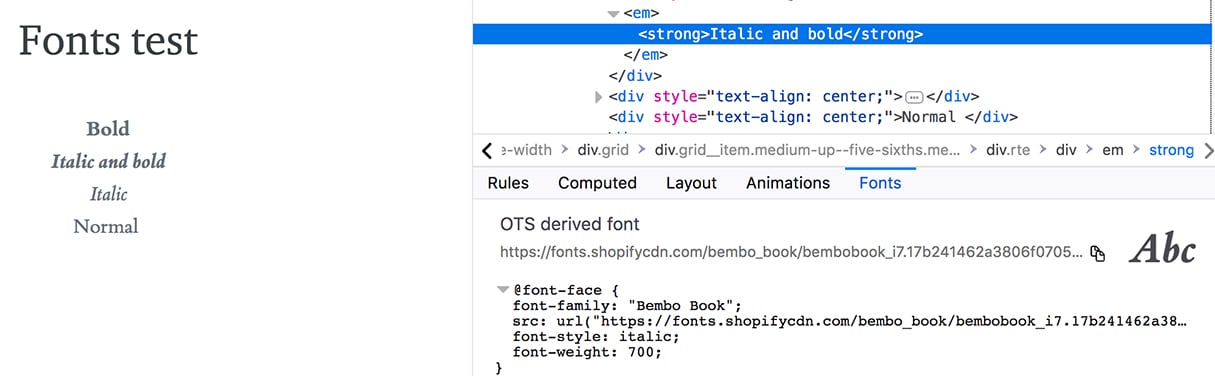
We can see in this example above, when you inspect the Italic and bold text, that the font-style value is “italic” while the font-weight is 700. If this was coded incorrectly, you could be seeing “normal” as the font-style, or “400” as the font-weight.
Remember to check your theme in each browser, as not all browsers will behave the same when loading fonts.
Helpful links for further reading:
If you’re keen to learn more about the new font_picker and font filters, take a read through some of these resources from the Shopify Help Center:
Typography 2.0
As you’ve seen, the new Shopify font library can expand the available tools merchants have for expressing their brand identity, and create an opportunity for you to upgrade your clients’ themes. Adding this feature to existing custom themes and building it into new themes will add extra value to what you can offer to clients. Hopefully with the help of this article, adding this functionality will be a little bit easier.
Have you had the chance to work with the new font picker setting yet? Let us know in the comments section below.
