

Interaction design is the relationship between the user and product they use. Bad interactions—both in the physical and digital worlds—create obstacles between a user and a product. Effective interaction design, on the other hand, aids good user experience and enables the user to achieve their goals in the best possible way.
Interaction design is a broad field; it lies at the intersection of many different disciplines such as sociology, psychology, ergonomics, and user experience (UX) design. To design effective interactions, you need a solid understanding of design principles rooted in those disciplines. The principles listed below work as a system and help you improve usability and increase user engagement with your product.
1. Familiarity
Familiar design minimizes the user’s cognitive load (the effort required to complete a task). It helps users understand how the user interface is organized and sets accurate expectations about what will happen before the interaction has occurred.
Introduce affordances
Affordance refers to an attribute of an object that helps people understand how to use it. For example, in the physical world, the shape of a light switch helps you understand how you can click it, flip it, or twist it. A similar principle works for digital interfaces.
While designing user interfaces, you should always consider how the user sees and perceives the objects in the interface. Think of affordance as a clue that you give to your users. When an object has strong affordances, it becomes clear how to use it.

Use popular interaction patterns
Jakob's Law of the Internet User Experience states that users spend most of their time on other websites and apps. It means that users prefer your product to work the same way as all the other products they already know.
To create familiar interactions, you need to rely on popular interaction patterns—patterns that are familiar to the majority of users. For example, most web visitors expect that they can click on the site logo to return to the home page. By utilizing this pattern, you make it easier for users to navigate your product.
2. Predictability
People should not guess when interacting with a product. Instead, they should be able to observe an interface, and understand how to interact with it right from the first time. Effective interaction design is predictable—it sets accurate expectations about what will happen before the interaction takes place.
Clear language
The words you use in your design have a tremendous impact on how users understand your product. The language should be meaningful and simple to understand. For example, when users read a label on a button, they should be able to predict what will happen after they click it.
Same rule applies when you design error messages. For clarity, you need to remove the technical terms and use understandable words and phrases. For example, when a user mistypes a password you:
Shouldn't write: System error (code #0f3213a): An authentication error has occurred
Should write: Sign-in error: You entered an incorrect password
Mind the order of UI elements
Arrange information and functional controls in a logical, natural order from the user’s perspective. This is especially important when you design data input forms and ask users to provide information. For example, when you design a shipping form, you typically ask for the user's full name, and only after that ask for their shipping address. It’s also important to consider your target market and internationalization as you scale, as the order of user interface (UI) elements could change depending on localized conventions.
You might also like: Symmetry vs. Asymmetry in Layout Design.
3. Discoverability
If users cannot find something in your product, it does not exist for them. Both content and functional elements should be easily discoverable. Otherwise, users won't know that they're available in the first place.
Be careful with gestures
Gestures are a very popular interaction pattern on mobile. Designers love them because gestures help to save screen estate. At the same time, gestures have one significant downside—they are hidden. Gestures don’t reveal themselves unless the user knows they can swipe, pinch or do something else. That’s why it’s important to design good mobile app onboarding to help users educate what’s possible.
4. Control
Effective interaction design incorporates a sense of control. If users feel in control of the system, they are more confident in their abilities and are more willing to explore and try different things.
Visibility of system status
The system should never leave the user guessing about what is happening. Whether the system is loading, searching, uploading, or does anything else, it should provide a current system status through appropriate feedback (visual, audio, haptic) in a reasonable time. Feedback acts as an acknowledgment of user interactions and information about the outcomes. When the system cannot provide feedback, it usually leads to unnecessary repetition of actions (multiple clicks or taps) and ends up in error state conditions.

Undo/redo operations
Undo acts as a safeguard against incorrect actions. When you allow users to undo operations, they are more willing to explore the product and try different features in it.

5. Findability
It's vital to help users find the content or functionality they're looking for. When you make users search for something, you're interrupting their state of flow. As a result, they switch from what they want to achieve (their goal) to learning your user interface.
Visual representation of UI objects has a direct relationship to findability:
Use visual weight to convey importance
Every object on the page has its visual weight—a force that attracts the user's attention. The more weight an object has, the more the eye is attracted to it. Size and contrast are two attributes that determine visual weight. Large contrasting objects attract the eye more than small, low-contrast ones.

Visual hierarchy
Visual hierarchy concerns the arrangement of elements in a way that indicates ranking by importance and the order you want users to view them.Visual hierarchy also helps reduce cognitive load. You need to review your design and prioritize content and functional elements accordingly. Show only users what they need to see in each moment. Keep visual hierarchy in mind as you’re planning your information architecture, which is especially important the more complex your product becomes.
You might also like: Skeuomorphism in Digital Product Design.
6. Learnability
Learnability is the user's ability to learn how to use the interface easily. Interactions should be easy to understand and easy to remember.
"Interactions should be easy to understand and easy to remember."
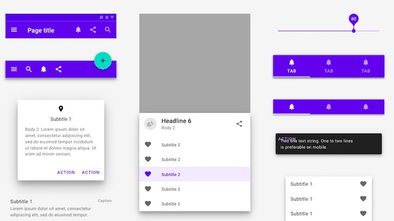
Leverage consistent elements throughout design
By leveraging consistent elements throughout your entire design, you make it easier for your users to interact with your product. When designs are consistent in appearance and behavior, users aren’t distracted by unexpected changes. They can rely on their experiences from one part of a product to another.
Limit the number of items users have to interact
Hick’s law states that the greater the number of choices, the longer it takes to make a decision.
When you offer users a lot of choices, you make it harder for them to learn what each option does.
"When you offer users a lot of choices, you make it harder for them to learn what each option does."
Here are a few things you can do to limit the number of choices:
- Design with aesthetics and minimalism in mind. Don’t overwhelm users with information or actions. Follow a minimalist web design approach and get rid of unnecessary content and features. Leave only content and actions that are absolutely necessary.
- Use smart defaults to minimize cognitive load. It’s possible to use pre-populated fields in forms (such as prefill the user’s ZIP code based on user geolocation) to simplify user input.
- Break down complex tasks into manageable sub-tasks. For example, you can break the checkout process into manageable steps.

You might also like: Progressive Disclosure: Simplifying the Complexity.
Use constraints
Constraints limit the possible interactions for the user. Constraints might sound like restrictions, but in reality, they aim to simplify the interaction with a system and prevent users from making mistakes. Designers should:
- Constrain inputs in forms. For example, use radio buttons instead of input fields when users have to select a particular option.
- Disable functions that aren’t relevant to the current situation.
Twitter warns users when they exceed that limit of characters and disables the Tweet button. Image by Twitter.
Interaction design creates comfortable human experiences
The ultimate goal of interaction design is to shape better communication between machines and humans. Interaction between the user and the computer should resemble a natural human-to-human conversation. Digital products shouldn’t make people think like computers, instead products should adjust to human needs and create comfortable experiences.
Grow your business with the Shopify Partner Program
Whether you offer web design and development services or want to build apps for the Shopify App Store, the Shopify Partner Program will set you up for success. Join for free and access revenue share opportunities, developer preview environments, and educational resources.
Sign up