

When we think about the “average” user, we tend to imagine them using a mouse or trackpad when they’re on their computer. But, what if their preferred or only option was to use a keyboard? Have you considered designing your apps with keyboard accessibility in mind?
There are many reasons someone might not want to, or be able to operate a mouse or trackpad to use their computer. They may have permanent, chronic, or temporary conditions that limit their dexterity or muscle control, causing sensitivity in their wrists or hands, or making it difficult to follow the mouse cursor on a screen. They could also be “power users” looking for more shortcuts to streamline their workflows. In any of these cases, keyboards might be an individual’s preferred or necessary means of interacting with technology.
In this article, you’ll learn about keyboard accessibility guidelines, as well as 5 steps to keep in mind when designing apps to make sure that they are keyboard accessible.
How does keyboard accessibility work?
If an app is keyboard accessible, that means people have the option of using only a keyboard to operate control elements. Control elements are any interactive components on the page, like buttons, links, form inputs, videos, and other interactive content.
Keyboard navigation basics
Here are some basic keys used for keyboard navigation:
- Navigating to the next control element: Tab (or the right or down arrow key for related radio buttons and select options)
- Navigating to the previous control element: Shift + Tab (or the left or up arrow key for related radio buttons and select options)
- Clicking a control element: Enter and/or spacebar
- Navigating between related radio buttons or select options: Arrow keys
You can learn more in this article on standard keyboard behaviors for HTML elements.
Focus order
The sequence in which control elementscan respond to keyboard events is known as focus order. When an element is focused, you can interact with it using certain keyboard controls. When an element loses focus, it becomes blurred. Browsers render default focus states to help users keep track of which element is currently in focus.
You might also like: Universal Design: 11 Practical Tips to Make Your Sites and Apps More Accessible.
Keyboard accessibility and the Web Content Accessibility Guidelines (WCAG)
The Web Content Accessibility Guidelines (WCAG) outline three levels of compliance—Level A, Level AA, and Level AAA—that have been adopted as standards for regional or national web accessibility laws around the world.
Keyboard accessibility is one of the success criteria for Level A compliance. Level A criteria describe must-have features for all web content. They’re also considered the easiest to implement.
That said, keyboard accessibility is also easy to get wrong if we’re not careful. Here are examples of common keyboard accessibility issues found on the web:
- Imperceptible focus states
- Incorrect focus order
- Interactive elements that can’t receive focus
- Complex components that don’t pick up keyboard interactions
"Keyboard accessibility is also easy to get wrong if we’re not careful."
Fortunately, there are a lot of techniques we can use to keep keyboard users in mind and avoid making these mistakes in our own apps.
Sign up for our Developer Digest newsletter
Stay up to date with the recent changes to Shopify APIs and other developer products with our quarterly Developer Digest.
Sign up5 steps for building keyboard accessible apps
1. Design intuitive interactions
When we render simple control elements without customized behaviors, we can usually leverage their built-in keyboard accessibility features. But, if we don't know the standard keyboard behaviors associated with buttons, links, or inputs, we may inadvertently create confusing experiences for keyboard users.
"If we don't know the standard keyboard behaviors associated with buttons, links, or inputs, we may inadvertently create confusing experiences for keyboard users."
For example, developers sometimes use CSS to hide native HTML radio buttons in favor of more stylized visuals. It’s not obvious that the inputs are radio buttons behind the scenes, so keyboard users may not realize they should use the arrow keys—not the Tab key—to shift focus between the related options.

To avoid this issue, we should display something that at least resembles the native HTML element to provide visual cues for anyone who wants or needs to interact with it using a keyboard.
2. Build your app so that a keyboard can do everything a mouse can
Be aware of elements that don’t come with built-in keyboard accessibility features. Layout elements, lists, tables, headers, paragraphs, and non-semantic HTML tags don’t support keyboard shortcuts by default. And yet, they’re frequently used to build more complex components, like tabs, drag-and-drop lists, or modals.
JavaScript enables us to add event listeners that make non-control elements respond to mouse clicks or gestures. In React, for example, we can use the onClick prop to add interactivity to a list item element.
<li onClick={moveItem}>{item.name}</li>
Whenever we add interactivity to non-control elements, we need to set their tabIndex attribute to 0. This will allow the element to receive focus in the correct focus order when the Tab key is pressed. We also need to implement keypress or keydown event handlers to register “clicks” via the Enter key and/or the Spacebar (links can be clicked using both, while buttons only support the Enter key).
<li onClick={moveItem} tabIndex=”0”>{item.name}</li>
We can avoid some of this extra work by using controls like anchor tags or button elements instead. We can always use CSS to override default link and button styles, and make the interactive element span the entire width of its non-interactive parent to maximize the target area.
<li>
 <button onClick={moveItem}>{item.name}</button>
</li>
Whether or not we use control elements for non-native features, we may still need to add event listeners for the arrow keys (to navigate between tabs in a tab component) or the Escape key (to close an overlay) to make our component 100 percent keyboard accessible.
If we implement non-standard keyboard behaviors for a more complex component, it’s helpful to provide visible instructions describing the keyboard controls people can use to interact with the component.
3. Do the extra work when overriding default focus order
Focus order is another WCAG requirement that is closely related to keyboard accessibility. To meet Level A criteria, the focus order should be consistent with the visual sequence of interactive elements on the page. Keyboard users should be able to navigate through control elements on the screen from top to bottom and in the same horizontal direction as your text content (left to right, or right to left).
The easiest way to meet this criteria is to leave the default focus order, which is determined by the sequence in which elements are arranged in the markup, as it is. We run the risk of failing to meet this criteria when we introduce discrepancies between the visual order of control elements and the way they’re laid out in the source code.
You might also like: Building an Accessible Breadcrumb Navigation with Liquid and Shopify.
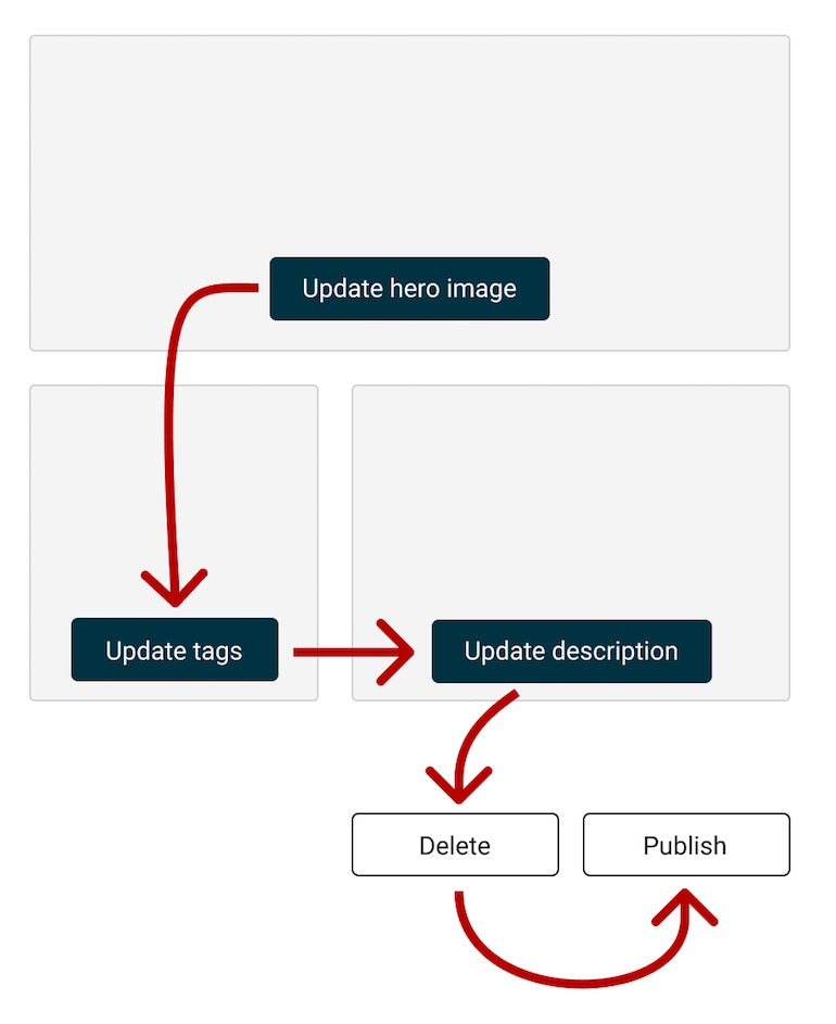
If we use the screenshot above as an example, let’s say we wanted the “Update tags” card to switch positions with the “Update description” card when they stack for narrower viewports. If the cards are rendered as flex items, we might consider using the order CSS property to change their sequence at a specific breakpoint.
While the order property affects the visual sequence of flex items, it does not update their arrangement in the source code. As a result, when a user presses the Tab key to navigate between each button, the “Update tags” button will still receive focus before “Update description”, even though they’re displayed in reverse order on the screen. This causes focus to unexpectedly shift up and down the page, creating a disorienting experience for the user.
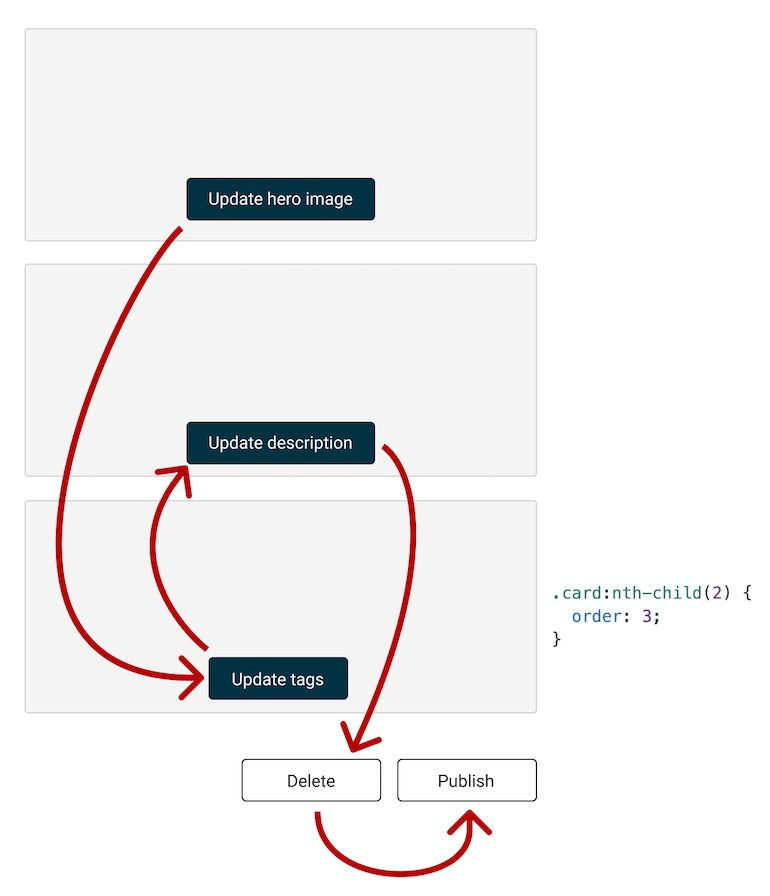
One way to avoid this issue is to render two versions of the cards in the markup: one in the order expected for wider viewport widths, and another in the order desired for narrower viewport widths. We can use the display property to toggle between them at certain breakpoints.
If we don’t want to maintain two versions in the markup, we’ll need to use JavaScript to update the tabIndex attributes of the cards as they stack on the page. Depending on the number of control elements we’re rendering, this approach could be more difficult to get right than maintaining different versions of the cards in the markup.
How tabIndex affects focus order
-
Setting
tabIndexto0: Adds element to the default focus order, in the position determined by its place in the HTML document -
Setting
tabIndexto-1: Removes element from the focus order; it won’t receive focus -
Setting
tabIndexto a positive number: Adds element to the default focus order, in the position denoted by the number value
4. When customizing focus states, design for users who need them most
Browsers use the outline CSS property to render some kind of visual indication that an element is in focus. Focus states are intended to help users identify which element will register keyboard events as they navigate the page with a keyboard.
It’s very common for designers and developers to replace default focus states rendered by browsers. This might involve updating the default outline, or removing it completely and replacing it with another CSS property, such as background, border, box-shadow, color, or transform.
You might also like: Creating an Accessible Pagination with Liquid.
However we decide to render custom focus states in our apps, we should make sure they meet the following accessibility requirements:
- Sufficient color contrast: There should be enough contrast between our focus state and the colors around it so that users that are visually impaired can easily keep track of which element is currently in focus.
- Changes in color are paired with other visual indicators: Changing the color of an element’s border, font, or background may not be noticeable to users with color blindness. It should be paired with other visual changes that don’t require users to be able to distinguish colors. This also applies to hover and error states that involve changes in color.
-
Visible in high-contrast themes: Some CSS properties, including
backgroundandbox-shadow, are ignored when high-contrast mode is enabled on Windows devices. Changes in color may not be registered either, which is why it’s doubly important to rely on additional indicators that are perceivable to people who need more contrast between background and foreground colors.
While it’s acceptable to override the default outline property, never remove default focus states without providing a replacement.
5. Provide shortcuts for keyboard users
If someone uses a mouse to navigate a webpage, they can scroll past extraneous header content when the page loads to reach the information they’re looking for. The process isn’t as streamlined for keyboard users, who may need to tab through multiple navigation links, or any other control elements that come before the page’s primary content.
As developers, we can provide a “skip link” at the top of each page in our app to allow keyboard users to bypass control elements that precede the main content of the page. The skip link is typically hidden from view until it receives focus. It isn’t visible to people using a mouse to interact with your app, but it will be the first element to receive focus for those using a keyboard.
When the link is clicked, focus shifts to the primary content container, and keyboard users can immediately start tabbing through the main control elements on a page.

Skip links are more than convenient shortcuts. They’re an example of bypass blocks, which are required to meet Level A WCAG standards.
Test your app often by becoming a keyboard user yourself
Testing keyboard accessibility has a relatively lower learning curve for people who are not accustomed to using assistive technologies or devices. All you need is access to a keyboard, familiarity with standard keyboard behaviors, and access to Windows high-contrast mode (either by acquiring a Windows device or installing a virtual machine).
Here are some questions to keep in mind as we test our app for keyboard accessibility:
- Am I able to use my keyboard to interact with anything that responds to mouse clicks and gestures?
- Will someone know how to interact with this element when it receives focus?
- Does the focus order match the visual sequence of interactive elements on the page?
- Can I keep track of which element is currently in focus, even if I require higher contrast between colors?
- Can I get to the main content of the page easily?
Answering “yes” to all of these questions doesn’t have to take a lot of effort, and can have positive effects for users in any circumstance: whether they have a physical disability, are looking for ways to save time, or need to use their computer with one hand.
Accessibility testing is a crucial component of app development. Specifically, keyboard accessibility is just as important as providing alternative text for people who use screen readers, or captions for people who can’t hear audio content. At the end of the day, the ability to use a mouse shouldn’t be required to use an app if you want your app to be fully accessible.
Build apps for Shopify merchants
Whether you want to build apps for the Shopify App Store, offer custom app development services, or are looking for ways to grow your user base, the Shopify Partner Program will set you up for success. Join for free and access educational resources, developer preview environments, and recurring revenue share opportunities.
Sign up