

Like any website, an online store needs to load quickly. The last thing your clients want is for a customer to leave because the page was too slow to appear.
Living in a digital age means that it’s easy to forget that some people don’t have access to a high-speed internet connection. In a 2017 blog post entitled Beyond the Bubble, Ben Schwartz warned that 60 percent of the world’s average mobile connections are 2G, and that the global average internet speeds stands at only 7mb/s. This means that it’s important to consider how performance can be improved for clients who are selling to an international audience.
In previous articles, we’ve demonstrated various ways of ensuring store pages render quickly. In this article, we’re going to focus on just one technique that tackles the worst offender when it comes to page loading speed—images.
We will also spend some time looking at how we can go a step further and use different lazy loading techniques to further reinforce the branding of a store by customizing how our images appear.
For more helpful tools, check out our list of favorite Sublime text plugins.
Grow your business with the Shopify Partner Program
Whether you offer marketing, customization, or web design and development services, the Shopify Partner Program will set you up for success. Join for free and access revenue share opportunities, tools to grow your business, and a passionate commerce community.
Sign upWhat is lazy loading?
Lazy loading is a broad term for a computer programming technique that consists of delaying the initialization, or construction of an object until it is needed. On the web, this is mostly applied to the images of a website.
This technique, while improving speed and performance, also makes the user think that the site is loading quicker than it actually is. This is called perceived performance.
How lazy loading works
Let’s consider a collection page for a Shopify store, where we can display up to 50 products per page. This alone is at least 50 images, without even counting the logo or a hero image in the header. This makes for a lot of content, which will further increase the loading time and size of the page.
Learn more about building a customizable related products section.
By default, all images on the pages will be loaded at their full size, regardless of if the user is looking at only the top of the website. This further complicates the loading state as, sometimes, you don’t need all the images to load as they won’t be seen by the user.
Let’s say that you want to only see the first 10 products before navigating to the product page. If the webpage loads each of the 50 products, this will take a considerable amount of time—time which is wasted as the user was only interested in looking at the first few products.
Lazy loading takes a different approach and is a technique that is used on almost every modern website. For example, you can see this effect on the store CandyLand. This website displays a large quantity of products and, as you scroll down the list, you see the product images change from faded and low in contrast, to clear and high-quality visuals.
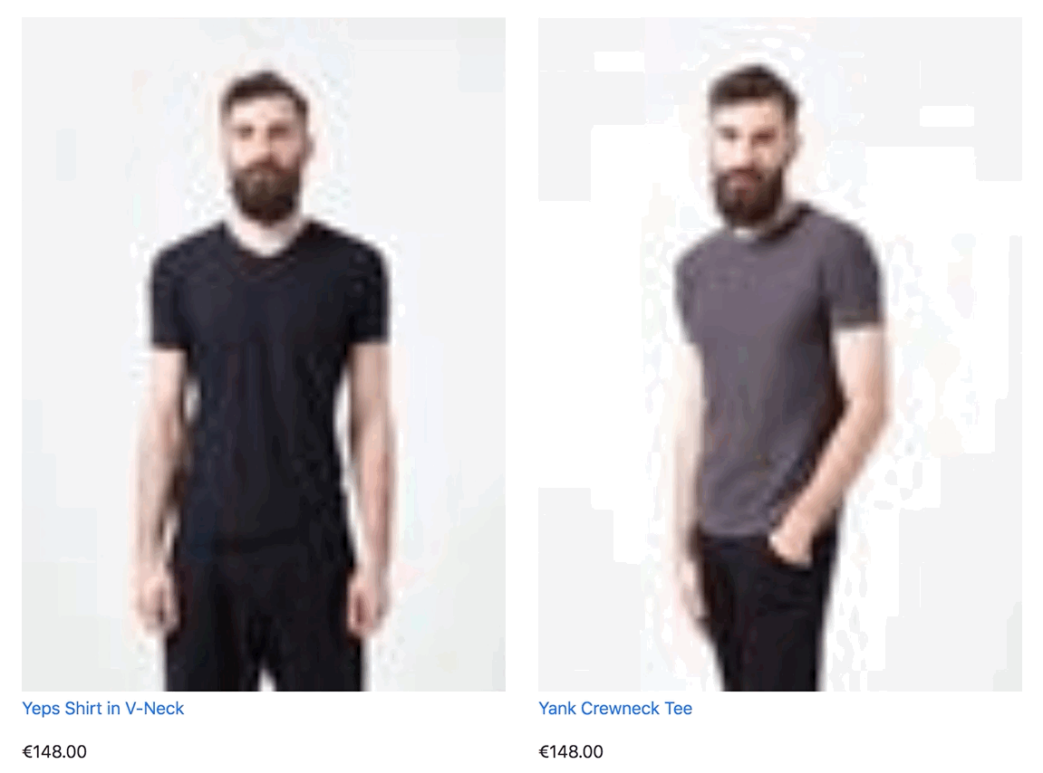
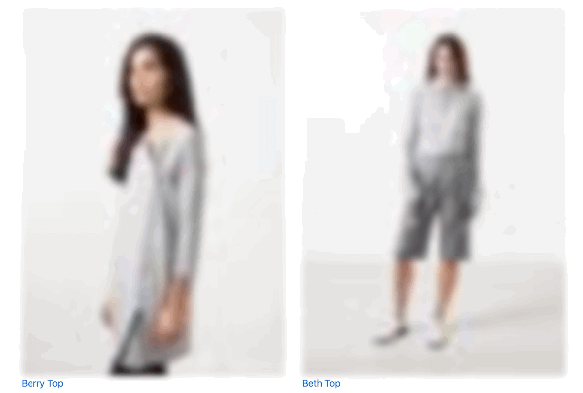
One of the most common methods of employing lazy loading is to display a low-quality image as a placeholder. That way, every image on the page is still loaded, but the page will appear much faster thanks to the very small size of the images. However, a low-resolution image means that it looks pixelated and full of artifacts, which will make it seem like the image is of poor quality.
But this is where the magic happens: as the user scrolls down the page, and the image appears into the viewport, it will be replaced by a higher-quality version of the picture.
What’s more is that this whole process will only happen when we actually need to show our high-quality image—when the image is inside the viewport of the user.
This technique adds a layer of interactivity to a website. Instead of looking at a white page, waiting for the image to load, you can see it slowly coming to life.
You might also like: Using Responsive Images to Decrease Page Loading Times.
Lazy loading and Slate
Update as of January 2020: Please note that Shopify has ended support for Slate. You can continue to use the tool and fork the repo to suit your own needs, however you do so at your own risk. You can learn more about our reasons for ending Slate support on the Slate GitHub page.
Different libraries exist to take care of lazy loading images, removing the need to create the logic behind the code from scratch. For this article, we are going to use the latest version of Slate, our theme development toolkit, and the barebone theme that is included with it, aptly named Starter Theme.
This theme includes two snippets that contain everything you need to get started with lazy loading—responsive-image.liquid and responsive-bg-image.liquid. You will find both in the snippets folder.

For these snippets to work, you will need three dependencies. There are many libraries available, but the one Slate uses is Lazysizes. You will also need Responsive Image as a Service (RIAS), which will take care of loading the correct image sizes with our CDN and BGSet for background images (in your hero images for instance).
These dependencies can be found bundled in the JavaScript file of the Starter Theme. There are different methods that you can use to load them, however, for the purpose of this example, we will assume that the files are simply uploaded to the assets folder of your theme.
You can load the libraries by adding the following in your theme.liquid layout file between the <head> and </head> tags:
<script src="{{ 'lazysizes.min.js' | asset_url }}" async="async"></script>
<script src="{{ 'ls.rias.min.js' | asset_url }}" async="async"></script>
<script src="{{ 'ls.bgset.min.js' | asset_url }}" async="async"></script>
In its simplest expression, the snippet for the responsive image can already be found in the collection.liquid file of Slate’s Starter Theme, and is provided as an example:
  {% include 'responsive-image' with
    image: product.featured_image,
    max_width: 700,
    max_height: 800
  %}
You can expand on this example and also pass some custom CSS classes for your images and for the wrapper.
Let’s consider the following example, which includes a loop that will fetch all the products available in a given collection:
The only difference here is that we have added our CSS classes, so that we can control the layout of our page. For instance, this is the CSS that we could use:
Let’s take a closer look at how the responsive-image.liquid file works, and the img tag, and its parameters, in particular:
The src attribute is where you specify your placeholder image. This image will be what the user sees while the original image is loading. The data-src attribute is where the original, full-size image, is called.
You can change the size of the placeholder image by modifying the filter img_url in the src parameter. The default value is 300x which means that the image that will be temporarily displayed will have a resolution of 300px.
src="{{ image | img_url: '300x' }}"
The lower the number, the lighter or smaller the image file, but the more pixelated, or ‘damaged,’ it will appear.
There is a balance between delivering speed and maintaining a good user experience. In the next section we’ll see a few ideas and strategies to help with this.
You might also like: Using Placeholder Images for Products with the placeholder_svg_tag filter.
Designing lazy loading
Looking at a ‘damaged’ image, even if for a few seconds, can be a bad experience for your clients. Clients might think that there is something wrong with the way their assets were uploaded, or that the compression is too strong.
Additionally, one of the more important aspects to build customer trust is to have a good design that further connects to the brand of the store. Landing on a store that doesn’t look perfect might be a deciding factor in customers leaving the store.
Though these situations are rare, they are worth considering, so that we can focus on customer retention while also offering a unique experience that reinforces the branding and style of the store. Let’s look at some approaches to avoid losing customers.
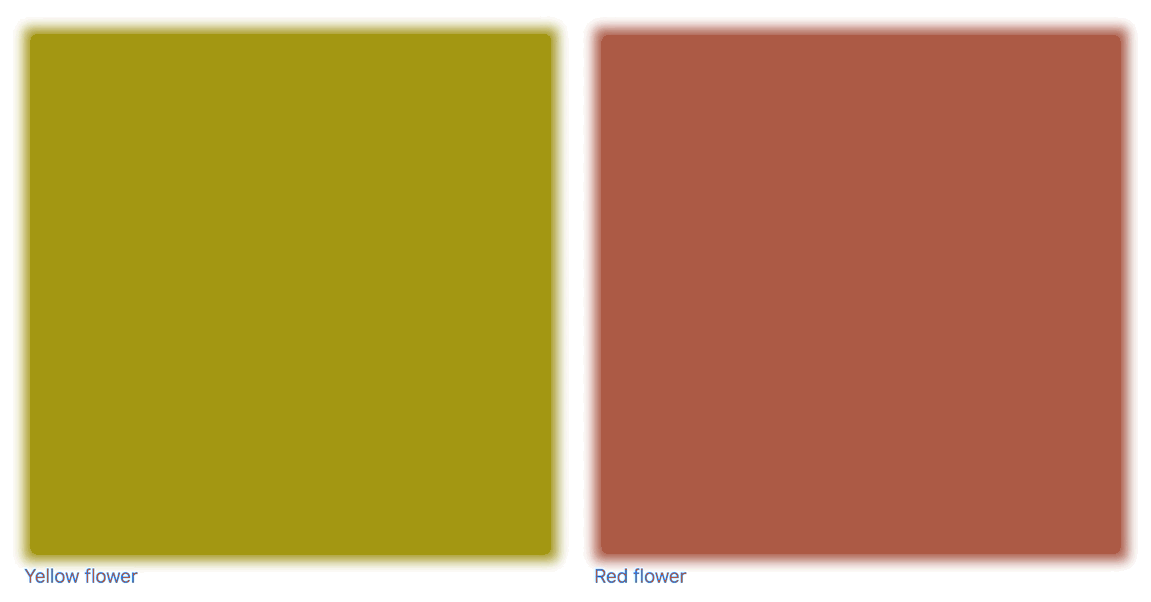
Using the dominant color
An interesting approach, inspired by Manuel Wieser, is to show the dominant color of your image as it’s loading. The process to achieve this is actually quite simple and elegant.
As we have seen in our responsive-image snippet, you can set the size of the image that is loaded in its src attribute. By default, it’s at 300x, which will show an image that is 300px.
By changing the value from 300x to 1x, you will display such a tiny image that it will just render the dominant color of the image. An added advantage is that since the image that we are loading is very small, it will load almost instantly.
This is something that works well for stores that have products with vibrant colors. Stores which sell paintings or photography prints would especially benefit from using this technique.
Using blur
Another approach is to use images with a pleasant blurry effect applied to them. This is very easy to implement using a Lazysizes plugin called Blur-Up.
To implement this method, you need to first call the script in theme.liquid. You can add this immediately below the other scripts that we added earlier.
<script src="{{ 'ls.blur-up.min.js' | asset_url }}" async="async"></script>
Then you can add the class blur-up to the snippet in responsive-image.liquid:
<img id="Image-{{ image.id }}-{{ responsive_image_counter }}"
class="blur-up responsive-image__image lazyload {{ image_class }}"
src="{{ image | img_url: '30x' }}"
Here’s an example CSS code for the blur effect, to get you started:
This technique allows you to serve a very small image, while still keeping it stylish and visually appealing.
We can also combine these two techniques and serve a solid color placeholder that has a blurry effect, by keeping blur-up in the classes and setting the img_url parameter to 1x. This blur will add a soft touch to the image, resulting in a placeholder image that looks less harsh.
By experimenting with different lazy loading approaches, you can make calculated decisions that are consistent with your client’s brand.
Other options
There are other various lazy loading techniques you could choose to implement. For example, you can pass any URL in the src of the snippet—meaning that you could load up a spinning wheel GIF, or even the store’s logo, while the image is loading. The options are endless. It’s as easy as changing the src attribute in the snippet:
src=”link_to_your_image.gif”

You might also like: How to Manipulate Images with the img_url Filter.
Going further
When it comes to using techniques to improve the loading speed of a store, it’s helpful to remind ourselves that it doesn’t have to look ugly. The user is not really worried about what happens behind the scenes, and they won’t even notice that the site is loading quickly. But they will notice if it takes too long!
This article was geared towards how lazy loading works in Slate. If you would like to learn more about lazy loading in general, we recommend this very complete article from CSS Tricks, which goes into detail looking at various techniques and libraries that can be used.
Have you experimented with lazy loading? Share your experiences in the comments below!
