

Many product designers know that great user experience is a lot more than just usability—great user experience also has a lot to do with the look and feel of a product. And when it comes to designing a great look and feel, nothing contributes more than microinteractions.
Despite being small, microinteractions have a great power to make the experience of using a product more effective and human. In this article, we’ll look at what microinteractions are, and when they should be used in a design. We’ll also look at examples of microinteractions in the websites, apps, and products you use every day.
The Complete Guide to Web Design Project Management
Read our complete guide to web design project management for developers, designers, and marketers. Learn how to work with stakeholders, manage budgets, and keep your clients happy.
Learn moreMicrointeractions definition
Microinteractions are contained product moments that revolve around a single use case. Those small micro-moments are a large part of our daily interactions with computers. Every time we log in, set an alarm, or press the “Like” button, we’re engaging with microinteractions. Well designed microinteractions smooth the user’s journey and make each step in it easier.
Microinteractions can be an excellent tool for communicating your brand. Some microinteractions are so great that they become a brand's signature moments—brand attributes that increase adoption and customer loyalty.
Facebook’s “Like” reactions are an excellent example of a signature moment. It’s hard to imagine Facebook without this little feature. The reactions are something that makes Facebook stand apart—every time we see a thumb up icon, we think about Facebook.

The microinteractions model
In 2014, Dan Saffer published the book Microinteractions. In this book, Dan coined the term “microinteractions,” and outlined a model for designing them. This model has the following parts:
- Trigger
- Rules
- Feedback
- Modes and loops

Trigger
The trigger is what starts a microinteraction. There are two kinds of triggers:
- User-initiated triggers. A user action initiates a microinteraction. For example, when a user clicks a button or says something to a voice-activated system (e.g. an iPhone user says, “Hey Siri.”).
- System-initiated trigger. The system can trigger the action when some specific (usually predetermined) conditions have been met. For example, when an email app checks a user inbox for updates automatically and notifies the user about new mail.
Rules
A trigger initiates a sequence of events (also known as rules). Rules define the actual actions that happen in response to changed conditions.
Feedback
In most cases, rules are invisible for users, and users only understand that something is happening through feedback. Depending on the type of product, feedback can be visual, audio, or haptic.
Modes and loops
Modes and loops determine the meta-rules of the microinteraction. What happens to a microinteraction when conditions change?
You might also like: Designing For Augmented Reality.
Use cases for microinteractions
Usually, microinteractions don’t get a lot of attention during product design. After all, they are just small details of user experience. But those small details have a significant impact on the impression that the product makes for users. As famed designer Charles Eames once said: “The details are not the details. They make the design.”
No matter how many well-designed features you have in your product, sometimes a small problem can cause a lot of frustration. In his book, Dan Saffer calls such moments, “a pebble in your shoe,” meaning that no matter how nice your shoes are, a small pebble can be unpleasant when you wear them.
That’s why in many cases, the difference between products we tolerate and products we love are the quality of the microinteractions that we have with them. It’s essential to put a lot of focus on designing the small moments.
"The difference between products we tolerate and products we love are the quality of the microinteractions that we have with them."
Provide visual or audio feedback on user actions
System feedback is one of the first areas that comes to mind when we think about microinteractions. No matter what product you design, you should always strive to create an intuitive design. Microinteractions are something that can help you achieve this goal—they are really good at providing feedback to keep users informed.
Interestingly, it’s possible to bake microinteractions into the very first experience that users have when they start using a product. Turning a product on can be an excellent trigger for a microinteraction. Many Apple Mac users remember its startup sound.
When it comes to baking feedback in everyday experience, it’s vital to consider the whole user journey. Look at places where the user might need feedback for reassurance.
For example, if you design a payment system, you need to provide excellent feedback for every transaction. Just imagine what can happen if the user doesn’t get a success screen after sending money.

Stripe reassures users that their transaction proceeded successfully by showing a green checkmark icon. Image: Michaël Villar.
Help the user prevent errors
Helping users to deal with the error-state condition is good, but it’s much better to prevent them from making errors in the first place. When we follow this approach, we create products that keep users in control of their experience.
Gmail’s automatic anti-phishing filter is an excellent example of a microinteraction that protects users’ data. Whenever Gmail detects content that can harm the user, it triggers a message that notifies a user about the potentially dangerous actions.

Web and mobile forms are a common source of frustration for many users. Let’s take the account creation process as an example. Many forms ask for a login/password combination.
Quite often, when the user creates this combination and presses the “Submit” button, they get an error message that states that the username already exists or that the password does not meet security requirements (even though those requirements were not previously specified).
Inline validation saves users from potential extra work. Microinteractions communicate to users whether their login and password meets all requirements.
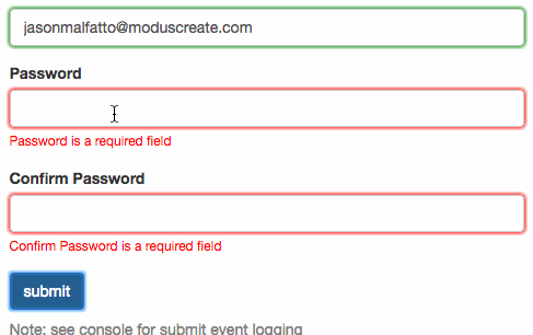
Inline validation in action. Image: moduscreate.
But it’s not only digital products that can benefit from error prevention. This approach works equally well in other products we use. For example, many modern cars have pre-crash safety technology. One of the most helpful systems is a blind-spot monitoring system. Changing lanes while driving is a potentially dangerous operation that leads to accidents—drivers can miss vehicles in other lanes because they are in a blind spot.
The blind spot monitoring system acts as an assistant—it monitors specific zones and warns the driver about the danger of a collision when changing lanes. Many such systems pair audio feedback (usually via a beep tone) together with a visual indication on the left or right rear mirrors. By doing that, the system prevents the user from making the error.
Make the interaction with product seamless
The concept of interaction cost plays a vital role in human-computer interaction. NNGroup defines interaction cost as the sum of efforts, both mental and physical, that the users must invest in interacting with a product in order to reach their goals. Interaction cost is a direct measure of usability—the less effort users need to invest in interaction, the better the usability of a product.
This is why so many designers strive to create seamless interactions. Seamless interactions are interactions that don’t require too much effort. Microinteractions can help us create a seamless experience.
Here are just a few examples of seamless interactions that you can find in many modern mobile apps:
- Swipe action. Swipe actions eliminate tapping and help the user quickly explore different options.

- Pull to refresh. Pull to refresh is an excellent example of a microinteraction triggered by a user. Pull to refresh lets a user pull down on a list of objects in order to retrieve more data. Originally created by Loren Brichter for the Tweetie app, this simple gesture was quickly adopted by thousands of apps, because it makes the experience of a data update really smooth.

You might also like: 6 Principles of Effective Interaction Design.
Consider the user context
The best experience is the one that uses all available information about the user to deliver valuable solutions. You almost always know something about your user, be that their current location, environment, time of the day, etc. It’s vital to use this information to deliver value to the user.
"The best experience is the one that uses all available information about the user to deliver valuable solutions."
Let’s take Apple Maps as an example. Apple Maps uses information about the user's current location to provide valuable insights on a direction. The great thing is that the app does this automatically—it collects information about the user and uses it to predict the direction they’re headed in.
So, for example, if you leave your office every day around 6pm and walk to your car, you will get a notification like the one you see below. It is an excellent example of a microinteraction triggered by the system.

Similar to the previous case, microinteractions aren’t limited to websites and mobile apps. It’s possible to find excellent examples of products that use the user’s context.
Consider the Nest example below. Nest turns on the screen to show the current temperature every time the user passes by, preventing the user from needing to manually tap the device.

Bring humanity into human-computer interactions
Baking emotions into your designs makes it possible to create a better connection between human and computer. Small moments of delight can be great signs of fine craftsmanship.
When it comes to places where you can bring humanity into interactions, start with basic things like animated feedback. Consider Twitter’s animated feedback in the example below. When the user taps the Like icon, Twitter animates the heart for a short duration. It is a simple but effective way to encourage liking.

It’s possible to reach even better results when you find moments in the user journey where users achieve important goals or finish important tasks. You can reinforce those moments using microinteractions. By doing so, you’ll create a feeling of great achievement and make the moment really special.

Again, microinteractions are not limited only to web and mobile experiences. They can be baked into all the products we use. For instance, Ford found an interesting way to show the efficiency of driving their hybrid vehicles. Similar to many other hybrid cars, the Ford Fusion has a scale of efficiency that shows the eco score.
But instead of displaying a percentage on this scale, they decided to use tree leaves. The drivers see more leaves when they drive in an eco way. As a result, many people get very attached to the leaves and try to grow as much as possible. The fact that people get so attached to this experience proves the fact that great design can change the users’ lives.

What to remember when designing better microinteractions
There are a few things you need to keep in mind if you plan on designing microinteractions.
Creating microinteractions should be part of a design process
Microinteractions are not nice things that you add on top of existing experience. They are essential ingredients of product design and should be baked in the design right from the start.
Here are a few simple tips that will help you bake microinteractions in design process:
- Don’t limit creating microinteractions to only designers. Everyone who participates in product creation and cares about it can propose great solutions. Give them this opportunity.
- Be ready to go back and rethink your experience. Don’t stop iterating and trying different approaches on different parts of tiny elements.
Always take the big picture into account
Sometimes design decisions might not be bad conceptually, but when you build an actual app out of them, it becomes evident that they are simply not working well together. As a result, the experience becomes amazingly poor.
That’s why it’s important to look at the overall product, not just separate parts of the experience. When you design for separate parts, you risk creating a fragmented experience. In such experiences, microinteractions can do more harm than good . Remember that all small details should come together to create a holistic user experience.
You might also like: Using Humor in Design: Why, When, and How.
Consider how your microinteractions hold up long term
Creating a long-living microinteraction is really challenging. You need to analyze not only how people use your product, but also how they experience it.
The reaction to design elements is all about emotions, so if users have negative emotions about your product, it’s a clear sign that you have to redesign some elements. What seems fun the first time might become stressful after a while.
Put yourself in the user's shoes and ask the following questions every time you evaluate an individual micro-moment:
- What happens when the user sees this animated effect/hears this sound thousands of times?
- Will they still enjoy it as much as they did the first time?
The Shopify design team did a great job with the “cha-ching” sound merchants hear when they make a sale.
It’s become so well-known and loved by merchants that Shopify recently created and sold a limited run of a physical button that makes the same sound, and marketed it as “your very own serotonin boost.” They sold out almost instantly.
This example of a Shopify microinteraction is a sound merchants love to hear over and over—and it also follows two more timeless rules you should also follow:
- Don’t start from zero. Use the information you have about your target audience to create the most effective experiences for them.
- Follow the KISS principle (keep it simple, stupid!). Avoid over-designing a microinteraction. Always try to make it as simple as possible.
Grow your business with the Shopify Partner Program
Whether you offer web design and development services or want to build apps for the Shopify App Store, the Shopify Partner Program will set you up for success. Join for free and access revenue share opportunities, developer preview environments, and educational resources.
Sign upMicrointeractions personalize a product
The magic is all in the details. Our overall experience of using a product is the sum of moments and details, both large and small. Microinteractions have the power to transform a good product into a great product.
"Microinteractions have the power to transform a good product into a great product."
People notice a product’s details, whether it’s an app, a theme, a social media “Like” button, or the sound it makes that reminds them of making their first sale. These microinteractions make the user fall in love with the experience, because they know that the people behind the design really care.
What are some of your favorite microinteractions? Let us know in the comments below!
