

Back in August, we asked the Shopify Partner Community to submit their work to the Shopify Commerce Awards, our competition that celebrates Shopify Partners, developers, and affiliates around the world.
The avalanche of exceptional submissions that followed was incredible.
We knew choosing winners for the 16 awards was going to be hard work, so our panel of expert judges rolled up their sleeves and got started.
The pool of talented creatives they chose to take home this year’s top prizes in Design, UX and UI, Apps and Development, as well as Marketing and Branding could not have been more impressive.
Without further ado, we are thrilled to announce the winners of the 2017 Shopify Commerce Awards. 🎉
Award winners
1. Design
2. UX and UI
- Best Animated Motion Graphic for UI
- Best Shopify Integration with WordPress
- Best Mobile Commerce Experience
- Best Storytelling Through UX
3. Apps and Development
- Best Store Experience Using Storefront API
- Best App Experience Using the Marketing Events API
- Best Store Experience Using Shopify Scripts
- Best App Design Using Polaris
4. Marketing and Branding
This year, our winners will receive a ticket to Unite 2018, $1000 towards travel expenses, two nights accommodation, and a winners dinner and awards reception.
There were so many exceptional submissions to the Shopify Commerce Awards this year that we couldn’t stop at just 16 winners. We’re thrilled to also announce the ten honorable mentions that captivated our judges this year.
1. Design
Best Product Page — Maapilim by TVP NYC

Shopify Partner: TVP NYC
Store: Maapilim
This product page is great in its simplicity. They remembered that the point of a product page is to sell the product! I also appreciate the integration of the ingredient provenance on a map. It creates original content for each product.
How do you communicate the feel, smell, and quality of a grooming product through an ecommerce site? That was the challenge facing TVP NYC when they set out to build a store for Maapilim, a men’s grooming product brand. TVP NYC worked closely with Mapilim to bring the client’s vision to life through Shopify.
They did so by building product pages that are easily updatable by Maapilim, so that the pages would always be telling the right story.
“Each product had completely unique information, from key ingredients, to scent guides, to ingredient maps,” explained Daria Rose, Technology Director at TVP NYC. “How could we take the client’s design and make it flexible enough to handle these different inputs from the get-go, while also letting them make updates? We worked with Maapilim to refine their designs and create an editable CMS, so they’re able to update product information and keep their page fresh at all times.”
To communicate the quality of Maapilim’s products, the team at TVP NYC also ensured that the site’s functionality properly highlighted the product visuals. They did so by including a zoom feature and an ingredients map. The team then focused on making sure it looked equally good on mobile as it did on desktop.
“Because the product images are full width, our original attempt to make the zoom work resulted in a sloppy UX—the image would zoom when the customer would scroll,” Daria said. “To fix this, we added a button that turns zoom on or off. This allows the customer to see the details of the branding and packaging, but would also allow them to scroll down the page easily if they wanted to learn more. The sticky add-to-cart button ensured the customer would not need to scroll back up when they decided they wanted the product.”
Understanding the story they wanted to tell on every page helped Daria and the TVP NYC team build functional, beautiful product pages.
“In every decision we made, it was obvious that we should let the brand speak for itself. We knew the brand’s story very well and so the process was actually really fast. The main discussion was making sure the website works as Maapilim continues to grow its product line.”
Best Home Page — Sasha + Lucca by Human, NYC
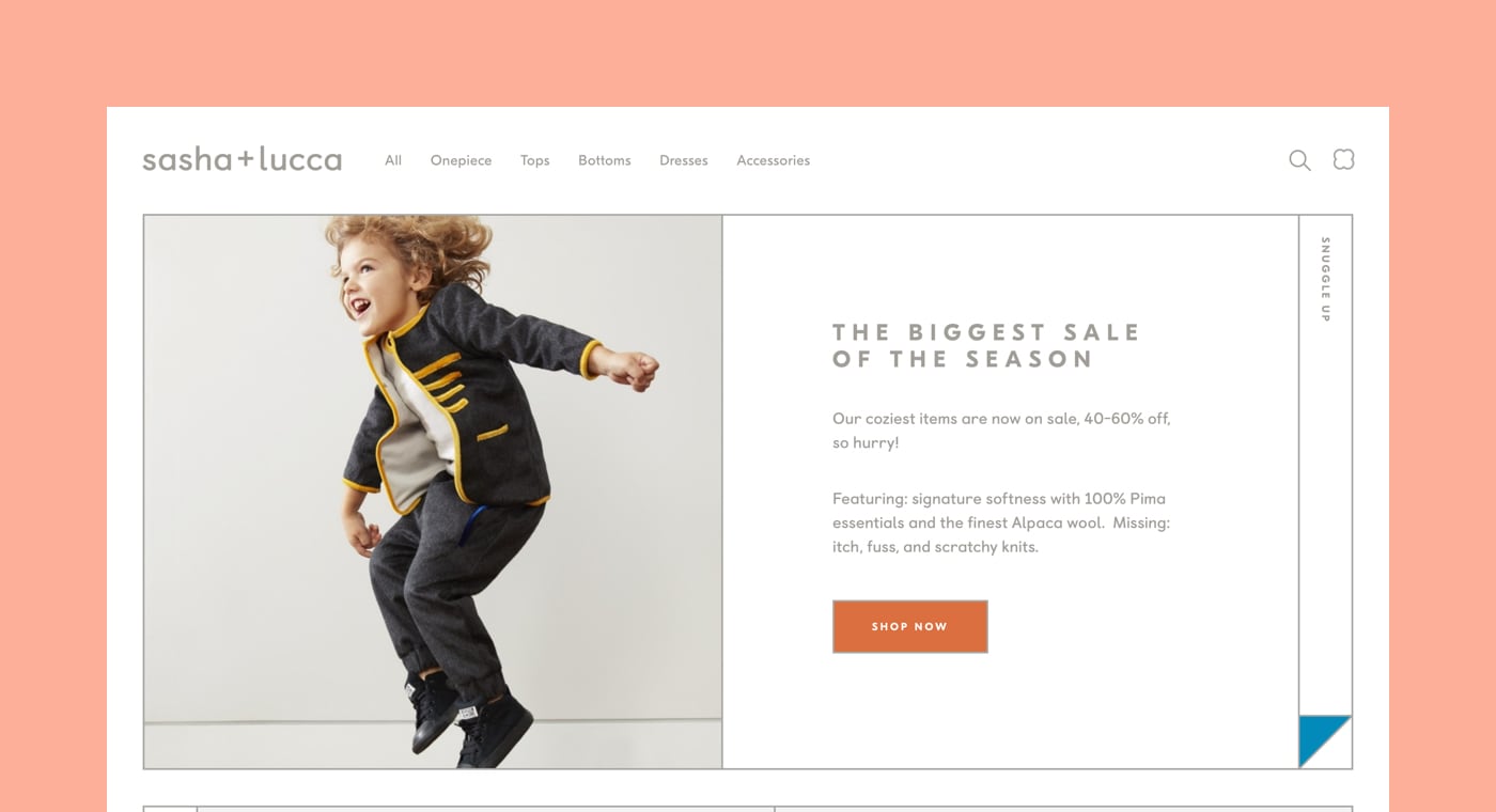
Shopify Partner: Human, NYC
Store: Sasha + Lucca
Beautifully engaging design, completely appropriate to the category, VERY FRESH, with a classic graphic design feel you don’t see much of on the web.
When building a strong homepage, the team at Human, NYC knows that it’s all about having inspiration. For their project building Sasha + Lucca, a children’s clothing brand, their inspiration came from opposing forces.
“Our very talented friend Verena Michelitsch [a branding designer] worked with the founders of Sasha + Lucca to create a new visual identity for the brand,” explained Rachael Yaeger of Human, NYC. “It’s about the tension between simplicity and sophistication, playfulness and logic, high contrast and softness.”
Having a strong design base allowed the team at Human, NYC to get explorative when designing the digital home for the brand.
“We were able to have a lot of fun because of what Sasha + Lucca sells—incredibly cute kids’ clothing! The size of the products on the category grids are intentionally small, why not? Kids clothing is small. The outfit maker module on the homepage reminds us of [the movie] Clueless, and we gave the site a playground-esque footer.”
To play with the contrast between cute children’s clothing and the sophistication of the brand, Human, NYC embraced the idea of modularity and used a grid system, reflecting the style that defines the Sasha + Lucca product.
“Every page is designed to be completely modular. We wanted to create a flexible system that makes the site look easily refreshed with each content update and empowers the Sasha + Lucca team to change the website over time, with new products, content, and testing.”
As with any ecommerce store, the Human, NYC team also had to walk the line between expressive design and ensuring that the store converted visitors.
“We are constantly trying to balance creating something that feels unique and soulful to the visitor, but doesn’t ever get in the way of being able to shop and convert sales. Understanding where we can push convention to surprise and delight users, and where we need to follow best practices is the exciting tension to explore with every project. We wanted to make sure the website provides the necessary context and information for a visiting shopper to feel comfortable in making a purchase.”
To hit the right note and ensure that the store met its goals, the teams at Human, NYC worked closely together.
“The biggest lesson from this project for us was a reaffirmation of how integrated and holistic the process around creating a website needs to be. Our team is wholeheartedly collaborative and integrated across design and development—Rebecca Zhou and Claire Pedersen, who worked on the website design worked closely with the developers Michael Burton Ray and Sasha Kluchnick from start to finish. We never went too far in design without it being vetted by development and vice versa.”
Working with opposing forces means that Human, NYC was able to appeal directly to their target audience of parents.
“Our vision was to create a website that is easy and exciting for parents to shop on—simple yet sophisticated, playful yet logical, crisp yet soft.”
Best Collection Page — Polaroid SX-70 by Love + Money Agency
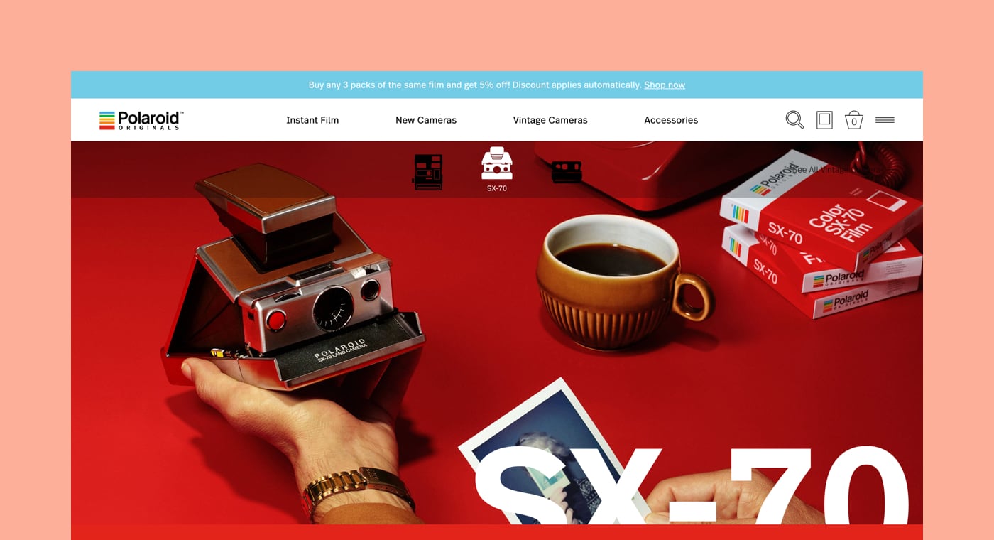
Shopify Partner: Love + Money Agency
Store: Polaroid SX-70
I like that the use of colors is very purposeful in this collection page. From the design to the product photography, each collection has its own universe. This design also takes full advantage of the grid layout while keeping a dynamic and playful feel.
When building a collection page for a widely-recognized retro brand, Love + Money Agency were faced with the challenge of communicating the look and feel of a Polaroid camera to an audience that had probably never held one before.
“As the reintroduction of a 20th century retrotech icon to a whole new age of consumers, there was a lot of storytelling to do and, being a photography brand, a lot of big, bold images to share,” explained Rachel Gilkison, general manager at Love + Money.
“But there was a strict commercial imperative, too: we needed a UX that was ultimately dedicated to selling a new tech product. An effective solution needed to tell the story to those who were curious, and sell the product to those who were ready.”
Once they found a design that worked, Love + Money then had to ensure that their collections were cohesive without getting repetitive.
“This site was a huge learning curve for us in template design. With such a large range of products across such a niche market, all with their own quirks and proof points, we needed to create a template that would allow each camera to feel diverse and unique, while not having to redesign each page from scratch. We had to make sure our template was both robust enough to give the user a cohesive experience, but also flexible enough to not get boring.”
To do so, the team at Love + Money focused on bringing the retro vibe to the whole design of the collection.
“From the art direction to the typography, the copywriting to the interactive UX elements, we wanted to reference the classic, analogue feel of picking up and holding a piece of classic 20th century technology.”
Love + Money did just that, creating a big, bold collection page for an iconic product.
Best Custom Design with Slate — Batch Organics by Paralel
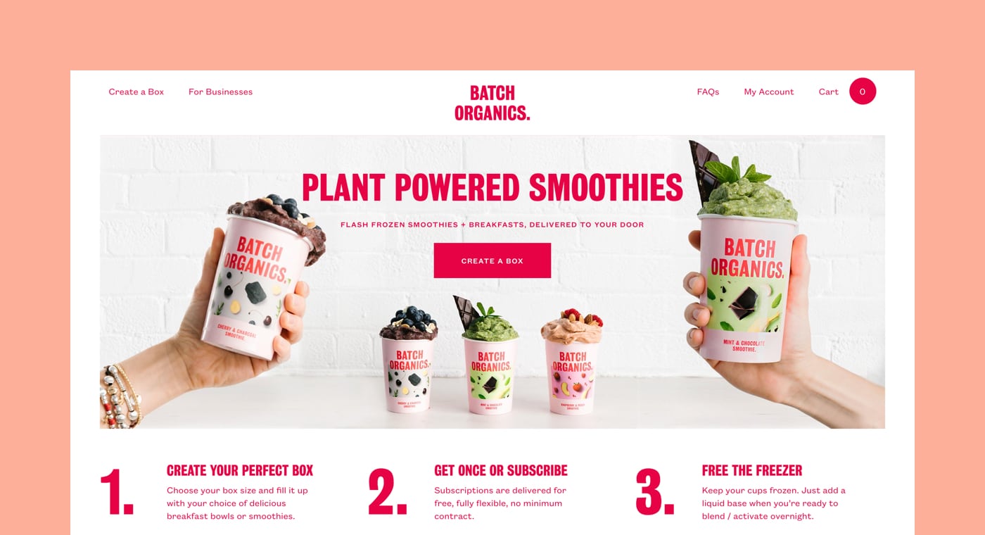
Shopify Partner: Paralel
Store: Batch Organics
Nice, punchy look and feel, no clutter, gets out of its own way, lets the product do the talking. Picking and mixing is so easy and pleasurable—and the whole thing feels so delightfully clickable—how could you not order a drink or two? Well done!
Batch Organics is a company that sells personalized frozen boxes of produce for smoothies and breakfast bowls on a subscription basis. They collaborated with Paralel to bring their brand to life online, both on desktop and mobile.
“Our vision was to simplify the process as much as possible,” said Patrick Levesque, founder and senior consultant at Paralel. “We wanted to provide all product information on a single, simple, streamlined page.”
Because of the nature of ecommerce, Paralel had to get creative to display the fresh, healthy produce in a way that enticed customers. They opted for big, bold photography and bright colors.
Paralel also needed a way to give Batch Organics the ability to easily edit, update, and modify how its products are displayed. They achieved this by using Slate.
“Using Slate to develop the theme and integrate the design offered a modern workflow and facilitated the launch of successive versions of the website,” Patrick said.
Bright, healthy, and customizable: the Batch Organics brand comes to life on their website.
2. UX and UI
Best Animated Motion Graphic for UI — Two Blind Brothers by SMAKK Studios
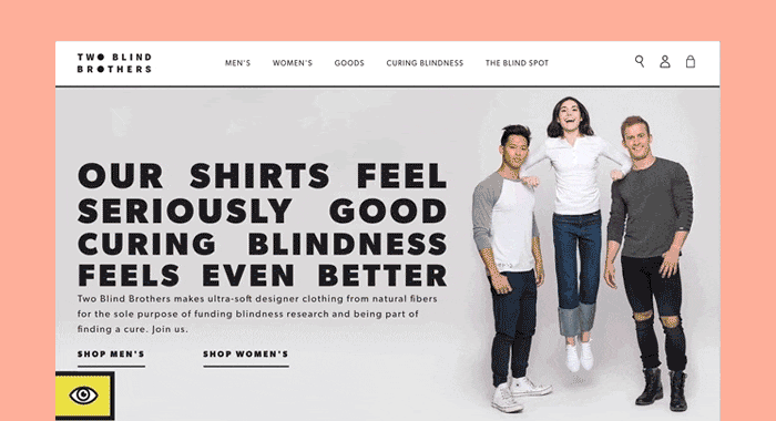
Shopify Partner: SMAKK Studios
Store: Two Blind Brothers
SMAKK Studios uses animation in an unexpected way to create a sense of empathy, and draws attention to the cause they support.
Why was building Two Blind Brothers such a big project for founder and creative director of SMAKK Studios, Katie Klencheski?
Because it was being built to cure blindness.
“Two Blind Brothers makes ultra-soft designer clothing with natural plants and proven fibers for the sole purpose of funding research to cure blindness,” Katie explained. “The site is built to sell as effectively as possible because when else are the UX stakes so high?”
Katie and her team set out to design a store that served the needs of their audience.
“Creating a look and feel for a brand with high visibility in a community with limited visibility presented some unique challenges—and possibilities. We wanted to embrace visual conventions that created a connection to, and best served, the unique legibility needs of the visually impaired community.”
To make that happen, the team studied up.
“One of our designers actually learned how to read Braille for this project,” Katie said. “As we did research into Braille grammar and characters, we learned that “2” and “B” are represented by the same double-dot character. The Two Blind Brothers’ abbreviation “2BB” translated into a unique Braille mark, and an inside pun for those who read Braille.”
The SMAKK team also looked at how to use color to ensure the site was accessible to those with visual impairments.
“We looked to design elements with high legibility design conventions for inspiration, like street signage and eye charts. And also studied vision impairments to select high contrast colors—black, white, and yellow—that were intentionally highly energetic, differentiated, and ultimately extremely legible for individuals with varying vision abilities.”
From ensuring that their color palette passed WebAim contrast level AAA guidelines, to paying special attention to how the site would be experienced with accessibility tools like screen-readers, the SMAKK team built the Two Blind Brothers website to be as accessible as possible for those with visual impairments.
But their efforts didn’t stop there: with the goal of curing blindness in mind, the SMAKK team also had to ensure that the site was designed to drive conversion.
“To drive purchasing and get consumers excited about their connection to finding a cure, we created super dynamic animations, modules, and pages to reinforce the ‘Curing Blindness’ message. But we also made sure that this content was designed to supplement the shopping experience,” Katie explained. “There's also an exuberance and hopeful spirit that founders Brad and Bryan have that we tried to bring to life with micro-interactions, motion, and personality throughout.”
One such micro-interaction hides in the bottom left corner of the Two Blind Brothers website. If users click on the eye logo there, the site toggles into ‘blind mode’, replicating Stargardt's disease—the form of macular degeneration that causes Brad and Bryan’s vision impairment.
In the end, the team at SMAKK created a site that is accessible, educational, and drives conversions—all with the goal of curing blindness.
Best Shopify Integration with WordPress — Workhorse Printmakers by Spindletop Design
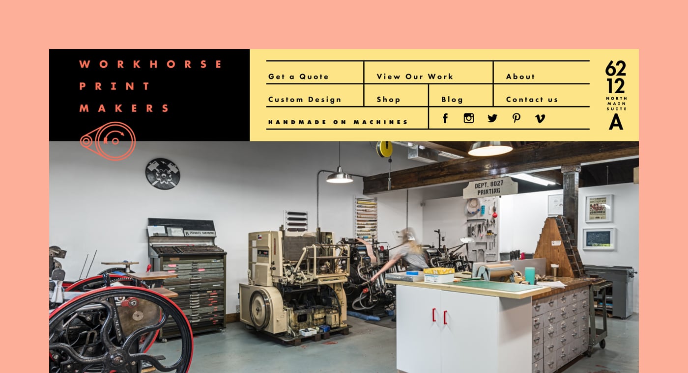
Shopify Partner: Spindletop Design
Store: Workhorse Printmakers
The bold use of color and type creates a unique and memorable feel for this site.
Workhorse Printmaker is a commercial specialty print shop in Houston, Texas. Spindletop Design had just built them a brand new WordPress website when Workhorse got the chance to sell some wholesale items online. They turned to Spindletop to add a store to their existing website.
Seamless and simple for both Workhorse and the customer: this was Spindletop’s goal with the design. Because online retail isn’t Workhorse’s primary sales channel, it had to be easy.
“The solution needed to require little effort to maintain and be easily implemented into their existing website. Ideally, there would be little to no discontinuity between the experience transitioning from the WordPress to the Shopify portions of the site,” said John Earles, principal at Spindletop.
The project proved a valuable lesson for Spindletop, opening them up to further possibilities.
“Up until this point we didn’t realize how much was possible with the Shopify platform. Now we feel completely comfortable developing sites from the ground up, built exclusively on Shopify. It’s been a valuable tool.”
Best Mobile Commerce Experience — Spoke London by Series Eight
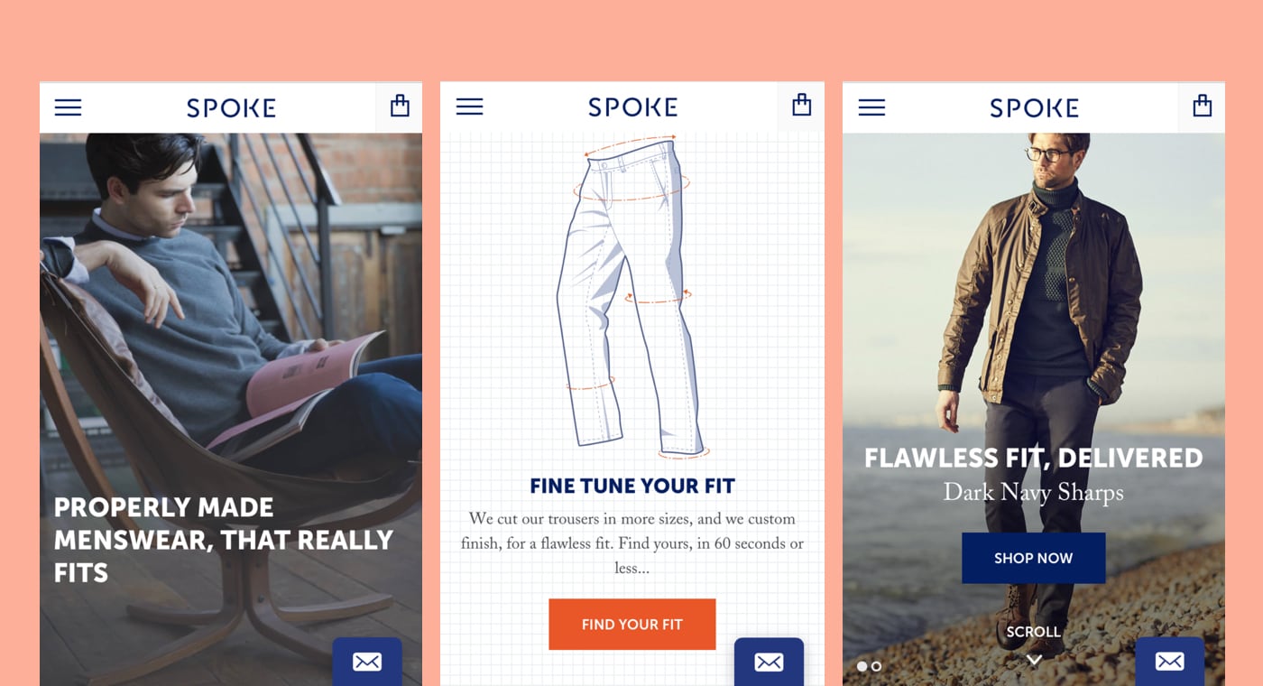
Shopify Partner: Series Eight
Store: Spoke London
A design with smooth transitions and advanced customization options. On narrow screens, floating filters bar at the bottom keeps filters always accessible and the checkout is smooth and straightforward. Well done! The user research work done here shows. Love the custom suit options and the entire user flow.
Spoke London is a bespoke men’s clothing brand. Their solid relationship with clients meant that when they voiced frustration over the online and mobile shopping experience, Spoke listened. They reached out to digital design studio Series Eight to address the issue.
Series Eight started by identifying where customers were feeling frustrated: finding the right clothes for the right moments, and ordering items in the correct size.
“Finding the right product had to be frictionless for the user,” said Francesca Vassiliades, co-director and designer at Series Eight. “Different product styles were given context through imagery, content, and grouping, so that boardroom-ready trousers could be easily distinguished over those that would do better on a wet day spent cycling.”
In addition, the filtering system had to be smart.
“Users were encouraged to take the Sizing Quiz, where after a quick round of illustrative questions, informative insights, and inputting their email address, they would immediately learn their unique measurements and the entire store would be filtered accordingly. This is like walking through a shop where everything you see is already cut to your exact measurements. And with your size and profile saved into the website for future visits—repeat customers are a given.”
With functionality addressed, the Series Eight team then turned to design.
“The Spoke brand is defined by bold typography, visual nods to their bespoke methods, and a witty and relatable voice—things that communicated well to their professional male audience. It was crucial that we elevated the shopping experience to be sharp, intelligent, and as tailored to the user as the bespoke garments they were about to pick out.”
The key to building solutions for clients, said Francesca, lies in listening.
“It’s been said a million times, but listen to your users. Through listening to our users and doing rounds of user testing, we were able to create a much more impactful and refined experience for them.”
In the end, the mobile experience Series Eight designed for Spoke London is directly on brand: seamless, and perfectly tailored.
Best Storytelling Through UX — Coffeebar by Laxalt and McIver
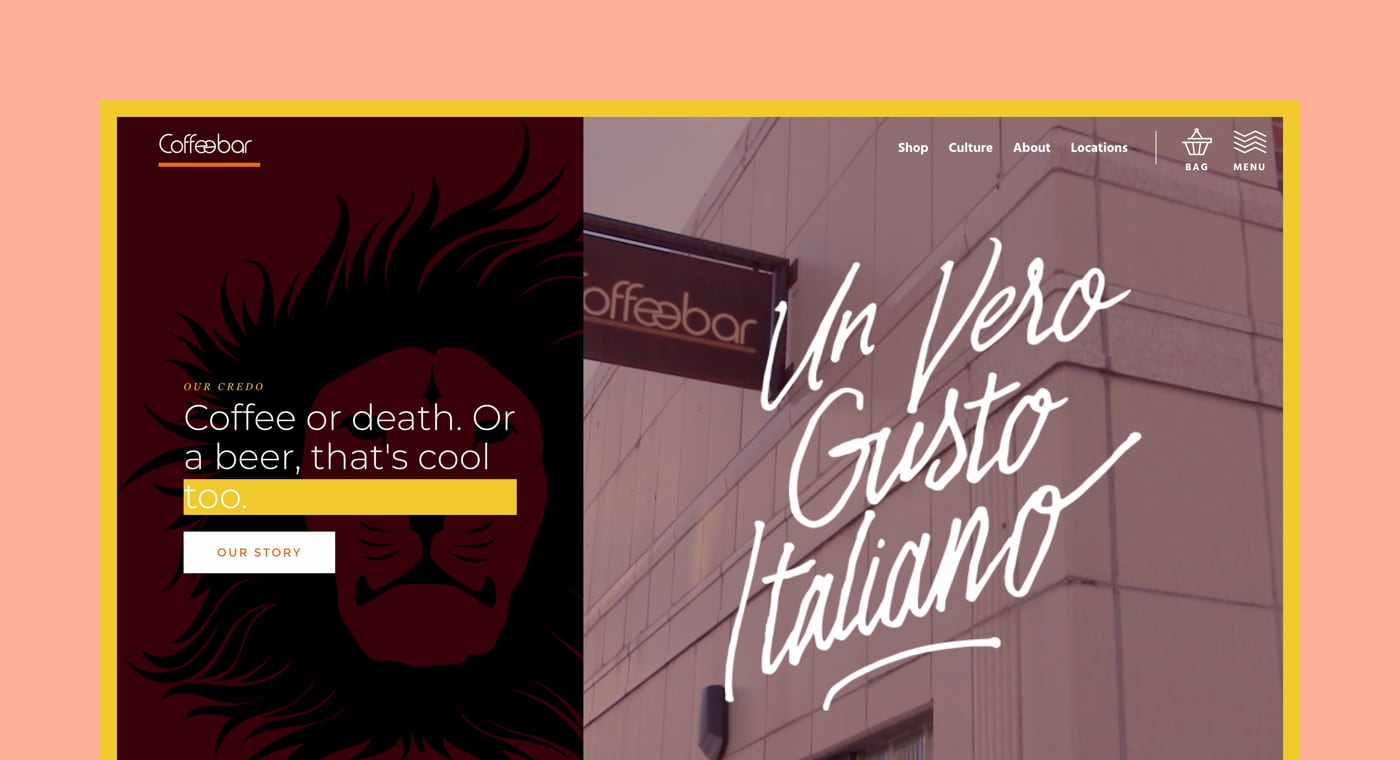
Shopify Partner: Laxalt and McIver
Store: Coffeebar
Sometimes selling products isn't good enough. Coffeebar wraps a story around their product, providing music playlists, reading material, and presenting the people working there.
Coffeebar is a chain of five coffee shops around the Nevada-California border. When Laxalt and McIver started building them a website, the goal was to reflect the in-store feel online.
“We wanted the vibes of Coffeebar to live and breathe online for someone who may have never been to one of their stores,” said Matthew McIver, partner at Laxalt and McIver.
Matthew turned to content to make that happen.
“We wanted to come up with an experience that engaged the user without being too pushy with sales. We always wanted the product to be easily accessible, but to also provide a much deeper experience through content.”
“The ecommerce coffee industry has had a good amount of time to learn how to pull off good websites, so we had plenty of references,” said creative director Peter Laxalt. “But Coffeebar being Coffeebar, it was imperative to give it its own unique flavor...pun entirely intended.”
The challenge laid in Coffeebar’s multiple locations.
“Each location is in pretty diverse areas. Snow bros and après-ski go-ers, college students, and some Bay Area tech. We decided to break down each location’s landing page to speak to each of those contexts. So when people log on to Coffeebar’s WiFi network, we collect their email and redirect them to a landing page unique to their location—hence the big push on the landing page designs.”
Making the landing pages unique to each of Coffeebar’s locations allowed the team at Laxalt and McIver to explore all kinds of customizations to connect more deeply with Coffeebar’s diverse audience. They even built a custom template to put a Spotify share URI and image into a Shopify blog post to share each location’s playlist.
In the end, the goal was always to appeal directly to the audience.
“Design cleanly, code cleanly, and when you are faced with a fast-paced, growing ecommerce website you need to make sure that any step you take is going to be efficient, powerful, and most importantly empathetic,” Peter said. “Your visitors are not designers. Your visitors aren't developers. You need to speak to the human to make a powerful web experience.”
For Laxalt and McIver, the results have been great.
“People loved it,” Peter said. “We loved designing, coding, photographing, filming, and crafting it. It's been rad.”
Commerce Awards 2017 honorable mentions
There were so many exceptional submissions to the Shopify Commerce Awards this year that we couldn’t stop at just 16 winners. We’re thrilled to announce the ten honorable mentions that captivated our judges this year.
Read more3. Apps and Development
Best Store Experience Using Storefront API — Daysale by Lucid
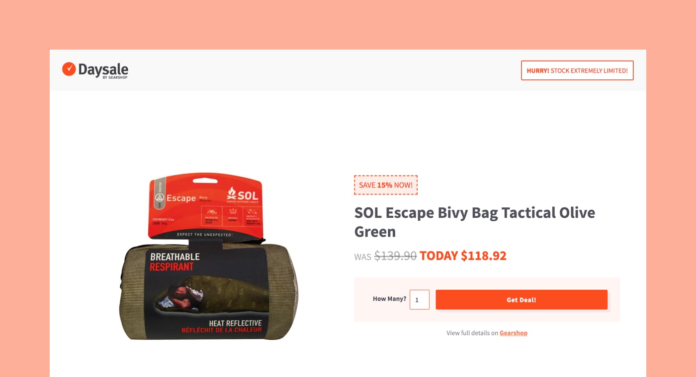
Shopify Partner : Lucid
Store: Daysale
DaySale is a creative take on clearing low-stock inventory. Merchants get a quick and easy setup, and customers get a great deal. We love when partners create experiences like these; serving the merchants and customers that use Shopify every day.
When Gear Shop, an outdoor equipment store in New Zealand, needed to create a one-page storefront, they turned to New Zealand-based creative agency Lucid to design and build Daysale.
“The main goal was to build a simple, elegant, functional one-page storefront for daily deals that is powered by Gear Shop’s main Shopify site,” explained Galen King, founder and creative director at Lucid. “It was important that fulfillment, products, and customer management are seamlessly integrated with the main store.”
Figuring out how to make the storefront work involved some exploration for Galen and team to find the smoothest solution possible.
“We experimented with the idea of a second separate Shopify site using the ERP to sync products, but settled on the Storefront API mainly because we wanted to kick the tires and experiment with what is possible. We also really wanted to see how far we could go with building a website on Webflow that is powered by Shopify.”
The experimenting taught them a lot.
“You can do a lot by layering Shopify on top of other platforms using the Storefront API—and GraphQL is powerful and surprisingly awesome.”
The experimenting and the lessons the team learned helped them build a simple, totally functional storefront that meets the needs of their clients and gets the job done well.
Best App Experience Using the Marketing Events API — OrderlyEmails by FORSBERG+two
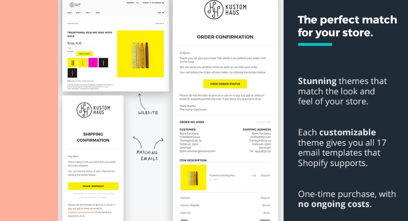
Shopify Partner: FORSBERG+two
App: OrderlyEmails
Forsberg+TWO and their apps have been a staple of the Shopify ecosystem for quite some time, but their submission showed that they are still enjoying the challenge of innovating and developing their app offerings as the Shopify platform matures. There was an awesome level of detail in this submission—not only did it provide an interesting description of the technical challenges in implementing the Marketing Events API for an app with a large user base, but it also described the impact for merchants and how it helped them drive their businesses forward.
Björn Forsberg is the founder of FORSBERG+two, a development and design studio that focuses on Shopify apps. Björn created the app OrderlyEmails to allow merchants to optimize the emails being sent out from their stores. What he found was that creating a successful and highly-rated app was all in focusing on the merchants’ needs.
“Creating a laser-focused app to solve a very specific problem beats creating a generalist solution,” Björn explained. “Because the app is so specific to Shopify, it's able to support a wider range of merchant and agency needs. For example, the app is able to extract logos and styling from the merchant’s store automatically, making the whole design process faster and easier. The design experience is also modelled on the Shopify theme editor, so users feel right at home with how everything works.”
The announcement of the Marketing Events API was the key for Björn to create OrderlyEmails.
“I wanted to provide merchants with ways to optimize and improve the emails for a long time, but gathering, processing, and displaying the data myself was too costly and not feasible. So when the Marketing Events API was announced, I was really excited. I found it nice and easy to work with. It also helps me keep my overhead costs for the app low, so offering the email designs as a one-time fee is a sustainable model.”
And the results Björn has seen speak for themselves.
“Merchants are now tweaking and optimizing their Shopify notification emails in OrderlyEmails like never before, based on the analytics the app surfaces. Many are seeing double-digit increases in conversions because of it. Previously, you could only hope that any content changes, discount codes, or recommended products added to a notification email would have a positive impact. Now they can actually measure and test different strategies to find the most profitable changes.”
Best Store Experience Using Shopify Scripts — Soko Glam by Swell
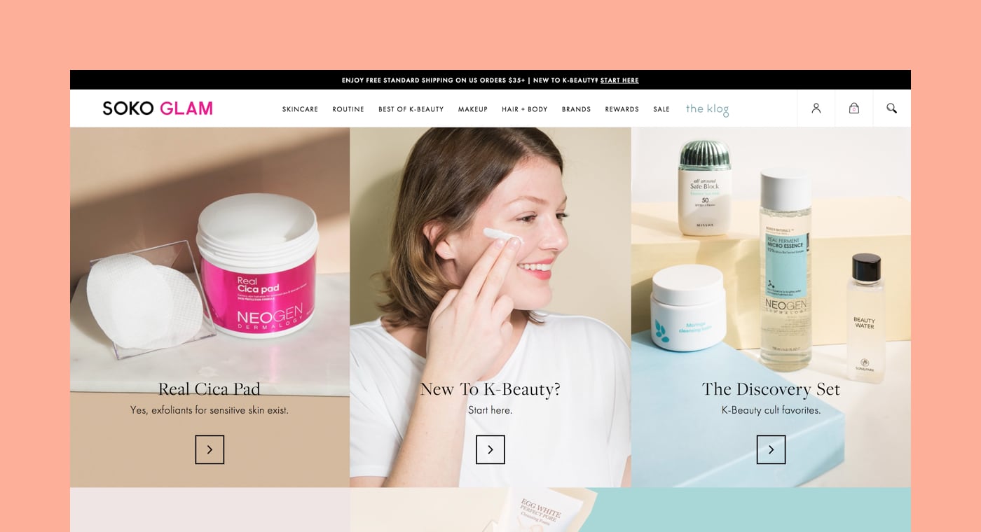
Shopify Partner: Swell
Store: Soko Glam
Swell has built not only great customer features, but has done so in a way that seamlessly preserves merchant branding. The end result feels like one cohesive and continuous shopping experience.
When Swell, an incentive marketing platform, started working Soko Glam, a beauty brand, they had a very specific problem to solve: reward programs. Shopify Plus merchants want to be able to offer customers the ability to redeem points and credits for free products—a model popularized by companies like Sephora. It creates a meaningful experience with the brand, and allows companies to try out new products and samples with their biggest advocates.
It’s a great idea, but this is where things got complicated for Swell.
“For the Shopify Plus merchant that rightly obsesses over customer experience and store management, there were significant problems with the typical ‘points for product’ redemption process,” said Josh Enzer, co-founder of Swell.
“First, in many setups, customers had to redeem for a 100 percent off discount code, hunt for the corresponding product on the store, add it to the cart, and then apply their discount code. Needless to say, that's not the right customer experience. As a workaround, some merchants tried creating hidden free variants on the store and adding those to the cart directly, but that just created a new issue with inventory; the free variant had to be tracked completely separately for planning purposes, which is a logistical nightmare.”
The Swell team brainstormed ways to address these challenges, and settled on using Shopify Scripts. It was a complete success.
“The solution we rolled out with Soko Glam completely solves the problem,” Josh explained. “The customer experience is now seamless, and free products are pulled from the store's existing inventory. Better yet, we recently rolled out an update to allow marketers to manage their free products directly from the Swell admin. Now, Soko Glam and others can update their free products on a monthly basis with ease, and give customers a reason to visit the online store more frequently. The Soko Glam project was a great jumping off point for our team to learn just how much Scripts can help us create incredibly rich customer experiences on behalf of our clients.”
Best App Design Using Polaris — Give & Grow by Pledgeling

Shopify Partner: Pledgeling
App: Give & Grow
Give and Grow has really embraced the ethos of the Polaris design framework—not just the visual look and feel, but all aspects of the UX philosophy including messaging and interaction design. Where the core components didn't meet the needs of their users, the developers have provided custom components that feel right at home in the Shopify Admin.
Pledgeling has the mission of helping everyone give back. By empowering merchants to be able to donate a percentage of every purchase, to allowing customers to donate at checkout, Pledgeling helps merchants build a brand that does good.
“We’re entering an era where corporate social responsibility is increasingly important for consumers, merchants, and our planet,” said Cassie Fowler, VP of Client Relations, Marketing, and Impact at Pledgeling. “We empower every merchant to give back seamlessly through their Shopify store.”
To do this, Pledgeling built an app called Give & Grow, giving merchants flexible options for doing good through their store. The team at Pledgeling needed to launch the app in time for the holiday season, the biggest time of the year for giving. To do so, they turned to Polaris, Shopify’s design system.
“Polaris components sped up our development process because we didn’t have to build custom user interface elements,” Cassie said. “We could use the pre-built components that were flexible and easy to implement, which was critical to launching our app in time for the holiday season.”
Pledgeling also learned, through trial and error, how to best build an app using Polaris components.
“The biggest thing we learned was how important it is to follow the content guidelines. It’s easy to implement the Polaris components, but without adhering to the guidelines, the app doesn’t feel like a native Shopify experience. The guidelines have been critical to our success.”
In the end, Pledgeling launched in time for the holidays, and helped merchants give back.
“Ultimately, designing our app through Polaris enabled us to build trust with our merchant partners, while empowering them and their customers to raise money for nonprofits around the world.”
Grow your business with the Shopify Partner Program
Whether you offer web design and development services or want to build apps for the Shopify App Store, the Shopify Partner Program will set you up for success. Join for free and access revenue share opportunities, developer preview environments, and educational resources.
Sign up4. Marketing and Branding
Best Ecommerce Copywriting — Nexgrill by Magnetic Creative
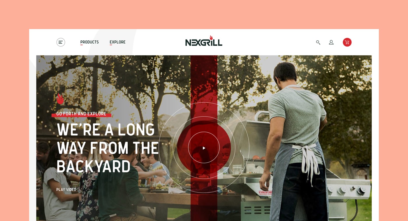
Shopify Partner: Magnetic Creative
Store: Nexgrill
I love the recipes and behind the grill stories. The food visuals are vibrant and enticing and inspire shoppers to have the confidence to try it themselves. Their content keeps me wanting to return to their site and share it with others.
How do you differentiate a single barbecue brand from all the others? That was the challenge facing Magnetic Creative when they set out to build the website for Nexgrill. The Magnetic Creative team turned to copywriting.
“The central idea for Nexgrill.com was that food with a story just tastes better,” said creative director Jeff Horn. “We didn’t want to slap up some features and leave it at that. Everything from the recipes, to the products, to the high production ambassador pieces had to be rooted in story.”
To find that story, copywriter Eric Kroupa and team dug into the stories around grilling and food.
“We discussed how food culture kept on changing, but for some reason, grilling culture was stuck to the same old burgers, dogs, and backyards,” Jeff explained.
“With Nexgrill.com, we still wanted to be inclusive of traditional grilling, but we also wanted to show how diverse and exciting grilling can be; how the stories behind our cookouts may end in the backyard, but they don’t always start there. It all feeds into our ‘Hungry for Different’ tagline.”
It was also important to balance the story with practicality.
“Just as importantly, it was an opportunity to tighten the branded experience between digital and retail touchpoints. We just wanted to create a clean shopping experience for grill enthusiasts. This meant copy that invites participation, differentiates the Nexgrill brand, and doesn’t muddy the path to purchase.”
Joining together to tackle these problems proved to be the secret to Magnetic’s success.
“We learned that the writing, design, and dev teams at Magnetic—when given an opportunity to dream together—are an absolute force.”
Best Ecommerce Course — Drop Ship Lifestyle by Anton Kraly
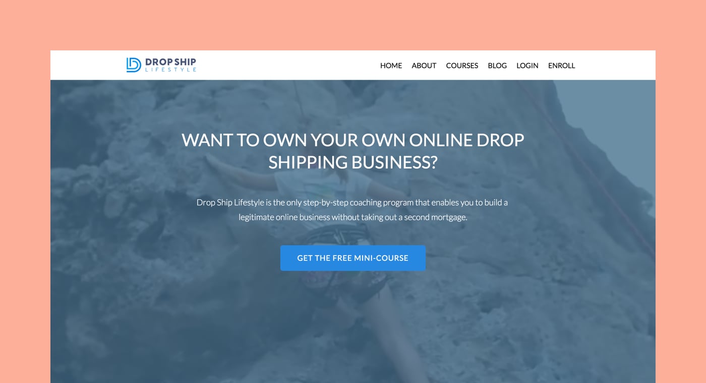
Shopify Partner: Anton Kraly
Course: Drop Ship Lifestyle
The content being divided by skill level and student goals was a big win. Loved that they had supporting blog content and a good amount of authority.
Back in 2012, Anton Kraly sold a group of ecommerce stores. He wanted to connect with other successful ecommerce business owners, and started looking for a forum where he could do so.
“Unfortunately, all I could find was so-called ‘gurus’ selling outdated advice,” Anton said.
Just when he was about to give up, he realized that if he was new to ecommerce and looking for guidance, there was really nowhere to turn. Feeling compelled to help out beginners, he started posting personal advice.
“From day one I received such positive feedback that I knew I had found a new passion. This feedback, and so many private messages requesting coaching, gave me the idea to take my knowledge and package it into an online course. That was the start of Drop Ship Lifestyle.”
Through the Drop Ship Lifestyle course, Anton has been able to create a community of entrepreneurs that know how to get results and support each other through their journey in entrepreneurship. They share lessons along the way.
“With ecommerce, you fail the second you stop learning. Things have changed a lot since I started selling online in 2007, and they continue to change each and every year. If you want long term success in this business, you have to be a lifetime student and never think you know it all.”
Best Offline Marketing Event — Atlanta Shopify Meetup by Nicely Built
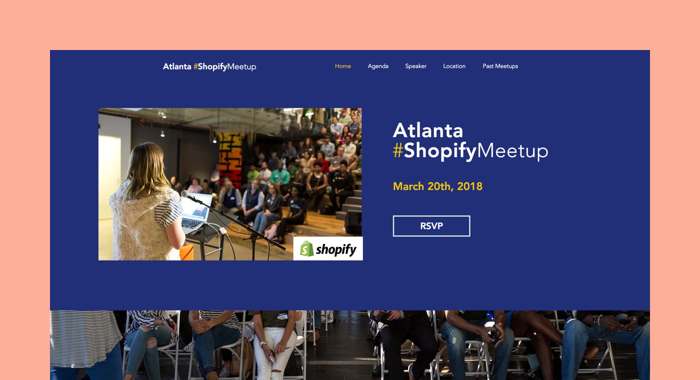
Shopify Partner: Nicely Built
Event: Atlanta Shopify Meetup
It's clear their offline marketing strategy is educational and centered around authentic community building.
For Natasha Murphy of Nicely Built, organizing the Atlanta Shopify Meetup was all about connecting with the local Shopify community.
“We really wanted to bring together everyone in the Atlanta area who was working with or considering working with the Shopify platform. Including other partners was just as important to us as including merchants. We also wanted the event to be fun and Atlanta-centric! We served up Georgia-made beverages and cranked out some of our favorite tunes from the Atlanta-metro area.”
For a non-event planner, putting together the Atlanta meetups was not without its difficulties. Securing space was always a challenge. For every meetup, Natasha pulled out a huge spreadsheet of approximate rental costs, availabilities, and amenities. The experience helped her plan for the future.
“At the end of the day, we’re a web design and development company. It felt like every meetup, we were reinventing the wheel. So instead, for 2018, we selected a single space to host all our meetups. Keeping it simple and easily reproducible makes the most sense.”
Simple, for Natasha, is the key to growth.
“We’re hoping to find an even bigger space for 2019. We have BIG ideas for our Atlanta Shopify community.”
Best Abandoned Cart Recovery Experience — Inked Gaming by Fuel Made
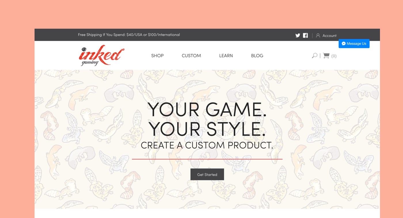
Shopify Partner: Fuel Made
Store: Inked Gaming
This sequence made a real statement. It had a clear deadline, offered incentives, and made clear calls to action. Very well done.
When building an abandoned cart recovery experience for the community of gamers that shop at Inked Gaming, a custom gaming accessories store, the team at Fuel Made had a great idea: make it feel like a game.
“We wanted to build an experience that was informative and helpful, but also friendly and humorous, to play to the customers imagination,” explained Lisa Oberst, email marketing specialist at Fuel Made.
The team turned to the loyal community that Inked Gaming had built for help, collecting submissions of fun creatures drawn by people in the community. Using those creatures, they created visual stories for customers.
“These stories bring our emails to life, captivate the reader, and give us an alibi for being in their inbox.”
The buying process at Inked Gaming isn’t always straightforward. Because all their items are customizable, customers can upload designs and edit them to fit the proportions of the object. Knowing this, the team at Fuel Made decided that the first email in the sequence would need to be helpful and address any problems customers were having.
“Our first email is brief, helpful, and in plain text to increase chances of it landing in the reader’s inbox,” Lisa said.
The second and third emails are where the fun creatures from Inked Gaming’s community come in. Using storytelling helps them capture the customer’s attention, and having visuals from the community itself builds trust with their audience. The final email further builds this trust: it’s from Thomas, the CEO of Inked Gaming.
“This is a very personal and friendly message in which Thomas apologizes for any inconvenience,” Lisa explained. “He adds humor to the mix and extends a discount. It helps establish a stronger connection with readers.”
The Fuel Made team realized that by making two out of four emails heavy on visuals, they built connection and trust with their audience. Having the first and last emails in plain text helped ensure the emails went through to the intended inboxes and made a powerful impact.
“We discovered that good design can help build a story, create a sense of community, and connect with the audience by being entertaining and relevant.”
Congratulations to the winners, and thank you to all the participants! Let us know what you think about all the winners in the comments section below.
