

A logo is critical for defining a brand’s identity, and it’s essential that customers can experience the best brand imagery, no matter what device they’re using.
However, the visual experience of logos can often have issues translating over to smaller screens. When scaling down, there can be unpredictable changes in how elements are positioned, where white space appears, and how the logo image itself resizes; all of which leads to a bad user experience.
By allowing your clients to choose a specific logo for smaller screens, you can mitigate against these layout issues and offer more control over the size and design of their logo images.
The ability to assign a mobile-only logo, that has a different design than the logo used on desktop, is a frequently requested theme customization from clients. Having this feature in your partner toolkit adds value to a project you may be working on, and increases the functionality of your custom themes.
In this article, we’ll look at how Liquid, HTML, and CSS can be leveraged to create options for adding mobile-specific logo images. We’ll also look at best practices for section settings when it comes to translation options, and the importance of customizing a theme based on your client’s requirements.
You might also like: How to Create Your First Shopify Theme Section.
1: Create a regular logo setting
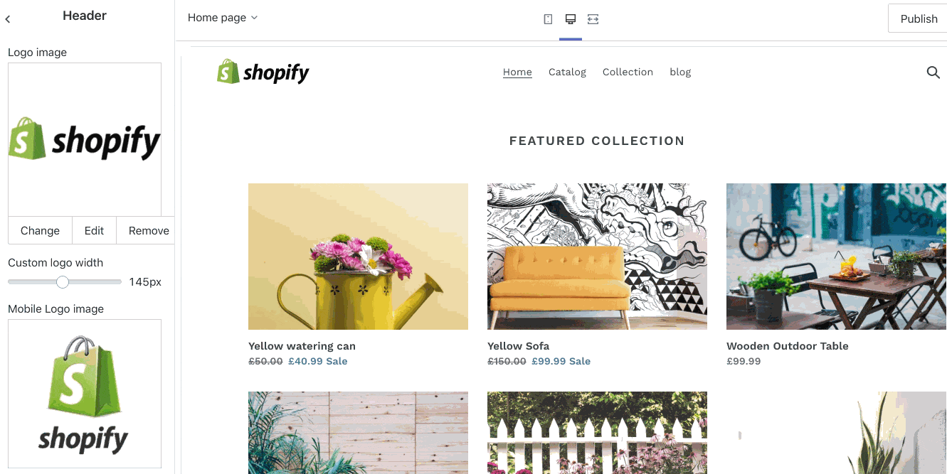
Many themes will already have a logo setting within a header section which allows your clients to select a logo from the theme editor. This will be the case if you’re using the Slate starter theme, or customizing an existing theme.
However, if you’re building a theme from scratch or working on an older theme, it’s possible you may need to add a regular, desktop logo setting to the header section. The easiest way to to see if your theme has an existing logo setting is to check what header settings exist in the theme editor:
You should see something similar to the above, where you can select an image that appears on your header, and can enable resizing on the image.
If your theme doesn’t have this setting, you can add the settings to the header.liquid file within the schema settings, which would appear like this:
Once the section settings are created, you can add the markup and set up the Liquid objects that correspond to the section settings. For this example I’ll be working with the Slate starter theme markup, but the basic process should apply to all themes.
You can find the full header file on the Slate starter theme GitHub repo, but the crucial part of the section is the markup below:
2: Add section settings for mobile logo
Now that you’ve created section settings for a regular logo, or established they already exist, we can create section settings that will take effect when the store is viewed on smaller devices. The first step here is to duplicate the section settings for the logo, and rename the IDs to be mobile related.
The section settings can simply be copied from the section schema and pasted below the original. Once this is done the two settings would appear as:
Now we need to rename the IDs of the duplicate set of settings to be related to mobile. You can simply add mobile_ to the beginning of the IDs. Once this is adjusted, the settings should appear as:
You can also reduce the default size of the mobile logo, since it’s likely that a smaller logo would be preferable on mobile. In this case, I’m changing the mobile max width default to 60 pixels. This could be adjusted by your clients on the theme editor.
The Complete Guide to Web Design Project Management
Read our complete guide to web design project management for developers, designers, and marketers. Learn how to work with stakeholders, manage budgets, and keep your clients happy.
Learn more3: Edit the markup of header.liquid
Now that we’ve created new section settings for the mobile logo, we’ll need to create corresponding HTML elements and Liquid objects. Within the header.liquid file we’ll need to locate where the markup for the logo images are.
This would start with an if statement and should appear something like this:
{% if section.settings.logo %}
<code for outputting logo>
{% endif %}
On the Slate starter theme, this code is:
Similarly with how we duplicated the section settings, we’ll copy this entire if statement and paste it right below the original code. Once there are two instances of logo markup, we can adjust the second by adding the new IDs we created in place of the existing IDs.
In the second instance, wherever we see section.settings.logo, we will replace it with section.settings.mobile_logo, and wherever we see section.settings.logo_max_width, we will replace it with section.settings.mobile_logo_max_width. Once this is set up, this area of the header.liquid should look like this:
The last change we need to make to the header.liquid file is to wrap each instance of the logo markup in containers with IDs that reference either desktop or mobile. The original markup should be assigned <div ID=”desktop”>, while the second should be <div ID=”mobile”>
Once this is set up, it will look like this:
4: Add CSS to hide logos
At this point, if we navigated to the theme editor, we would find two different image pickers that display two logos on the header. The final step here is to hide logos depending on the screen size, using CSS.
Using the @media rule, we can execute specific CSS properties only when a certain condition is true. In our case we can create a condition where the mobile logo is hidden on large screens and the desktop logo is hidden on smaller screens.
Using this, we can set up two @media rules with the display:none property. The first will hide elements with an ID of mobile when the width of the screen is 701 pixels or above. The second will hide elements with an ID of desktop when the width of the screen is 700 pixels or below.
Once this is added to our stylesheet, it would appear like this:
Now, when we navigate to the theme editor, and select different logos for desktop and mobile, we’ll see the logos switch as the screen becomes smaller and larger.
5: Customize your settings
Now that you have the basic functionality up and running, you can adjust the styles of the logo or adjust the width settings, so they fit in with the rest of the page.
One important aspect to consider is which language translations you should apply to the section labels. This might be too critical if this is a bespoke theme that only one client will use, but if you’re planning on providing this to a range of different merchants, having internationalized setting labels could be a big advantage.
You can simply create an array of the logo’s label setting and include the different translations that would be relevant:
You can learn more about internationalizing themes from our theme development help docs.
By being aware of your client’s requirements, you can customize the settings so that your theme provides the most intuitive and user friendly experience.
You might also like: How to Improve Conversions with Dynamic Checkout Buttons.
Scaling down
This is just one example where the user experience can be improved when viewed on smaller devices. Being mindful of how different elements appear when scaled down, and implementing strategies to mitigate against design problems, can make a big difference to the overall success of a store. Hopefully with the help of this article, you’ll be able to add value to your client work and identify areas where design can be improved.
Grow your business with the Shopify Partner Program
Whether you offer marketing, customization, or web design and development services, the Shopify Partner Program will set you up for success. Join for free and access revenue share opportunities, tools to grow your business, and a passionate commerce community.
Sign up