

Here at Shopify, we've recently been testing different UX patterns to enhance the popular slideshow section in Shopify-built themes, without compromising what’s unique about their design—no matter if they have a fixed width, extend to the full browser window, or fill the entire viewport. Informed by user testing and support analysis, our updates aim to comply with what’s generally considered today as UX best practices, as well as higher accessibility standards. Along the way, we’ve learned some interesting things.
Having addressed our own support debt through research and design exploration, it seemed only natural to share our insights with our partners. In this article, we share the context of what inspired us to take the approach we did with slideshows. Feel free to have a look under the hood of our themes to replicate the same tactics we came to implement, or try something completely different.
But first, let's address an observed merchant pain point with slideshows: image cropping.
Grow your business with the Shopify Partner Program
Whether you offer marketing, customization, or web design and development services, the Shopify Partner Program will set you up for success. Join for free and access revenue share opportunities, tools to grow your business, and a passionate commerce community.
Sign upThe problem of image cropping
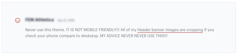
A common theme customization request from merchants is to ensure images don't appear cut off on slideshow sections. It's very difficult for merchants to deal with both mobile and desktop image ratios when they're drastically different.
A quick look at the nicely crafted demo shops in the Shopify Theme Store demonstrates that such design can be successful in many cases. Yet a majority of merchants expect more from their theme and simply have a hard time finding images that are optimized for both contexts.
Although not exclusive to the slideshow section, this frustration amplifies when merchants have invested time and money in photoshoots which they can’t easily leverage in the prime estate of their homepage. This is especially problematic with (but not limited to) full screen slideshows.
Many themes in the theme store enable merchants to upload multiple image versions, each optimized for desktop, mobile, and sometimes even tablet. This strategy is valid, but has the downside of an extra time spent with external image editing tools and a multiplication of files to manage afterwards. It’s also not uncommon to find separate settings for desktop and mobile heights.
You might also like: 5 Ways to Improve Store Loading Times with Minification.
A new solution
We’re making the bet that another approach, relying on a single image upload, can work too, and we tackled the problem from a different angle, or rather two angles:layout options and image position settings. Below, we dive into how both these solutions work.
1. Layout options
A challenge inherent to slideshows is that slides may contain images with different ratios. When this is the case, providing solutions to completely avoid cropping comes with trade-offs.
Adapting the section’s height per slide is not something we recommend. We tested different variations of a slideshow that dynamically adapted its height to one image regardless of the screen size, combined with further image display options to optimize the remaining images. But it quickly became obvious that slideshow settings can get complex and overwhelming to merchants, and the notion of image ratio itself is already a pretty confusing concept to begin with.
We gathered feedback on different interfaces, and featured different labels in attempt to avoid confusing jargon (adapt to image height, adapt to tallest image, dynamic height, fill slide, fit to slide, landscape and portrait ratios, tall and short images, and on and on). The mental model was often too complex and the live preview in the theme editor didn’t help merchants understand.
In the end, the solution we settled on doesn’t prevent image cropping in every possible use case, but is the result of an intensive battle between usability and the level of control given to merchants.
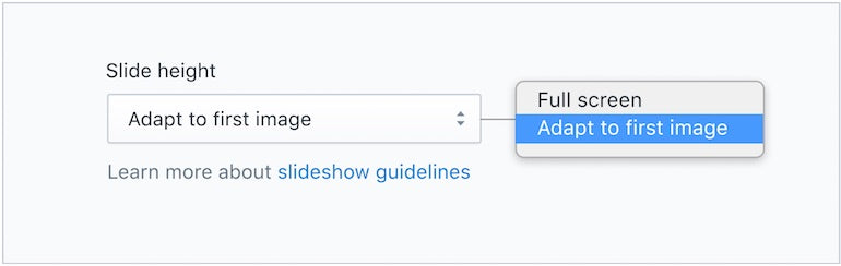
This feature is a slide height setting called adapt to first image.
Along with our theme updates, we released a corresponding theme help doc that puts a special emphasis on image cropping notions to reduce confusion behind the new feature.
There are a number of benefits to the adapt to first imageapproach:
- It doesn't require overriding the existing layout. The adapt to first image feature can be added as an extra alternate layout.
- The setting is relatively self-explanatory and easy to understand.
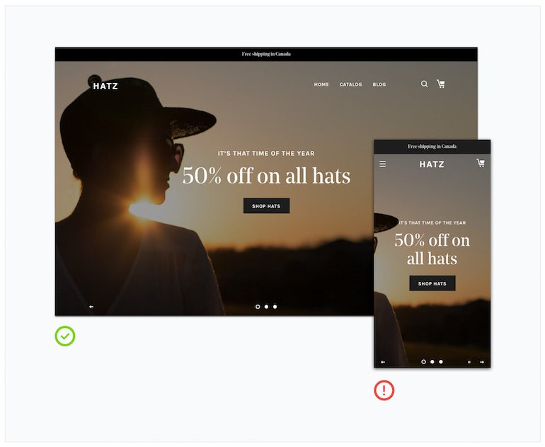
- It prevents image cropping on the first slide, on both desktop and mobile (unless it exceeds a maximum or minimum height).
- It makes it possible to avoid cropping altogether by using the same image ratio on all slides.
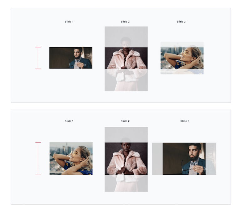
- Reordering slides enables merchants to test different scenarios when different image ratios are involved (as per the example below).
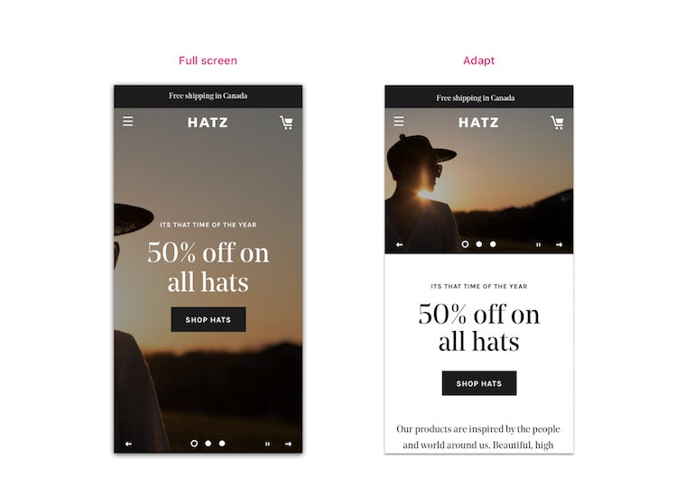
Of course, this feature update implies some design changes too. The changes are often more apparent on mobile.
Because the section height can be considerably reduced when thin landscape images are used, we sometimes moved otherwise overlaid content below the image. This also ensures most of the image won’t be hidden behind headings and buttons, and aligns with the initial problem of attempting to uncover the entire image.
In cases where the text length varies from one slide to another, the rest of the page below may shift when slides are changing. As long as it stops shifting when the user scrolls down (if auto-rotate is enabled), I would argue that the UX trade-off is reasonable. Let’s not forget this trade-off is still optional too, since we retained the original layouts as options.
You might also like: A Beginner's Guide to Sass with Shopify — Part 1: Getting Started With Sass.
2. Image position settings
Reducing the occurrence of image cropping with an alternate layout is great, but we can go a bit further to support merchants when cropping does occur. A new image position feature allows the focal point of images to stay in a relative ‘safe zone’, and the setting applies regardless of the slideshow height option (adaptive or not). Making sure to include this in our theme settings can make a big difference for merchants.

We first shipped this update to Debut and our support team noticed a significant decrease in tickets regarding slideshow issues. Our other Shopify-built themes have since been updated too, successfully stress testing the UX pattern in different contexts.
Slideshow best practices
In addition to addressing the image cutoff issue detailed above, a theme should provide sufficient options to customize its slideshow. Not being able to change the text alignment, for instance, can make certain images unusable. Because a lot of images have their focal point in the center, I believe themes with alternatives to centered text and buttons have an advantage.
It is not uncommon for me to encounter Shopify stores with text and buttons baked-in into slide images, perhaps as a workaround from lacking such features. This worsens the cropping problem, in addition to encouraging bad practices. We’re hoping to provide merchants with a cohesive experience for storefront customization, and to allow them to build usable and engaging shopping experiences for their customers.
Here is a list of recommendations to keep in mind when building out or updating slideshows. Nothing below should be too surprising, and the slideshow section in the theme you built might not even require any design update.
Recommendations:
- If auto-rotate is supported, allow it to be disabled in theme settings
- Avoid enabling auto-rotate by default
- Allow auto-rotation to be paused/resumed by the users
- Pause rotation on hover, and resume on mouse out
- Provide theme settings to increase the contrast when text is overlaid on images
- Provide different section height options
- Provide image position settings for smarter cropping
- Provide text alignment options
- Display slideshow controls (wayfinder and arrows)
- Support keyboard navigation
- Avoid video content in slideshows (poor UX and a11y when combined with auto-rotate)
- Avoid overcrowding small mobile images with overlaid content
You might also like: How to Add a Social Media Marketing Icon to Your Theme.
Make slideshows easier for merchants
This article deliberately refrains from covering other phenomenons associated with slideshows, such the low conversion rate caused by the banner blindness effect, because that’s a whole other topic. At the very least, UX best practices should be considered and balanced in order for this widely used section to not diminish by default the quality of our merchants’ stores.
By using the best practices and implementing the solutions above, you’ll help merchants by building highly customizable, usable slideshow features.
What are your best practices for working with slideshows? Share your thoughts in the comments below.
