

Good product design is intuitive—it does not require any explanation and a complete novice user should be able to master the product based on instinct alone. Products that have a familiar design are easier to use because users can rely on their previous experience when they interact with these products. Designers use a technique called skeuomorphism to make interfaces intuitive to users.
In this article, we’ll look at what skeuomorphic design really is and whether it’s still relevant in modern design.
Grow your business with the Shopify Partner Program
Whether you offer marketing, customization, or web design and development services, the Shopify Partner Program will set you up for success. Join for free and access revenue share opportunities, tools to grow your business, and a passionate commerce community.
Sign upWhat is skeuomorphism?
A skeuomorphism is an imitation of an object intended to represent the original. The term skeuomorph is compounded from the Greek words skeuos (meaning "container or tool"), and morphḗ (meaning "shape"). Originally, this term was used in the context of material transitions. When Ancient Greeks transitioned from wood to masonry construction, they recreated some of the functional features of the early wooden temples in stone.
"A skeuomorphism is an imitation of an object intended to represent the original."

Skeuomorphism exists in the design of physical objects around us. You can notice it in furniture, tableware, jewelry, and many other physical objects.

Automotive design has historically been full of physical skeuomorphism. The fact that we still use the term ‘horsepower’ as a unit of measurement for the power of automobiles is an homage to what came before the car: horse carriages.
In this sense, skeuomorphism helped people transition from horses to automobiles. In 1899, Uriah Smith introduced the concept of Horsey Horseless, which is basically a life-size replica of a horse head, down to the shoulders, attached to the front of a carriage. When the concept of the car was first introduced, the vehicles were daunting for many people, and this design decision helped to make it less terrifying.

Skeuomorphism in graphical and visual design
Skeuomorphism is used in a graphical user interface design to create objects that mimic their real-world precedents. From a psychological perspective, creating skeuomorphic objects in digital interfaces makes a lot of sense. This technique helps designers create visual affordances—visual cues that give users hints on how they can interact with certain objects.

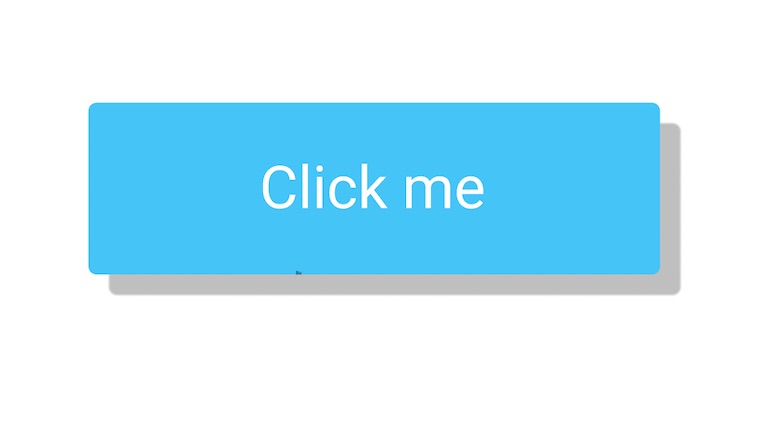
When it comes to visual design, designers create skeuomorphic objects using shadows, excessive gradients, and reflections. These visual design attributes help to create the illusion of depth, and this helps users understand the purpose of individual objects at a glance. In the most basic terms, elements that appear raised look like they could be pressed down (i.e. buttons), while elements that appear sunken look like they could be filled in (i.e. input fields).
The history of skeuomorphism in digital design
In software design, skeuomorphism started to get traction in the 80s during the dawn of personal computing. The rise of personal computers was one of the most significant technological transitions our civilization has ever encountered. At that time, a computer was a new concept for almost everyone. Interactions with computers are mostly learned, and big companies like Apple tried to minimize the effort required to learn how to use it.
You might also like: The 10 Best Product Design Books.
Skeuomorphism allowed people to easily transition to using personal computers because elements on the screens looked familiar to them. Take a trash can as an example. The trash can icon is perhaps the most famous skeuomorphic object from that era that is still around today. The idea of this object is pretty straightforward—in real life, when we put something in the trash can, we basically delete it. Users can drag stuff they don’t want on their computers into an actual bin.
"Skeuomorphism allowed people to easily transition to using personal computers because elements on the screens looked familiar to them."

When the usage of mobile devices began to rise, the digital world again relied on skeuomorphism to educate users on how to interact with these new devices. The original iPhone was the first buttonless phone that hit the market—the phone didn’t have any sort of tactile buttons—and it was critical to make the interface intuitive to people who had never used a mobile phone with a touch screen before. If you check the first versions of iOS, you will notice that many UI elements have a skeuomorphic design.

Digital watches represent the latest attempt to use skeuomorphism in digital design. Once again, skeuomorphism helps users interact with new types of devices by allowing them to use their prior experience. For example, people are used to glancing at watches to see the time. Digital watches successfully mimic this interaction by showing a clock face, so that users have a familiar experience.

Skeuomorphism vs. neomorphism
Neomorphism (or neo-skeuomorphism) is one of the latest trends in graphic design. This visual style uses design elements and textures that mimic the physical world. David Ofiare summarized the key visual characteristics of neomorphism:
- Colors with low chroma and observable close to whites
- Shapes that allow for the creation of repetitive forms
- Very mild and subtle effects
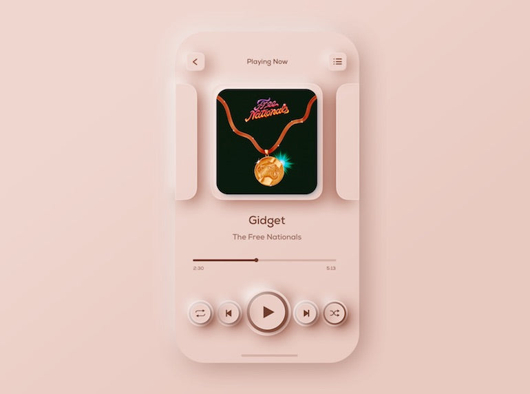
Neomorphism has one key difference from skeuomorphism: designers who apply neomorphism mimic the physical world for purely aesthetic purposes. While neomorphism makes interfaces look fresh and trendy, this visual style does not have much impact on the usability of a product. In fact, it can have a negative effect on accessibility because it can be hard to find a proper contrast ratio for textual content and iconography.
Similar to skeuomorphism, neomorphism makes it difficult to scale a design. So if you want to follow this visual style, you need to consider whether or not you want to scale your design across multiple platforms.
The downsides of skeuomorphism
Despite having significant advantages, skeuomorphism is often criticized for its overuse of purely decorative elements. By its nature, skeuomorphism relies on decorative visual styles, and these styles introduce visual noise and make interfaces look heavy. This noise creates a distraction and takes user focus away from the content and functionality of a product.
Another problem is that not all objects from the physical world can (and should) be transferred to the digital world. For example, a wooden shelf which can be found in Apple Books (Apple iOS 6) looks absolutely unnecessary in this digital app.

Last but not least, skeuomorphism makes it difficult to scale a design because it is built on specific proportions and ratios. Product teams often try to release a product on various platforms (i.e. mobile phones, desktop computers, TV), and the fact that they need to adapt their design for each platform introduces extra effort and increases the time required to prepare layouts.
The fall of skeuomorphism and the rise of flat design
In 2006, Microsoft released its first product (Microsoft Zune) that was built with a new visual language called Microsoft Metro. Microsoft Metro was the opposite of skeuomorphism—it took inspiration from the Swiss school of design (including minimalism, attention to typography, and the strong desire to remove all unnecessary decorative elements) and stayed purely utilitarian. Metro was one of the first instances of flat design. This language was used in many Microsoft products, including Windows 8.

Microsoft started a trend of moving away from skeuomorphism to purely digital design. Flat design came in the world of digital design in response to the overuse of skeuomorphism.
It was seen as a way to create a visual language that better fits the digital medium as it does not try to reproduce the appearance of the physical world, but still provides all of the functionality.
Some designers think that flat design was a revolution in the design world, but the move to a flat design represents how design evolves. When people became familiar with certain interactions with their devices, designers were then able to simply trim all unnecessary visual attributes.
You might also like: Redesigning the Design Process: How to Work More Efficiently This Year.
However, when flat design started to gain traction, some designers went too far and made interfaces completely flat. True flat interfaces don’t have any 3D visual effects in the graphic elements on a page or screen. As Kate Moran mentions in her article, Flat Design: Its Origins, Its Problems, and Why Flat 2.0 Is Better for Users, true flat design created a lot of problems for users. When designers reduce all visual details to the absolute minimum, they also remove essential visual cues that help users to understand how to interact with the UI. The most common problem of true flat design is the lack of signifiers on interactive elements, and this problem has a significant negative impact on the usability of a product. When users cannot tell what objects are interactive and what objects are not, they have a bad user experience.
"When users cannot tell what objects are interactive and what objects are not, they have a bad user experience."
In an attempt to solve this problem, designers introduced a refined concept of flat design—almost flat or flat 2.0. Google’s Material Design language is an excellent example of Flat 2.0. Material Design is a more balanced interpretation of flat design in which designers have adopted some elements of skeuomorphic design, such as lighting and subtle shadows. Subtle shadows create some depth in the UI and improve the discoverability of interactive elements.

Is skeuomorphism not used anymore?
Skeuomorphism still exists in the small details within digital products we interact with daily. If you look at the screen of any modern smartphone, you will notice an icon of a classic telephone receiver that is used to launch a phone app. You can also notice a paper envelope icon that is used to launch email apps. Both the classic telephone receiver and paper envelope are analog elements that do not have much connection to the digital world. Yet, designers use them to make the interface familiar for people because users have learned the meaning of these icons.
Don Norman described this phenomenon as cultural constraints— interactions with a product that are learned only through culture. Decisions that the first generation of designers made had an impact on all later generations of designers and users. In other words, while designers can use any other icons for phone and email apps, when they do so, they will make it harder for users to decode the meaning of the icons.
You might also like: Data Visualization: Interpreting Uncertainty in Product Design.
Skeuomorphism was one of the most important design techniques for interface designers. It was particularly helpful during the three waves of the digital world’s evolution—during the rise of personal computers in the 80s, the mobile revolution of 2010s, and the rise of smart watches in 201x. It helped product creators minimize the effort required to learn how to use products. Elements of skeuomorphism still exist in the products we use today. Flat 2.0, which is the de-facto standard for product designers, uses some aspects of skeuomorphic design such as shadows and elevations.
As with any new design trend, it’s essential to evaluate it in accordance with the needs of your users. If your design team wants to transition to a neo-skeuomorphism aesthetic, you should always take your users' needs into account. Never sacrifice user experience for the sake of trendy aesthetics, and every time you want to introduce a new visual style, always ensure it works for your users.
Have you thought about skeuomorphism when designing your own products? Let us know in the comments below.
