

Five years ago, the Shopify App Store featured 100 apps, was operated by a team of three (including an intern), and personalized phone calls were the method of choice for vetting app submissions.
In other words, we’ve come a long way.
We’ve already discussed the features of the new Shopify App Store, including better recommendations, new sub-categories, and improved app listing pages. What we’ve not yet covered is the story of how it all came to be.
We spoke with several people from the Shopify Apps Team on how they tackled the app store revamp: what problems they sought to solve, how they uncovered solutions, and ultimately what drove the project forward.
Read on to get the full story.
Check out the new Shopify App Store
Visit the new Shopify App Store, and see how it can get your app in front of the right merchants.
Visit the app storeA short history
Launched in 2009, the first iteration of the Shopify App Store had less than a dozen apps, many of which ended in “-ify” to match Shopify’s name.

App & Partner Platform Director Atlee Clark explains that the original push to build an app store not only came from Shopify’s leadership at the time, but also from an organic pattern happening on the open platform.
“From the beginning, Tobi (Lütke), Harley (Finkelstein), and the architects of Shopify really believed that a merchant owns their own store and should be able to do whatever they want with it. That's why we always had an open platform and an open API,” Atlee explains.
Partners—or the designers, developers, and agencies that would soon form the foundations of the Shopify Partner Program—were already helping Shopify merchants in a variety of ways, including using Shopify APIs to modify their stores. At times, they made the same modifications repeatedly for different clients looking to solve the same problem.
“Those developers were actually the ones who came to us and said, ‘I'm doing the same thing over and over again. Is there a way I can build this once and sell it to people?’” Atlee recounts. “Luckily, the team had already been thinking about that—partners saw an opportunity, Shopify saw an opportunity, and merchants loved it.”
Three years later, Atlee joined the team with the goal of accelerating the growth of the app ecosystem. The app store’s app count hovered around 100 back then, and while that was a strong marketplace any company would be pleased with, the team wanted to figure out how to improve and grow.
“We had identified that partners could help us accelerate merchant growth, and were increasingly becoming helpful and important to our merchants. So we knew that we needed to find ways to make that opportunity bigger and to commit to those partners in a more meaningful way,” she says.
In those early days, Atlee focused largely on how to evolve the app ecosystem; from developers building tools, to a linked ecosystem of services and software where developers could easily connect into Shopify and make merchant workflows simpler.
Her work in those early days did lead her to consider refreshing the app store in 2013.
“The app store was always something that everyone knew was meeting merchant needs, but that could be better,” she explains. “But it was all about timing. If we had done it then, it would have simply been a fresh coat of paint, because we were still trying to figure out what the app store could be for merchants.”
So, Atlee waited for the right time to do right by merchants and partners.
Build apps for Shopify merchants
Whether you want to build apps for the Shopify App Store, offer private app development services, or are looking for ways to grow your user base, the Shopify Partner Program will set you up for success. Join for free and access educational resources, developer preview environments, and recurring revenue share opportunities.
Sign upThe catalyst for change
Merchants don’t just need more software—it’s a bigger story, it’s that commerce itself is becoming more complex.
From 100 apps in 2013 to over 2,000 apps today, the Shopify App Store and its corresponding ecosystem of developers has become critical to solving the increasingly complex problems of Shopify merchants. The marketplace has become so popular over the years, that in 2017 it was one of the top five most frequently-viewed pages in all of Shopify, including the merchant admin.

In fact, on stage at this year’s Unite conference, General Manager of App & Partner Platform Brandon Chu shared that in the previous 12 months, Shopify merchants had used more apps than in the entire history of Shopify.
“That was a wake-up call for us,” Brandon recalls. “There are very, very few merchants that are using Shopify and aren’t using a lot of apps.”
Brandon was one of the major drivers behind getting the app store revamp project approved. He explains that it was not only the app store's popularity with merchants that was the catalyst for change—issues of scale were becoming more apparent, and were causing problems for both merchants and developers.

“It was very clearly an experience that was designed well, but in a different era of web products,” he says. “It was built for a time when there was a couple hundred apps, and now we’ve gone 10 times past that, and not only that, but at an accelerated rate.”
The user experience of the app store was limiting how discoverable apps were. This not only limited the opportunity for new developers joining the platform—because the experience wasn’t as personalized or sophisticated as needed (considering the number and size of Shopify merchants, as well as their vastly different needs)—but merchants couldn’t discover all the relevant tools and integrations.
It just simply wasn't designed for the diversity of merchants that we have today to be able to find the diversity of apps that now exist.
“It just simply wasn't designed for the diversity of merchants that we have today to be able to find the diversity of apps that now exist,” Brandon says. “I think we've seen a lot of apps that have historically made traction and continue to gain a lot of traction, but that makes it more difficult for newer apps to get discovered. It also makes it difficult for merchants to not only find apps that are new in an existing category, but to find brand-new categories and types of apps that they've never even thought of before. A lot of those are hard problems that you can't really solve by curating more apps.”
Because the Shopify App Store wasn’t designed to scale into this new world of commerce, the team tackling its revamp needed to pause and think deeply about the needs of merchants and developers, and how the app store would reflect those new and increasingly complex challenges.
“That was the basic principle of it all,” Brandon recalls.
And so in 2017, the team started work to reimagine a new app store.
You might also like: Introducing the New Shopify App Store.
The project
Jonathan Zhao says he’s always been an entrepreneur at heart. The Senior Product Manager for the Shopify App Store explains that before his days at Shopify, he tried his hand at affiliate marketing, ran an ecommerce business, and was one of the earliest dropshippers of hoverboards.
When I took on this project, I wanted to make sure that we never lost sight of the fact that there are real people behind these apps.
“Even now I still run some side businesses, so I feel a lot of empathy towards app developers,” he says. “Very often they depend on their app business—it’s their livelihood. When I took on this project, I wanted to make sure that we never lost sight of the fact that there are real people behind these apps. They have families, some people have mortgaged their houses to build these apps. It's a lot of responsibility and I take it very seriously.”

While there are a number of exciting new features and updates to the app store, it’s hard to get Jonathan to start anywhere but with the groundwork of it all: app taxonomy—or the way apps are classified and organized within the app store.
“That's the foundation of the app store,” he explains. “This matters a lot because no developer wants to be classified as a generic app or tool. How we perceive these apps, the actual metadata, I had to make sure that was right first.”
Categories
Previously, there were 11 categories in the app store. Merchants searching in those categories were shown all tagged apps, with little ability to filter or refine. And some categories, like ‘Marketing’, had hundreds of apps listed under it and could run 20 pages deep—leading to a tedious and time consuming process for merchants searching for the right tool.
With such broad app categorization, it follows that the fifth most asked question of Shopify gurus was for app suggestions.

“We had a lot of data coming from support that demonstrated merchants were looking for recommendations, but very specific recommendations for very specific problems,” Jonathan explains.
The categories that once worked for an app store of a few hundred weren’t granular enough to be useful in the current ecosystem. Beyond sheer volume, the high-level categories were also failing to translate for merchants.
They were such high-level categories that it didn't teach merchants or developers how to think about the capabilities of the app in respect to how commerce works.
“They were such high-level categories that it didn't teach merchants or developers how to think about the capabilities of the app in respect to how commerce works,” Brandon muses.
For example, a merchant looking for a marketing app could actually be looking for any number of tools: an app to create a pop-up banner, a way to increase organic traffic, or a tool that helps them buy ads. How do you match what a merchant is looking for to how these categories are actually expressed?
Jonathan’s team started by looking at several sources of data, including support interactions and how app developers described their own apps: what words, phrases, and patterns were popping up across app listings?

With the help of a taxonomist, the team re-classified and remodeled every single app in the app store to get a better understanding of their features and the problems each app solves for merchants. They updated top level categories, added new categories, and created over 80 new sub categories.
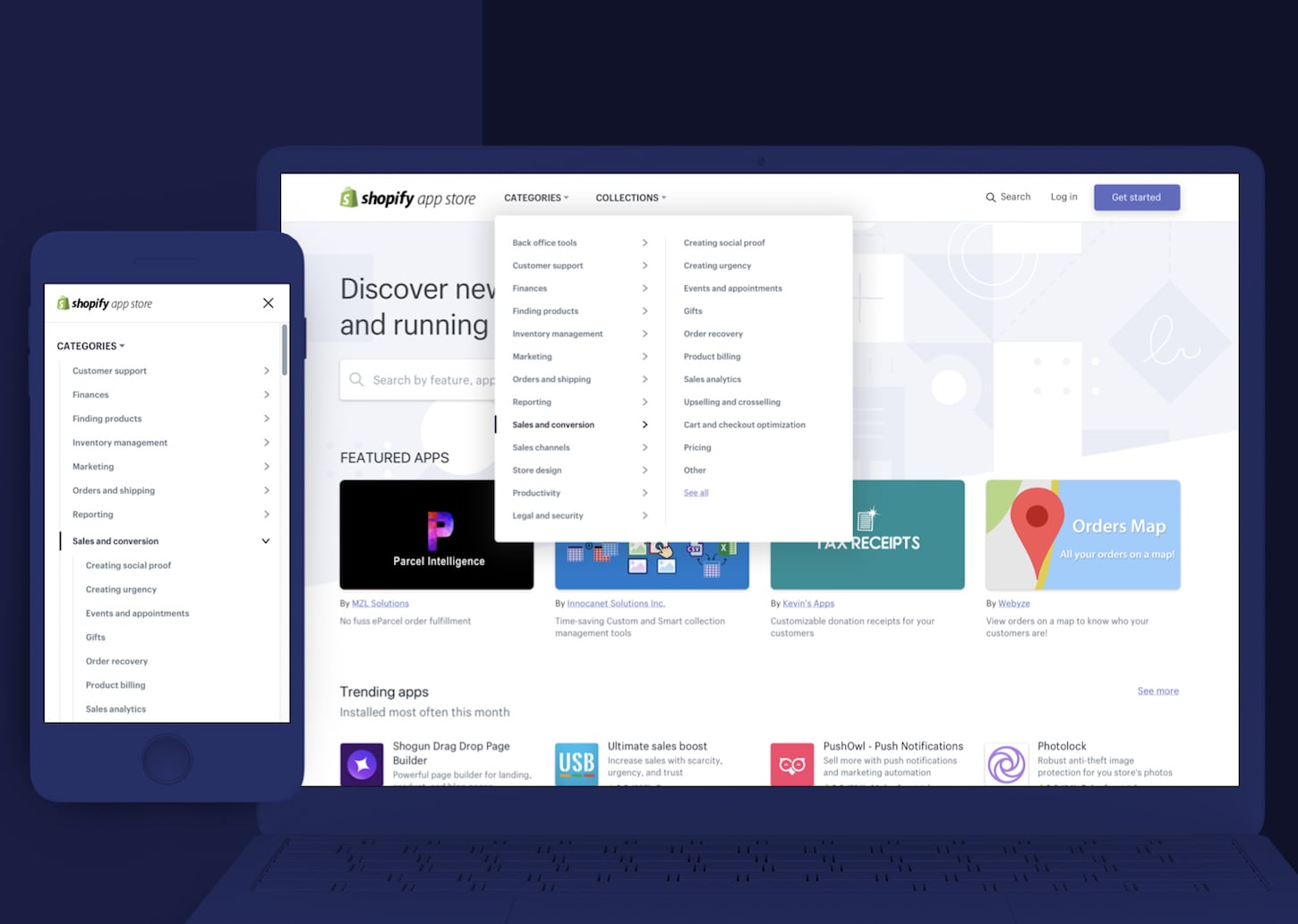
The team also addressed the issue of tagging for multiple categories. In the old app store, apps could only appear in one category, forcing partners to create two different app listing pages if their app was relevant to both the marketing and customer support category, for example.
Because the app store’s data structure is now more robust, apps can be tagged in multiple categories, enabling better visibility.
“All of these aspects were missing. And without this level of data, we cannot help match the right apps to the right merchants,” Jonathan explains. “This foundation was actually very critical for better search and better recommendations.”
Search
In 2017, there were 5 million searches on the app store, meaning merchants rely heavily on search to find what they need. And as Jonathan explains, the search functionality of the app store wasn’t keeping pace with that volume.
“Search was actually very basic and lacking in many ways."
Improvements were made to the search algorithm in 2017, but to accomplish everything the team wanted, it quickly became evident that tackling the structure of app listing pages was a necessary first step.
“Basically, you can look at the problem in two ways,” Jonathan explains. “First is the listing’s relevance to the search terms. In other words, how relevant is the data in the listing to what the user is searching for. The second concerns the quality of the app, meaning reviews, ratings, etc. Previously, listings weren’t really structured and there wasn’t much guidance on how developers could optimize them.”
While the team tackled the herculean task of improving the app listing pages (discussed in further detail below), they also started diving into the user experience of the app store’s search functionality.
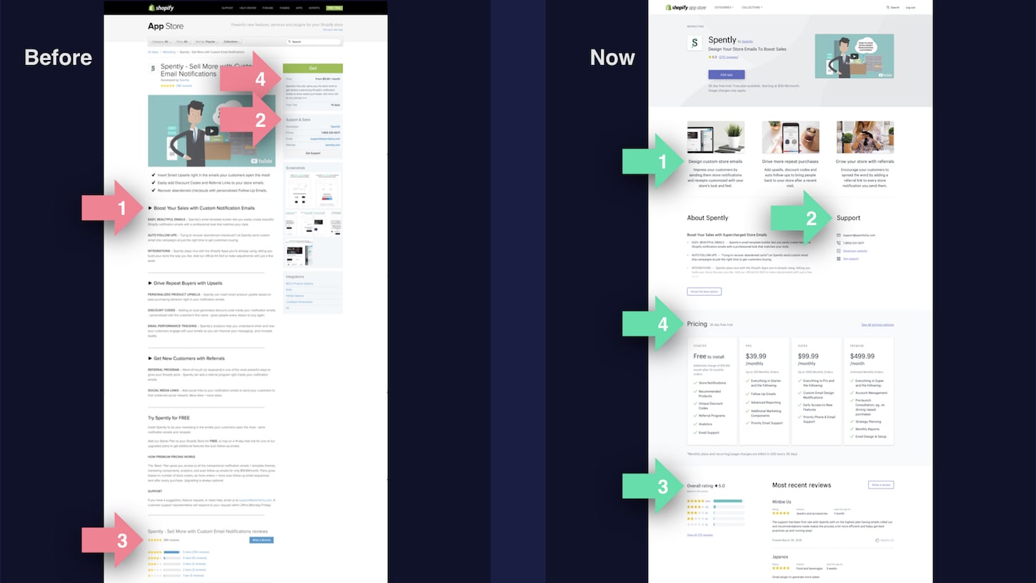
A large number of app listing page visits originate from the app store's search—a piece of data that did not go unnoticed by Senior Product Designer David Stubbs.
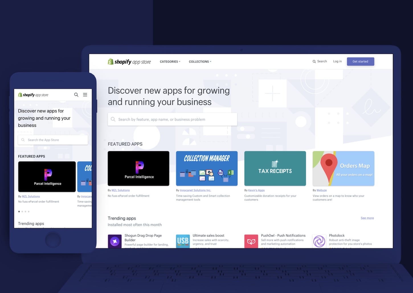
“That drove a lot of the visual design,” he explains. “In the new app store, search is significantly more prominent, and the featured apps banner is less so. It’s a stark contrast to what it was, where search was a little box at the top right, but featured apps were very prominent.”

“We wanted to put a lot more emphasis on search because we’re putting so much work into being more intelligent about serving merchants the right app at the right time.”
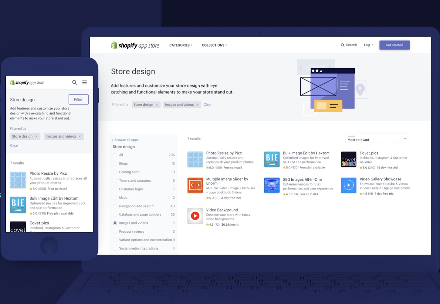
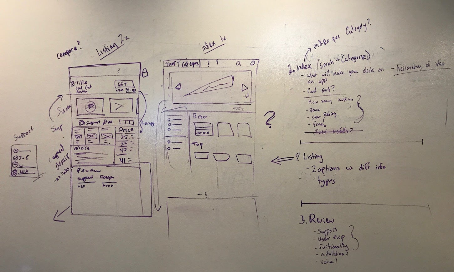
App store listing pages
At Unite 2018, Quality Assurance Lead Oren Harris and App Store FED Lead Erin Marchak discussed what guided the decisions around the app listing page improvements.
“We didn’t want to start any work on [the app store] without having real data to back up our assumptions, because we all have that gut feeling that we think we know what’s best, but having data to back that up can challenge our perspectives,” Erin explained on stage.
To collect that data, the team reached out to existing merchants and asked them how they found the right app for their needs. They used the results to develop a model for how merchants find and choose apps, which consisted of three key stages: search, evaluate, and install.
While all three stages touch the app store, the team took special interest in evaluate: when merchants compare listings side-by-side. Digging further, the team uncovered that one of the largest merchant pain points during this decision making process was the user experience.
“We knew that the listing was a huge opportunity for us to improve a merchant’s experience, because the evaluation stage of their decision making process happens entirely on the listing,” Erin explains.
According to research, when evaluating apps, merchants want to understand an app’s functionality, identify how support works, read reviews, and understand the price. But there were challenges in how the old app store’s listing pages shared this information:
- It was difficult to determine functionality because the descriptions were unstructured, making it hard for merchants to truly compare apps
- Support details weren’t easy to understand and were often buried under other information
- Reviews weren’t trusted because they could link to inactive stores and the order of appearance could be manipulated
- Pricing was confusing and inconsistent, especially if the app had complex features or multiple plans
According to Senior Product Designer David, there was a lot of work that went into correcting user experience pain points. The entire app store team invested in an intense series of sprints at the start of 2017 in an effort to find alignment on the toughest user experience challenges.

“We all were in agreement from the beginning that it was too hard for merchants to parse through all this data and that there were too many details,” David recalls. “We needed to give merchants everything in a structured, simple way so that they could scan the information they needed to convert.”
According to David, reimagining the app listing pages was a large investment, but was the biggest opportunity to make the highest impact. His team started by reviewing a hundred app descriptions in an effort to see patterns in content types and to understand what was essential.
“We made a checklist for everything that was in the description that could possibly be somewhere else,” David recalls. “We went through all of these classic features and descriptions, and started defining what appeared to be highly needed and what was always being put into the description.”
The team also looked at what could be removed from the app description and put elsewhere in the listing with the help of optional information fields and linking opportunities.
The goal was to make app descriptions more scannable while not taking away any valuable information, like FAQs or demos.
“There were all of these things that made it harder for the merchant to understand what exactly the app was,” David explains. “But it was also hard for developers. We didn't provide them with the opportunities to describe additional information or resources anywhere else, so of course they're going to jam it all into the app description.”
What was once an open ended form was starting to take a structured shape. But diving into what the description should include only scratched the surface. In collaboration with content strategists, UX designers, researchers, front end developers, and product designers, the team carefully considered everything that could and should be featured on the app listing page.
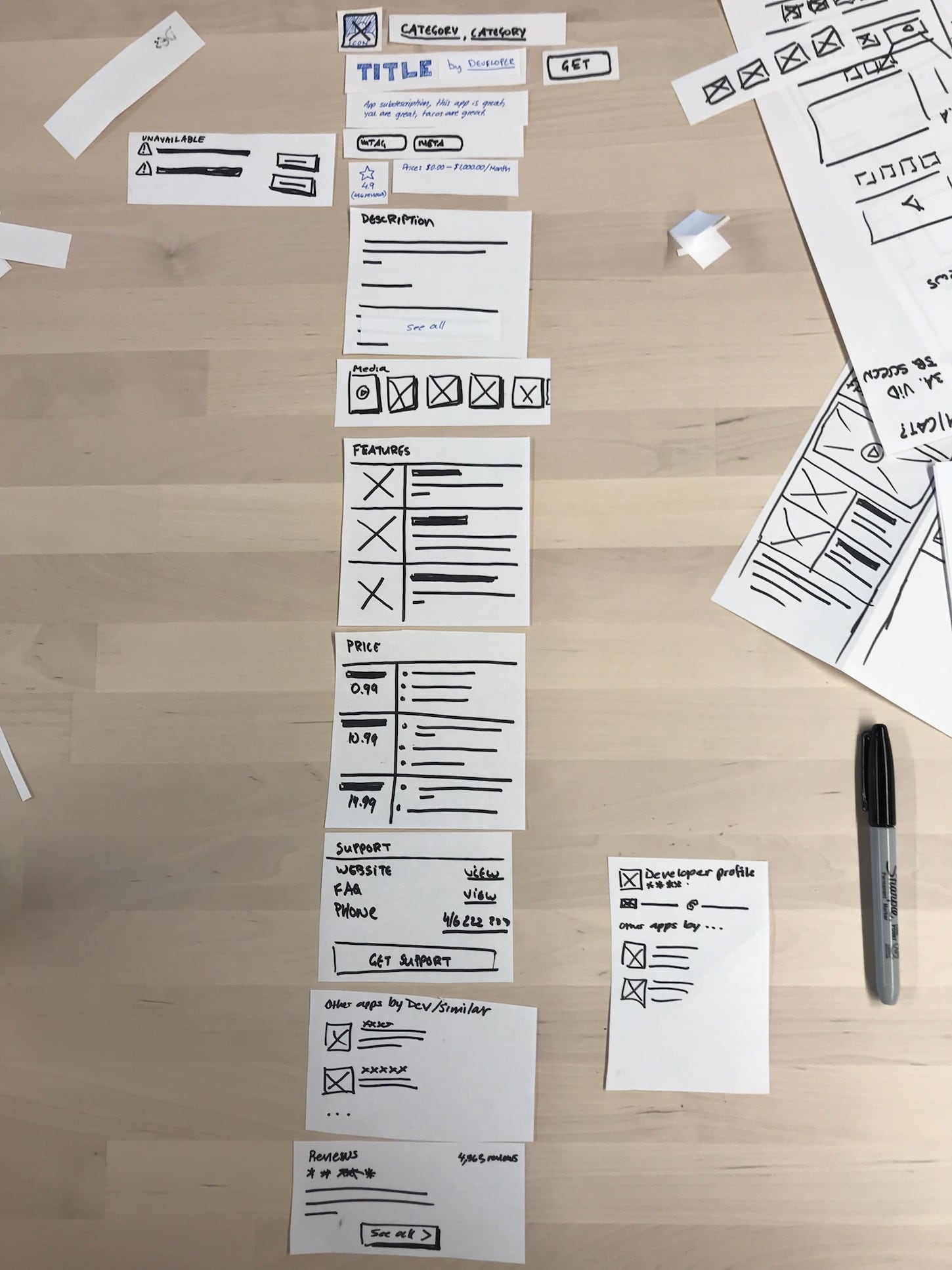
“It came down to the particulars of each individual field,” David recalls. “We would meet and go through each field individually.”
Questions about not only what could be included but how long fields could be were raised: the length of a standard phrase, the number of characters in a tweet, and what could fit into quick search in Shopify’s merchant admin were all considered.
“We also asked ourselves, ‘how long does it take a person to read 2,500 characters? How long should it take to read an app description?’” David explains. “Ultimately with the listing, we wanted to maximize the speed of comprehension, so we needed to make some hard decisions.”
In the end, the team made several key updates to the app listing pages that will help merchants in the evaluate stage of their app selection process:
- Determining functionality—The team tightened up the listing to make it more readable and structured. This means describing the key benefits of the app, which include three high impact calls to action to help developers sell the value of their app.
- Understanding Support—Support information was cleaned up and given stronger visual signposts.
- Reading Reviews—The team built a more robust ranking system to help developers build trust with merchants, and demonstrate how they’ve positively impacted merchant businesses over time.
- Viewing Pricing—How apps are priced is now in a standard format across the app store. It’s comparable between apps, and there’s consistent information so merchants can easily understand the differences between what each app offers.
Other challenges along the way
While the app store team tackled user experience challenges specific to the listing page, search, and app taxonomy, there was also a more high level perspective to consider.
In 2017, Shopify launched a redesign, and simultaneously released the design system Polaris to the partner ecosystem. Despite this, the app store still reflected the old design, and updating it would prove to be a complex job.
Polaris is a design system that’s used both internally and externally at Shopify (check out Polaris resources). It’s visually dense and often full of information, and it’s used at Shopify for systems like the merchant admin or the partner dashboard, where the user’s goal is to complete a task in their workflow.

By contrast, marketing assets is an internal UI kit that builds airy marketing sites that have more open space and use larger visual cues. Users often see marketing assets in action on shopify.com.

From a merchant’s perspective, moving from the Shopify Admin to the Shopify App Store to find an app would yield very different experiences. So much so, that it could feel disjointed and even impact trust.
“Merchants shouldn’t feel alienated when they go to this new property,” David says. “It’s part of a merchant’s linear flow. They don’t care who at Shopify is shipping what or how we’re organized internally.”
The team needed to find somewhere between these two worlds where a merchant could easily recognize where they were, but also accomplish the task at hand.
To find that consistency, the app store team hunkered down with multiple teams who focused on marketing assets and Polaris, in order to push forward a new user experience that had never been accomplished before at Shopify to this scale.
“On the app store, each category can go two layers deep. So that poses a very specific, very unique challenge. We had to create brand new patterns to ensure that it was very easy for a merchant to follow similar paradigms that they're familiar with across the web—but all the while, making sure that we were doing it to marketing standards,” David says. “It took a lot of trial and error because that level of density just didn't exist at that time, so we had to make it.”
A number of design sprints, workshops, and brainstorms were organized to work through the challenge, but David stresses that the most vital element in driving the entire process forward was simply an openness across teams to collaborate.
“I think we found a great middle ground between the two systems, where a merchant is not hindered by the design language and they're able to get through the workflow very quickly, but it also looks very much like a public property on Shopify.”
The big picture
For App Store Front End Development Lead Erin, keeping the team on track and aligned throughout so much complexity and so many moving yet interconnected parts came down to an important mental model: the balance between shipping immediate value versus shipping for the long-term.
At Shopify, a core tenet is to build for the long term, meaning that teams should be making decisions that ensure projects and products have strong and stable infrastructures that can be scaled in the future.
But as Erin points out, the app store had been around for quite some time and had a very old code base. Everywhere you looked there were opportunities to dive deep into a complex problem and make improvements.
“It's kind of like when you're renovating your kitchen,” Erin explains. “And you think, ‘Well, since I'm pulling up the floors in my kitchen, I might as well pull up the floors in my living room.’ And then you think, ‘Well since the floors are up I might as well re-do the foundations.’”
Finding a way to address the long term needs of the app store—especially considering that more work to improve the store is planned post launch—while simultaneously meeting all major project milestones, was a crucial challenge.
“We focused on hitting all project deadlines, but the team was also able to identify and decide when we wanted to prioritize the larger architectural work,” Erin says. “It was important for us to take our time and make sure we did it right.”
Getting that balancing act right came down to a few important aspects for Erin:
- Document everything: “If you think you may build it someday, or if there’s decision fatigue where you’re making too many decisions around scope, log it and make it future You’s problem. When you inevitably have to make that decision down the road, you don’t have to dig to find all the original context around it.”
- Focus on accelerators: “Focus on things that are accelerators for you in your future workflow. If you know it’s a repeated task that continually takes up time, spend a bit of time now to speed it up, so that when you have to do it three or four times in the future, it’s faster.”
- Avoid expensive technical debt: “On the flip side of finding accelerators, if we knew that certain technical debt would slow us down in the future, we paid it down early. If a technical design was difficult to change later, we invested in the architecture so that we were more confident in our decisions. Iteration is part of building software, and we wanted to make sure we were iterating on code that could be changed quickly.”
- Make mini-milestones: “It’s really easy for the team to get overwhelmed with everything that needs to get done when you’re working on a very long project. We split the project up into mini-milestones and worked towards them piece-by-piece. We even put up a big roadmap in our pod and checked off what we completed! If you’re a cyclist or a runner, you know this: don’t stress about what’s down the road, instead focus on getting up that next big hill.”
The future of the app store
The team’s thoughtful approach to shipping has meant that the app store was built to reflect not only its current state, but its future scale as well. It’s a living, breathing marketplace that will see continued investment. For Brandon, it’s the start of a new product evolution.
“We're going to be able to build better and faster in the future because the new app store was built as a platform for app discovery,” Brandon explains. “The team behind the app store isn't going anywhere, and what you're seeing today is a just first step towards new, innovative ways to discover and use apps that will help businesses succeed.”
Check out the new Shopify App Store
Visit the new Shopify App Store, and see how it can get your app in front of the right merchants.
Visit the app store