

Adding animation to websites is a great way to increase visitor engagement, emphasize a client's brand, and improve the usability of a website. Animations can delight and involve customers, but designers should be mindful that these effects could drain visitors’ bandwidth, and will have an effect on performance.
It’s possible to add extra value to your projects by adding subtle animation, making store touchpoints more interactive without being too resource heavy. Sometimes visuals are so subtle that customers might not even realize they’re interacting with an animated element.
As modern customers tend to expect engaging and interesting design from their online experiences, developers are faced with a challenge of designing sites which are both dynamic and efficient. Many developers have turned to CSS animation effects to make store touchpoints, like buttons and links, more appealing without overly affecting page loading time.
Barely noticeable micro-interactions can improve the navigation flow of a website with the use of transition, transformation, and overflow properties. These are used to attract a customer’s attention to important areas, or improve the usability of interactive elements.
In this tutorial we’ll demonstrate three practical ways to achieve these subtle animation effects, and discuss best practices for when and why animation can enhance custom themes.
Grow your business with the Shopify Partner Program
Whether you offer marketing, customization, or web design and development services, the Shopify Partner Program will set you up for success. Join for free and access revenue share opportunities, tools to grow your business, and a passionate commerce community.
Sign up1. Creating an animated call-to-action button.
A reactive button can introduce playfulness onto a page, and allow your clients to drive traffic to a desired location. By creating a call to action section we can design a button that your clients can customize by assigning a link and text.
The animation I am using for this tutorial involves creating pseudo-elements that slide over a button. This gives the button a playful transition effect when a user interacts with it and this achieved completely with CSS:

The first step is to add a new section to your theme, where you will include the markdown and Liquid objects for this button. In this case, I am creating containers that hold links and a button that we’ll animate later in the stylesheet. In the example below, I am also adding Liquid objects within the markup, which will allow your clients to assign a link target and text from the Theme Editor:
The Liquid objects are referenced within the schema tags of the section itself, which defines the settings of the object. These section settings would be added below the markdown, within the schema tags. The variable that we add after section.settings. becomes the ID of the section object and we use this ID along with a type and label to define how this variable renders on the Theme Editor. For example the settings for {{ section.settings.link }} could look like:
Following this process, the code for the full section could appear like this:
Now we can add our styling and animation to the button! We use regular styling effects on .btn-animated to define basic settings for the button, size, color, and positioning, while our animated effects are assigned to the pseudo-elements. The styling for the button would be:
One very important property applied to .btn-animated is overflow. This hides the pseudo-elements that will transition in, and clips any part of the button that would be outside our defined shape. If this was set to visible we would see the pseudo-elements which create the animation effect. In this case we would see two white rectangles above and below our call-to-action button:

We can use the Sass selectors &:before and &:after to target “before” and “after” versions of the .btn-animated element. The ampersand here is employed to specify the parent selector.
In our case &:before allows us to create a white rectangle that’s positioned above the principle button, at an angle, using the transform property. Likewise, &:before performs a similar function, creating a white rectangle positioned below the button, which is also at an angle.
The animation effect is caused with the shorthand transition property, which controls movement when the cursor hovers over the button, or moves off the button. We can control the transition speed and duration with the values we assign to the transition property. In this case the duration will be .3 seconds, with a slow start and end using ease-in-out.
The ease-in-out value is important when giving a natural “feel” to the animations you are creating. This value ensures that moving elements have a slowed down start and end, however, you could use the cubic-bezier syntax if you are looking for more precise effects.
Finally you will want to include this section file on the template where you would like this to appear, or if you would like this to be an available section on the homepage you will need to add presets to the schema settings, within the section.
Once you are happy with the animation effect on your button, you can add text and a link from the Theme Editor:

You might also like: A Beginners Guide to Sass.
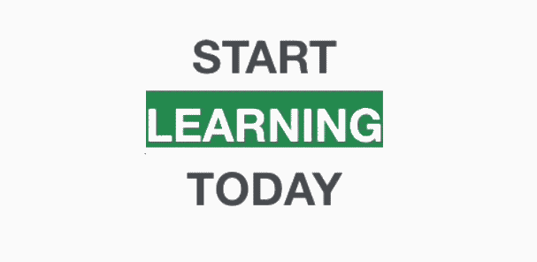
2. Creating scrolling text, using @keyframes.
Very often a client might want to draw attention to a slogan, or series of statements. Scrolling text is a great way to generate this kind of effect, and can introduce movement into your clients messaging.
Once this scrolling text section is created, your clients can assign any text they like to appear in the animated statement, and our finished section will look something like this:
Our first step will be to create a new section within our theme, which holds the HTML markdown and Liquid objects for a range of text boxes. There will be an opening text, a closing text, and three middle text objects. Similar to our call-to-action section, each of these objects will be referenced within that section’s schema settings, and this will render as text fields on the Theme Editor. This will allow your client to personalize the scrolling text.
Next, we’ll set up basic styling for your container and text. I want the text to stand out, so I am forcing uppercase with text-transform.
For our scrolling elements, I will be setting overflow to hidden, as before. This will cover up the parts of the container we don't want to see during each iteration of the animation. #scroll > div > div controls the actual text within the scrolling elements, so we can set the color with this selector.
A very important property here is animation, which allows us to determine movement timing and behavior. In this case we are applying this to the first child in our scrolling class.
#scroll div:first-child { animation: show 5s linear infinite; } is shorthand for animation name (scroll), duration (5s), timing function (linear) and iteration count (infinite). The name we assign, declares the name of the @keyframes at-rule to manipulate- this will be something we set up when we move to the @keyframes.
In our example, five seconds is how long in total the animation will take place during, and a timing function of linear means there’s no preset acceleration curves. Alternatively, you could add ease-in here, or create your own timing using cubic bezier. The final part of this property, iteration count, is set to infinite, which ensures this animation doesn’t stop.
Now we can assign colors to the different scrolling text containers. Here, I chosen colors that compliment white text, as outlined in our design system, Polaris. If your client doesn’t already have an existing color palette, you could also design one, based on their core principles and guidelines.
Finally the @keyframes allows us to set different points that text boxes will appear, by defining a range of margin-top values. The animation effect is created by gradually changing these margin top values. The type of movement the container makes between each point is controlled by the animation property we set up in the previous step.
The section and styling is all ready to go- you just need to include this section in the template it should appear in, or add presets with the schema settings of the section, if you want it to appear on the home page. Once included, you will be able to edit all the different text areas from the Theme Editor:
You might also like: A Practical Guide For Creating the Best Website Color Schemes.
3. Animated underline for menu items.
Menu links are ideal touchpoints for subtle animation , and a smooth effect, like this simple CSS trick, can add a dash of sophistication to your navigation. By adding an underline that fades in on hover, you can create the feeling of an elegant environment for your clients stores.
Navigation links are usually list items on Shopify themes, so the first step here would be to assign a position of relative so that we can target individual menu items:
We can implement Sass again with our pseudo-elements, by using the ampersand to create a nesting structure, that refers to the parent selector. In this case &:before would be compiling to li a:before, and once we have added our styling and animation effects the full CSS syntax would look like:
As we saw with the call-to-action button, transform and transition are used to create a fluid movement, based on time parameters. The height here creates a two pixel high line below each link, while transform: scaleX defines a transformation that resizes this line along the horizontal axis.
In this case I am setting the scale to 0.75, or three quarters of the length of the menu item, as this gives a cleaner effect than the full length. To find what works best with your menu items, try experimenting with different values for the transform property.
When the cursor hovers over the link, the line transforms from zero to 0.75 on the X axis. In other words, a line becomes visible that’s covering three quarters the length of each link. How quickly this occurs is controlled by the transition property which, in this case, happens in 0.3 seconds.
The final effect from these CSS additions would look like this:
You might also like: How to Create Your First Shopify Theme Section.
Staying safe with CSS Animation
As we have seen, animation can inject extra life into a client’s store, and even move beyond mere decoration to improve the usability of a website. While advanced animation techniques are achieved with Javascript, the comparatively lightweight nature of CSS means it can give your custom themes a dynamic edge , without sacrificing too much speed.
The versatility of CSS allows you to experiment with the properties you’ve seen in this article, and craft your own bespoke animations. Each client is different, so you’ll want to match your animation to the style of the brand you are working with.
As well as being aware of the context where animation is being used, you also need to be mindful of how the animation appears on different browsers and devices. Cross testing on different browsers and machines is crucial to ensure your newly created animations look their best in every condition.
Remember, animation is supposed to be fun — so try to enjoy yourself when adding animation to themes!
Grow your business with the Shopify Partner Program
Whether you offer marketing, customization, or web design and development services, the Shopify Partner Program will set you up for success. Join for free and access revenue share opportunities, tools to grow your business, and a passionate commerce community.
Sign up