

At Unite 2017, we introduced our new design system and user interface kit, Polaris. The aim of this system is to help unify the look and feel of all parts of the Shopify ecosystem, while also providing a comprehensive tool that builds excellent user interfaces faster and more efficiently.
To make Polaris as user friendly as possible, it includes markups for both HTML and CSS interfaces, as well as those built in React. Polaris also provides design guidelines — written and used by Shopify’s own lead designers — that are well worth the reading time, and instruct how to build great user interfaces.
However, we know that many members of our developer community love to build first, and tweak later. Designer at Shopify Ryan Frederick and Front End Development Lead at Shopify Dominic McPhee recently demonstrated in one of our Partner Session Webinars how simple it is to access Polaris components, and jump right into building a simple and well-designed app interface.
In this article, we’ll recap the steps Ryan and Dominic took in navigating Polaris to set-up a basic UI, in both HTML and React.
Interested in Shopify app development? Learn more about how to build a Shopify app.
Design before you build
Before you get coding, it’s common to first design how you’d like your user interface to look. In the Resources section of Polaris, you can download the UI kit as a Sketch file. This will provide you with all the components, as well as a color palette, texts, and styles.

Using this kit will help make designing your page faster and easier. For this tutorial, the coding is based around building a simple settings form.

You might also like: How to Get the Most Out of Shopify’s New Design System Polaris.
Use the components to start coding
As mentioned above, Polaris components are available to you as both CSS files that can be used in static HTML (or HTML generated by any other framework you prefer), or as React components. We’ll start off by showing how to create a stand-alone page (not part of the embedded admin), in CSS.
Building with CSS components
Using the text editor of your choice, create an ‘index.html’ file and input boilerplate responsive HTML, including a line to make the viewport expansive and a title for the app.
To create a stylesheet, you’ll need to grab the link tag in the Installing and implementing section in the Components collection, and paste into the head of your HTML document.

With this boilerplate in place, you’ll only have an empty page, so you’ll need to add structure. In the component menu under Structure,select Page. In this section, you’ll be able to use one of the most practical features of Polaris: interactive playgrounds.

Within these playgrounds, you can select sample code from the dropdown menu under Examples, and remove whatever code isn’t needed for your design. For our example app design, you’ll only proceeded with the code needed to place a title on the page.
Since you’re building in HTML/CSS, at the top right of the playground you’d select HTML before Copy Code to copy this markup into your text editor. This will provide you with a page with margins in place, a background color, and proper typography for the title.

To build out the rest of the page, you can use Polaris layout components. As per the example design above, you’re working to build a layout called Annotated Style, in which headings are on the left, and content is on the right, with annotations under the headings. To find the component markups needed, you’ll need need to visit the Layout section, under Structure.
In the playground section, you can select the Annotated Style example, and adjust the copy to match what’s on your mock-up.After updating copy, select the HTML markups and add to the ‘page content’ section of your code, replacing this line:
Page content
And voila — you’ll now have some page structure.
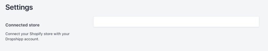
The next step is to replace the empty card with a component in Polaris called Account Connection, which is used for connecting or disconnecting a merchant’s Shopify account to a third-party service — in this case an imaginary drop-shipping account. You can find this playground by searching in the Actions section of components.
In the example code provided, you’ll need to update “title”,“terms of service”, app name and app URL. If you don’t have an app URL yet, you can input placeholders. Once this is updated, switch back to HTML mode and copy the code. In your text editor, paste the code into where the empty card currently is, replacing this code:

However, to make the Connect button interactive, you’ll need to add some JavaScript to hook everything together. If you’d like to build your UI in a way that that’s a little more out-of-the-box, and does not require additional code to enable functionality, we recommend you use the Polaris React components.
You might also like: How to Increase User Retention Throughout the App Usage Lifecycle.
Building with React components
Because of its efficient and flexible nature, React was Shopify design team’s language of choice in building Polaris. Not only are all of the style guide components available in React, they also give you a more convenient API to work with.
To get started with these components, make sure you have node and npm installed on your computer. Once this is done, install the create-react-app package:
npm install -g create-react-app
The -g is important as it will ensure that the package is installed globally, not just locally. Now, we can generate a new project:
create-react-app dropshipp-for-shopify && cd dropshipp-for-shopify/
And to start the application:
npm start
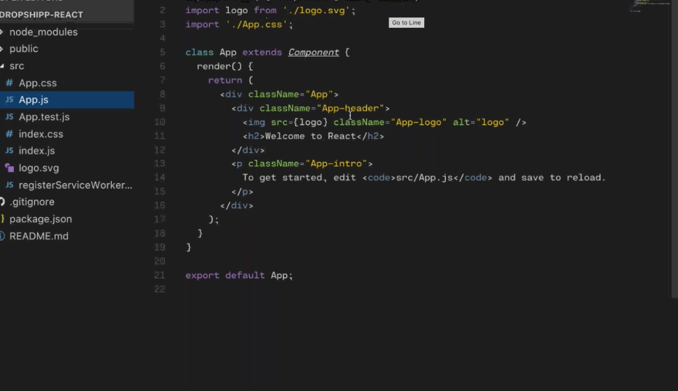
This will trigger output from the terminal as the app starts, and will open up a new browser window displaying it. You can now create a new project in your favorite text editor to look at what was generated. We recommend using Microsoft’s VSCode, but you can use any code editor you prefer.
Looking at the output, most of the code you need will be under src/App.js. Now that this new app is running, you can install Polaris. To do this, you will need to stop running server, and run the following in your terminal to install and save the Polaris component package in your project:
npm install --save @shopify/polaris
Then, open the App.js file in the project and add the following line:
import {Page} from '@shopify/polaris';
This will import the Page component from the Polaris package. You can then use that component in our app below by replacing the return of the render method to be:
When you start your server back up again, you will notice that it’s outputting your new content, but the styles aren’t yet being applied. To get the styles, you will need to add the following line of code:
import '@shopify/polaris/styles.css';
This will include the Polaris CSS in your application, and you should now see a correctly styled page structure.
Build your own components
With the components imported and the styles working, you can even build your own components! Everything in React is divided into components, and to create a new component, can you add a new file called SettingsForm.js to the src folder. In that file, input the following:
This is a very basic template for a React component, using the render method. This is the function that returns the actual JSX markup you will be rendering. Now, you will need to import the Layout component from Polaris, and include it in your SettingsForm.
import {Layout} from '@shopify/polaris';
In your render method add:
You can now go back to App.js, and import the new SettingsForm component you just built.
import SettingsForm from './SettingsForm';
Then inside of the Page component in your render method, you’ll add:
<SettingsForm />
Now, your SettingsForm component is rendering within your Page!
Account connection
When a merchant installs your app, it connects to their Shopify store. Because our example is a dropshipping app and therefore a separate service, you’ll need a way for merchants to connect the app to their actual drop-shipping account. Fortunately, Polaris includes a component for this. It’s called AccountConnection.
To add this component, go back to SettingsForm and change your Polaris import to include both the AccountConnection and Link components:
Then, you can add a new method under your render that has the following:
You’ll also need to track the internal state of this component for whether the account has been connected or not. To do this, add a constructor function that will set the initial state for you:
Now you will need to add a method to toggle this state on and off, that you can attach to your button toggle. In setting this up, note that it’s important to always use the setState method to change state and never modify the values directly. Because React modifies states asynchronously — meaning that the script sends requests to the server and continues its execution without waiting for a replay — you should not rely on its values for calculating the next state.
Now that this has been inputted, you will also need to toggle the markup for this component based on the state. You can change it to return either the connected or disconnected markup conditionally, based on your state variable.
Now you should have a working example of an account connection flow. Click the Connect button and it will display the connected user. This is where you should hook in the code and ensure it correctly authenticates a user and stores the state, for the connected user information.
If you completed this tutorial, make sure to give yourself a pat on the back, because you’ve just built a basic, functional app user interface in React!
You might also like: How to Improve Your App’s Design and Gain More Users.
Just scratching the surface of what you can build with Polaris
We hope you can use this tutorial as a guide to get you more comfortable with using Polaris components to make app interfaces more efficiently, and in a way that’s familiar to merchants using your app.
Whether you want to use classic HTML and CSS components, or take advantage of the interactive and component based nature of React, we hope you explore the many components of Polaris to build the best possible interface for your app.
