

Whether you’re building a theme from scratch, or editing an existing theme for a client, chances are you will need to make decisions on which fonts to include in your theme. Typography has a huge effect on how customers perceive webstores, and clean, complimentary text will give your custom stores a professional appearance.
Websites can have a wide range of content on a page, including video and images, however text is usually a huge focus, and as theme designers, it’s your job to select the right fonts for your client. In this article, we’ll look at how fonts can be added to Shopify themes, as well as what best practices to consider when working with typography.
You might also like: Font Pairing For Designers 101, Plus 10 Free Font Pairing Tools.
Fonts 2.0
If you want custom stores to stand out with noticeable text, it’s likely you will consider using web fonts to add character and style to your client’s site. By using web fonts, you can unlock a world of new font options, rather than being locked into the limited range offered by regular fonts.
By using web fonts, you can unlock a world of new font options, rather than being locked into the limited range offered by regular fonts.
These days, customers expect to see dynamic and interesting typography on websites, rather than stale-looking fonts, like Times New Roman. By allowing developers to choose from a wide selection of custom typefaces, web fonts eliminate the need to rely on the limited number of fonts users have installed on their computers.
Unlike regular, desktop fonts, web fonts are not stored locally on a user’s computer, but are loaded onto a page via a third-party provider. There are a number of different hosts that provide free or paid web fonts including Google Fonts, Typekit, and Font Squirrel.
Once you have found fonts that suit the theme you’re developing, you can generate code that you add to your theme. This allows you to assign your new custom fonts to different text elements on the theme editor. Once everything is set up and you have all the fonts you need, your client can pick the combinations they prefer straight from the theme editor.
FOUT vs. FOIT
Having a range of new and exciting web fonts opens a lot of possibilities, however, it’s worth bearing in mind that since these fonts are not stored on your site, there can be problems with loading these fonts.
One of the disadvantages of using web fonts is that site visitors could encounter what is called a Flash Of Unstyled Text (FOUT), where a backup font is loaded, or a Flash Of Invisible Text (FOIT), where text is not visible until the web font loads.

This can happen with slow internet connections or mobile networks, and browsers can act differently while they’re loading web fonts. Internet Explorer and Edge will hide text completely before a web font is loaded, while Chrome and Firefox will show a fallback font during the loading process.
To ensure your text appears on all browsers, it’s recommended that a fall-back “safe” font is assigned to all text, after the web font. This would be a regular font, like Arial or Helvetica, that is pre-loaded on all computers. It would appear like this in the stylesheet:
h1 {
  font-size: 2em;
  margin: 0.67em 0;
  font-family: my-custom-font, Arial, Helvetica;
}
WebsiteSetup provides a useful list of other possible safe fonts.
The debate between FOUT and FOIT is an ongoing discussion online, and both strategies have their own advantages and disadvantages. While a fallback font does load with FOUT, it can mean that the page layout will adjust once the web font loads, resulting in a moment when elements on the page change position. This effect can be confusing to visitors, and could cause an increased bounce rate. One technique to minimize page distortion would be to choose a fallback font that has a similar size and weight, so that when the web font loads, the layout doesn’t move as much.
FOIT on the other hand does not shift the layout of the page, however it does mean that, depending on the user’s connection, there could be moments where crucial content is missing from the page. While the shape of the page remains static during the loading process, it can be argued that the user suffers by having to wait before they can read any text. In cases where a connection is very poor, the web font may not load at all, in which case a page could be rendered useless.
Experiencing FOIT and FOUT is the price to be paid for the flexibility of using web fonts. The files that are located on a third-party service can be slow to load, an effect more noticeable on weaker network connections or mobile devices. A good way to test how your fonts are loading is to use Google’s Inspect Tool to simulate slower connection speeds. Within the Performance tab is a throttle option that allows you to mimic specific speeds — for example a 2G network.
The inspect element tool has an option to throttle network speed so you can test how web fonts load on slow connections.
How to add custom web fonts to Slate
If you’re building a theme from scratch using Slate, you’ll see that there are no pre-loaded fonts with the theme. This is intentional, and gives developers free-reign over how their store will look and which fonts they choose to include. One of the most common methods to add fonts to a blank theme is with Google Fonts, which provides free and attractive fonts and is relatively easy to implement.
First, you would create a connection to Google’s Fonts API by creating a new file (google-fonts.liquid) containing this code to your snippets folder:
Next you would need to include a link to this file within the head section of your theme.liquid file, so that the fonts will load on every page of our theme:
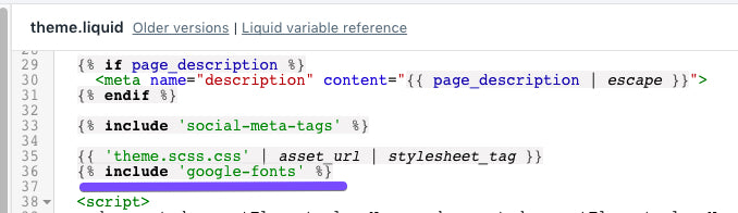
{% if page_description %}
    <meta name="description" content="{{ page_description | escape }}">
  {% endif %}

  {% include 'social-meta-tags' %}

  {{ 'theme.scss.css' | asset_url | stylesheet_tag }}
  {% include 'google-fonts' %}
In this case I have added it just below where the stylesheet appears.
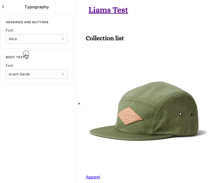
Following this, we can start adding the Google custom fonts to our settings_schema.json file, so that they will appear on the theme editor. Once these are added, they will become selectable within the font-picker in the theme editor. You will add these to the settings_schema.json file. In this case, I’m picking some popular web fonts, such as Lato and Helvetica Neue, as well as some other more stylized fonts, like Alice.
In settings_schema.json:
Finally, you will need to connect the fonts in the CSS, so that different HTML elements can look like the fonts assigned in the theme editor. The code below uses select settings types, combined with some custom Liquid logic, and Sass variables to load the Google fonts.
If you are using Slate, in your variables.scss.liquid add:
You might also like: Getting Started with Slate in 4 Simple Steps.
If you are not using Slate, you can add the above code to your stylesheet, for example your theme.scss.liquid
Now when an HTML element is assigned a font-family in the theme editor, those settings are assigned to a Sass variable such as $font-stack-body or $font-stack-header.
For example, within the stylesheet, I have set the font-family of h1 & h2 to $font-stack-header and the font-family of a to $font-stack-body.
These link back via the code in the stylesheet to the settings of the theme, and will pick up on changes I make in the theme editor.
The future of fonts
It was announced during Unite 2017 that Shopify’s font selection will be improved with an updated approach to fonts. As well as partnering with Monotype to make more fonts available, custom web fonts will be loaded using JavaScript’s scroll events to load and monitor web fonts.
It was announced during Unite 2017 that Shopify’s font selection will be improved with an updated approach to fonts.
Following this update, browsers can detect if custom fonts have loaded before, by using cookies. If a custom font is cached in the browser, it can be loaded without using bandwidth to connect with the third-party host. Using this method, fonts can be supplied by either a font service such as Google Fonts, Typekit, and Webtype or be self-hosted, which adds a level of flexibility already available.
With this update, we’ll know when the fonts are loading, loaded, or have failed, which in turn gives the option to choose whether your site’s fonts are loaded via a FOUT or FOIT process, rather than being determined by the browser type.
When building custom themes, you will be able to make informed decisions, whether fonts appear temporarily as a fallback or invisible. If the text itself is not the main focus of the site for example, and images are more important, then you can choose to have fonts load with FOIT, to avoid a page restructure.
By setting rules using the new fonts-loading class, you can implement FOIT or FOUT from within the code of your theme. This new update to fonts will be available later this year.
You might also like: Creating Dynamic Color Schemes with Theme Options and Presets.
Typography is king!
As you can see, there are a range of different ways to implement fonts in your custom themes, and provide clients with the most appropriate options.
While web designers and markers often say that “content is king,” if your content isn’t displayed in a clear and readable fashion, then your message will not be heard. This makes it your job as a developer to consider the best methods and web fonts for each individual site.
What types of web fonts and loading methods do your prefer? Let us know in the comments section below.
