

What’s the first things that comes to mind when you think about improving a website or app’s user experience?
Most likely you think about user flows, information architecture, interaction and visual design. These are large and extremely important components. But there’s another component of UX that can help—or hinder—your users that you might be overlooking. I’m talking about microcopy.
Microcopy is short, contextual text that informs or guides users throughout your product. You can find it all over the place. From buttons and form fields, to success and error messages, to name just a few examples.
"Don’t judge microcopy on its size, judge it on its effectiveness."
At a glance, these tiny clusters of words seem insignificant when compared to major elements of design. But don’t judge microcopy on its size, judge it on its effectiveness.
Almost every interaction users make, through a website or app, involves words. Thoughtless microcopy can be the Achilles heel of an otherwise excellent design.
Words form the backbone of communication on the web and in apps. They should be positioned at the heart of a design process.
In this article, you’ll see how the smallest bits of copy can have the biggest impact. We’ll explore the craft of writing at a micro level, along with some examples of apps and services that have really great microcopy we can learn from.
Build apps for Shopify merchants
Whether you want to build apps for the Shopify App Store, offer custom app development services, or are looking for ways to grow your user base, the Shopify Partner Program will set you up for success. Join for free and access educational resources, developer preview environments, and recurring revenue share opportunities.
Sign up5 ways microcopy can improve your design
Words should always be considered part of a design; not just where they’re placed but also what they actually say. Remember that the fastest way to improve an interface is to improve its copy.
You might also like: Microinteractions: Tiny Design Decisions, Big User Impact.
1. Alleviate the user’s concerns
Microcopy is extremely contextual. That’s why it’s so valuable. It answers a very specific question people have, and speaks to their concerns right on the spot.
Fear of irreversible changes
When users are about to sign up to Tumblr, they’re asked to choose a name for their blog. This seems like a big deal because this defines not just the username, but the URL at which the site will be available for others.
To reduce the stress of making a big decision, Tumblr reminds users that “you can change it any time.” Problem solved. No more worries about choosing the wrong subdomain name.

Fear of spam
Microcopy can be fundamental in reassuring your users at the point of subscribing or sharing details. When people add their emails or connect their Twitter accounts, they hope their inbox won’t be spammed with things they don’t want.
Of course, the vast majority of apps and web services follow the rules, and don’t spam/auto-tweet when asking for an email address or access to social network accounts, still many users hesitate to share details.
That’s why it’s important to say something like, “We hate spam as much as you do,” when people add their emails and actually deliver this promise.
Fear of data loss
Data loss is a nightmare for many users. Nobody wants to spend a few hours working on something important, to suddenly realize that all the results of their hard work are gone.
Fortunately, it’s possible to prevent a data loss situation from happening by using autosave and microcopy together. Autosave will save information automatically, and microcopy will reassure users that their data is safe.

Fears over personal data security
“Why do you need that?” is quite a common question among many users when an app asks for personal information (such as a birthday or a phone number).
People are apprehensive about giving out personal information: a usability study by the Baymard Institute found that users felt as though their privacy was being invaded when they are required to enter seemingly unnecessary personal information, without any further explanation or help.
Explaining to the user why you need their information, or outlining how you use (and protect) their data, is crucial. When you tell users how their personal data will be used by your service, you give them more reasons to provide this information.

2. Help your user along the way
Throughout a user’s journey, they’ll stop along the way for a number of reasons. Where am I? What should I do next? How does it work? Be ready to assist your users as they interact with your product. Good microcopy reduces negative friction and allows users to go from point A to point B in the fastest, smoothest, and most efficient way.
"Good microcopy reduces negative friction and allows users to go from point A to point B in the fastest, smoothest, and most efficient way."
Help users get started
Once people have downloaded your app, you can create paths for them to follow using microcopy. Consider Twitter’s original onboarding screen in the example below. The screen is full of contextual microcopy, which helps first-time users start using a service.
For example, new users could tweet with preloaded tweets (with a hashtag to get them in touch with others like them) or write their own messages.

Let users know what to do next
A good user interface (UI) is intuitive: when users see a new page, they should be able to determine what actions are possible in just one glance. In the Airbnb example below, the app provides specific text as a search box placeholder: “Where are you going?” instead of blank space or generic text like, “Search.”
As soon as users launch the app, they know what the app is expecting from them (basically, all they need to do is to type in where they want to travel). This placeholder text gets the ball rolling.

Explain new features
When introducing a new feature in your app, it’s easy to assume that users will figure out how to use it right from the start. Unfortunately, what you think is intuitive might not work for your users. So, it’s always better to provide the necessary context to get users on the right track. A brief explanation of a new feature, like in Quora’s example below, makes it clear what has changed, how it will affect the user, and what they can do now.

Reduce cognitive effort
Microcopy can minimize extraneous cognitive load—the amount of brainpower a user needs to understand and interact with your interface. Here is another example from the Airbnb app—a host contact form. Small bits of text below the form tell a user the local time of the host. This allows the user not to waste time checking different time zones themselves.

You might also like: 6 Principles of Effective Interaction Design.
Suggest users take a certain action
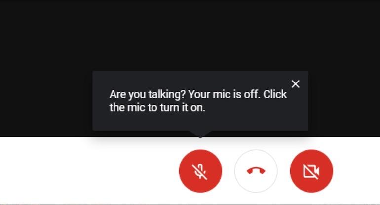
Microcopy can guide users through an interface at a moment of potential uncertainty, and to explain certain outcomes. One great example can be found in the Google Meet app. When a user starts speaking on mute, the app detects it, and notifies them about it.
Help users in a moment of failure
Another opportunity for improving microcopy comes from user errors. How errors are communicated can have a huge impact on the way someone experiences your website or app. There’s nothing more annoying than receiving an error message, and not being able to figure out where the error is.
"There’s nothing more annoying than receiving an error message, and not being able to figure out where the error is."
Unfortunately, we often see ill-constructed error messages in our desktop apps:

We also see these vague types of error messages in our mobile apps:

An ill-constructed error message can fill users with frustration. This error message simply states there is a problem and does little to help a user fix it. Image credit: JakubVul
Good microcopy takes advantage of the situation by calming the negativity. A well-crafted error message can turn a moment of frustration into a moment of joy or fun.

Error states must incorporate concise, friendly, and instructive copy as to what to do next. Image credit: microcopymatters
You might also like: An Introduction to Information Architecture.
3. Sets expectations
Microcopy is able to answer very specific questions people might have when using an app, such as, “What’s the app doing now?” or “How long does the operation take?”
It can address user concerns in the moment, and let them know what will happen next. Just a few, carefully chosen words can stop users from struggling or dropping out of the process altogether. This is especially critical during your app onboarding process. If users don’t know what to expect, they may churn out of frustration or confusion.
Show progress
While an instant response is the best, there are times when your app won’t be able to respond instantly. Delays are usually caused by slow loading times and latency issues. For such cases, you must reassure users that the app is working on their request and that progress is being made. Good microcopy lets you know exactly what’s happening.
"You must reassure users that the app is working on their request and that progress is being made. Good microcopy lets you know exactly what’s happening."
For example, an app that notifies users that it’s loading files as the user waits for a page to load, could use microcopy that simply says, “Getting your files.”
Set expectations
The online checkout process was once one of the most annoying parts of buying something online. Historically, it contained a lot of steps and required users to spend a lot of time filling out a dozen forms.
But when users see options to pay that will autofill their details, a box to add any custom order notes to the merchant, and microcopy that explains how shipping and taxes are calculated, they’re not left wondering about any step in the checkout process.

4. Bring delight
Microcopy plays a big part in shaping how people think about your product. People are generally well aware that digital experiences don’t include feelings, and yet they prefer responses that feel warm and human, rather than cold and robotic. As the quote often attributed to Maya Angelou goes: “I’ve learned that people will forget what you said, people will forget what you did, but people will never forget how you made them feel.”
"Words have the ability to make people feel something. Whether you create friendly feelings or cold formal relationships largely depends on your copy."
Words have the ability to make people feel something. Whether you create friendly feelings or cold formal relationships largely depends on your copy.
Make the product sound human
A quick way to make your UI warmer and less mechanical is to use a human tone in the copy. If your product sounds human, it’s easier for people to trust it.

Convey personality
Microcopy is the perfect opportunity to express a brand’s personality. It can turn a routine task into something memorable. For example, by customizing the message for a specific person or a group of people, you can make them feel special.
Create positive moments
Delightful detail shows that app creators put a lot of love into what they’re making. Delight is often brought on by an unexpected, yet positive, turn of events. For example, you could display a special greeting when a user opens the app on their birthday.
"Delight is often brought on by an unexpected, yet positive, turn of events."
5. Boost engagement
Microcopy has the ability to make people take action. Good microcopy is able to move users and make them willing to do something, whether it be to sign up for a newsletter or provide their credit card information to purchase a product.
Reassure users
When deciding whether to sign up for a service or not, it’s difficult to know if you’re making the right choice. The task becomes even more challenging when subscription requires instant payment. Microcopy in the format of social proof and compelling data can reassure users before deciding to commit to something.
Motivate action
Microcopy can encourage people to keep going. Sometimes users need a subtle reminder to get things done. For example, an app can give people a friendly nudge to encourage users to do something.
Microcopy: More than writing skills
Just because microcopy is small, doesn’t mean it’s easy to implement. Writing microcopy takes more than good writing skills. There are multiple factors that play a role in designing great microcopy. Here are a few tips to make a wee bit of text pay off in a big way.
Get inside your user’s head
Good microcopy comes from knowing your user. User testing is a tool that helps you better know your users and anticipate their questions. It gives you insights into what parts of the copy are clear, and what confuses the user. It’s important to identify the different needs and concerns of your users at each stage of the journey, and to use microcopy to address these concerns.
Keep microcopy short and helpful
When implementing microcopy, use short snappy sentences. Users don’t want to read long instructions on how to complete a certain task. It’s supposed to be microcopy, not a long paragraph of content.
Be careful with jokes
It’s not always appropriate to use humour in your microcopy. First, not everyone shares your sense of humor. What might sound good on the paper, can be considered as uncaring or rude by your users.
Secondly, it all depends on context. For instance, when an app fails to save user data and a user loses a significant amount of his/her/their work, it's entirely inappropriate to say “Oops! Seems we lost your data. Take care!” Thus, leave humor out if the situation is potentially frustrating or stressful.
Pair microcopy with images
Words and images are highly complementary. Together, they are more interesting than each would be alone.
If you can, add a simple image to accompany your microcopy. It can sometimes be the perfect pairing for your microcopy. Words and images work together to create a feeling of delight that’s more magical than words or pictures alone. For example, a fun or cheeky illustration can lighten the user experience when something goes wrong, such as a network connection failure.
Never, ever use jargon
Microcopy often falls victim to internal terminology—industry specific jargon often sneaks onto the website and in the app. Don’t let it happen. Remember, you need to convey technical information in simple terms.
"You need to convey technical information in simple terms."
Use natural language and talk to your user like a person, research and reuse the existing language of your audience. When you speak the same language as your users, you not only make everything easier for them, you also build trust by showing them you know who they are.
Be careful with idioms
Cute, clever microcopy shouldn’t leave those less familiar with the cultural vernacular behind. Think of those who don’t speak the primary language of your product, and try to use straightforward microcopy. Straightforward microcopy is a safer, simpler, and more scalable choice.
Test and refine your microcopy
Good microcopy takes time to get right. Thus, prepare to iterate, test your design, and revisit it when things aren’t working. Don’t be afraid to experiment and see how people respond. You can easily run A/B tests to compare your current microcopy against a new and improved version.
Microcopy: Small text, big impact
Writing good microcopy in your app is just as important as the app working correctly or the user interface being easy to use. When done right, effective microcopy increases conversion, improves the rate of task completion, and delights users. It also demonstrates the care and attention to detail in the product.
