
Retail store layout, also referred to as store design or layout design, is a term used for the way retailers set up product displays, fixtures, and merchandise in-store.
There’s no right or wrong way to lay out your store, but it’s important to focus on your target market, your space, and the types of products you sell to come up with a retail store layout that works for your business.
Studies have shown that most people naturally look left first, then right as they enter a store. Shoppers typically also prefer to move right and walk counterclockwise around the space.
If you’re looking at opening a new retail shop or you have a shop you want to redesign, you’re likely doing your due diligence into store design that could work for your space. But you don’t need to spend a dime on research and development, as we’re sharing some of the top retail store layouts and store design tips that science has to offer.
Let’s get started.
Table of Contents
What is customer flow and why is it important in store layout and design?
Before we dive into the different types of store layouts, it’s important to understand what customer flow is and how it can impact your sales.
Customer flow is the number of people and patterns of shoppers coming into or passing through a retail store.
You can monitor a store’s customer flow in a few ways, including:
- Observing the number of people who come into the store
- Analyzing purchase data
- Reviewing a time-lapse video, if you have an in-store camera
It’s crucial to understand customer flow to inform flow patterns, store areas that are visited frequently or not visited at all, the number of visitors, and overall customer behavior.
Understanding customer flow will help you create a visual merchandising plan or store layout that works. By analyzing which areas of the store are performing well and which need improvement, you can pinpoint whether the store design is helping you turn a profit or resulting in lost sales. Once you succeed at setting up the right store layout, customers will flow the way you intended and your sales will increase.
If, through observing customer flow, you find that many areas of your store aren’t getting any shopping traffic and inventory isn’t moving, you can reevaluate your entire store design or just the layout of that particular area to improve customer flow.
What are the different types of store layouts and designs?
Your store layout should help you achieve your retail merchandising goals by guiding customers through the store and exposing them to your products, all while managing important stimuli that encourage purchasing behaviors. How people experience your store is a big part of your brand and needs to be as carefully crafted as other aspects of your business.
That’s a lot to consider, but layouts are a great place to start. Store layouts are the foundation that will guide the experience of your retail space.
There are many store layouts to consider. Here are 10 to get you started:
- Grid
- Herringbone
- Loop, or racetrack
- Free-flow
- Boutique
- Straight, or spine
- Diagonal
- Angular
- Geometric
- Multiple, or mixed
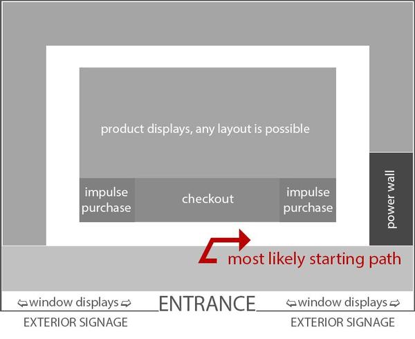
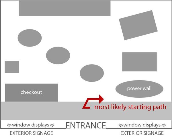
We’ll take a closer look at each of them, but let’s first examine the commonalities each of these layouts share by looking at a generic store with a blank interior.
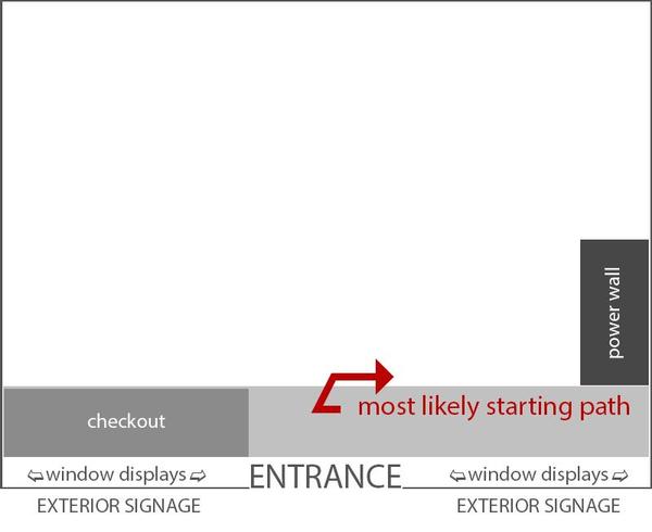
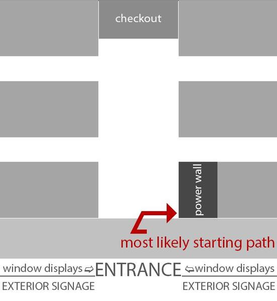
Exterior signage and window displays are curbside appeal for your store’s real estate. Doing a good job here can help to convert foot traffic into store traffic. Check out these tips on how to create a compelling curbside story.
Once a person steps inside, they enter the decompression zone, which is the first five to 15 feet of your store. Think of this as a transition space—customers take a broad, sweeping look at the store, and anything placed directly in this area likely will not be noticed. Avoid placing key items here, like new arrivals or high-demand products.
Notice the empty space at the front—the decompression zone helps customers transition into your store.
As we mentioned above, studies show that the majority of people tend to turn right after entering a space, starting a circulation trail through whatever store layout you’ve designed. Thus, placing your high-demand product or premium promotion in this space will ensure it gets seen. This area is known as your power wall and it can be both an excellent promotional and brand-building space. Use it to strike an impression.
Here’s an example of a power wall at American Eagle Outfitters. Beyond these common features, store layouts highly influence the remainder of the circulation path and experience of your store—so let’s examine the 10 most used layouts now.
1. Grid store layout
We’re all familiar with the grid. Nearly every convenience store, pharmacy, and grocery store utilizes this familiar layout. Reams of merchandise are displayed on a predictable pattern of long aisles where customers weave up and down, browsing as they go. The grid maximizes product display and minimizes white space. This layout is all about product, product, product. A standard grid layout looks something like this:
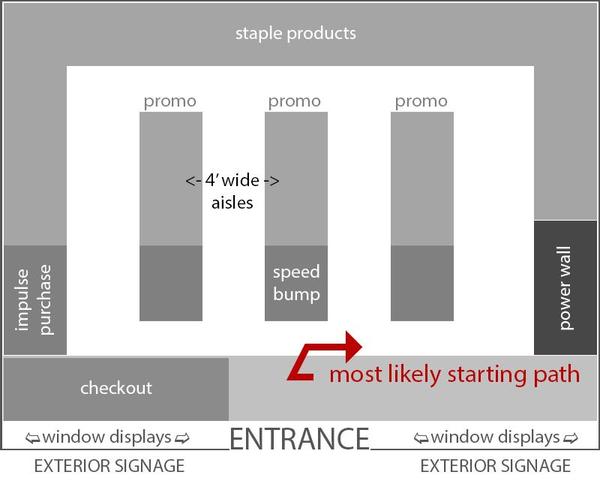
The grid features long aisles with impulse-purchase items near the front and staple items at the back. The ends of aisles are prime real estate and many stores use additional features such as wing shelves to further highlight products. If you ever wondered why milk is at the far end of a grocery store, it's because this design forces customers to walk past an assortment of impulse purchase items, both on the way to and from the staple item they need.
If you have the room, four-foot-wide aisles help prevent customers from bumping into one another. While far from standard, this is something you’ll want to aim for, given that due to the pandemic, 62.2% of consumers in North America say social distancing is one of the top factors that makes them feel more comfortable shopping in-store.
Pros
- Best for stores with lots of merchandise, especially when products are varied
- Lots of exposure to products, as the layout encourages customers to browse multiple aisles
- Familiar for shoppers
- Predictable traffic flow means you can put promos where you know customers will see them
- Lots of infrastructure suppliers, such as shelving, are available as this layout is used so much
- Best practices within this layout are well researched
Cons
- Least likely to create an experiential retail space; this layout is a dime a dozen
- Customers may be frustrated they can’t shortcut their way to what they need
- Customers may not understand your product groupings, leading to frustration and questions (or worse, departure)
- Few visual breaks and lots of merchandise can make customers feel overwhelmed
- Cramped aisles often lead to customers bumping into one another
If you operate the type of shop where customers pick up multiple types of items that aren’t naturally grouped together (think shampoo and greeting cards), you may want a layout that makes it easy for customers to browse the whole space and find what they’re looking for.
The grid creates natural barriers that serve to simultaneously group like products together and separate different products. This can help to clear up confusion about where to find things in a shop with a high number of SKUs. Furthermore, customers are highly accustomed to this layout, so flowing up and down aisles is second nature to most shoppers.
Some of the cons of this design can be addressed through creative interior design that helps improve the look of the space beyond the bones of the layout alone, such as using shorter shelving to make the space feel more open and help customers see how you’ve grouped products through visible signage.
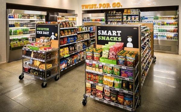
This is an example of a modern grid layout in a store—notice the promotional areas at the ends of each aisle. This shop cleverly uses shorter aisle shelving so that staples at the back are still clearly visible, which opens up the space, improves wayfinding, and helps to reduce thefts. Aisles are spacious, helping to avoid the butt-brush effect.
2. Herringbone store layout
If you think the grid may be best for your merchandise but you have a very long, narrow retail space, the herringbone layout is one to consider.
The herringbone layout has many of the same pros and cons as the grid, with a few notable exceptions.
Pros
- Suited to stores with lots of product but minimal space
- This layout often works well for warehouse-style stores open to the public
Cons
- Limited visibility down “side roads” can increase shoplifting opportunities
- Can feel cramped, and customers easily bump into one another
Tuck shops, small hardware stores, and many small community libraries use the herringbone layout to pack a tiny space full of wares. The side roads can be used for promotions, but by adding some welcoming visual breaks within the promo areas, you can provide some much-needed breathing room to an otherwise overwhelming space.
Some herringbone book shops encourage people to linger by setting up a comfy chair at the end, where shoppers can leaf through books before they decide to buy.
You’ll find large warehouse-style stores use the herringbone layout as well. IKEA’s convoluted loop track (which we will examine below) is replaced by the herringbone when you’re in the pickup area and the intention of the shopper changes from browsing to purchase.
A big potential downside with the herringbone is the potential for theft. But one way to mitigate the risk is to park security cameras at the end of the side roads, as visibility from the checkout is likely to be limited to none.
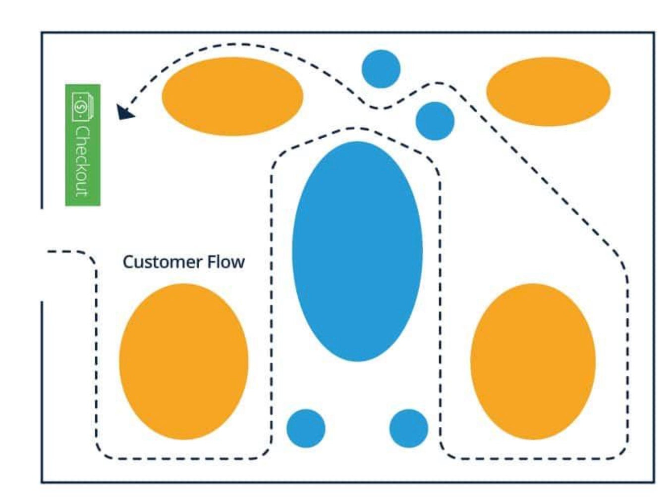
3. Loop (racetrack) store layout
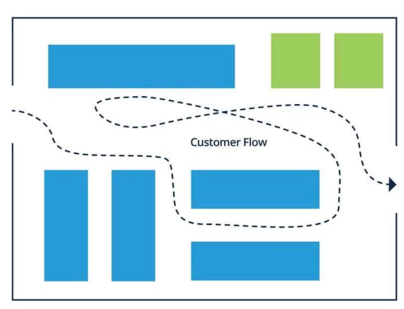
The loop, racetrack, or forced-path store layout takes the grid’s fairly predictable traffic flows a step further and creates a deliberate closed loop that leads customers from the front of the store, past every bit of merchandise, and then to the checkout. Customers are exposed to the most merchandise this way, but the path they take is controlled.
A basic loop layout is shown below—the white path represents the main corridor that traffic flows through, although the central area would be populated with a micro version of any layout, which suits the product offerings and fits the space.
Pros
- Maximum product exposure
- Most predictable traffic pattern; easiest to place promotions and have highest assurance they’ll be seen
- Can be experiential—may work with retail where a journey makes sense and time spent in store doesn’t need to be brief
Cons
- Customers don’t get to browse at will
- May waste the time of customers who knows what they’ve come for; they may avoid this shop in the future when buying intent is specific
- Not suited for shops that encourage high traffic turnover or carry products people need to spend little time considering before purchase
IKEA takes the loop layout to the extreme, and if you’ve been to one, you’ve probably experienced both the pros and the cons of this design depending on your intent in the shop. If you’re there to browse, the experience can be quite nice—it encourages perusing and the creative displays spark ideas for your home. However, if you’ve gone there for a few specific items, it’s a daunting, frustrating place to be—it’s no coincidence that haunted houses use the loop layout too.
The loop doesn’t have to be frustrating though, so long as it’s carefully selected for the appropriate purpose.
One well-considered loop layout application are those pop-up gift shops accompanying time-limited museum exhibitions that continue the story of the exhibit by making the shop a natural extension of the display rather than a sudden, jarring retail space.
A well-executed loop layout can let retailers tell a story, albeit within very well-defined parameters.
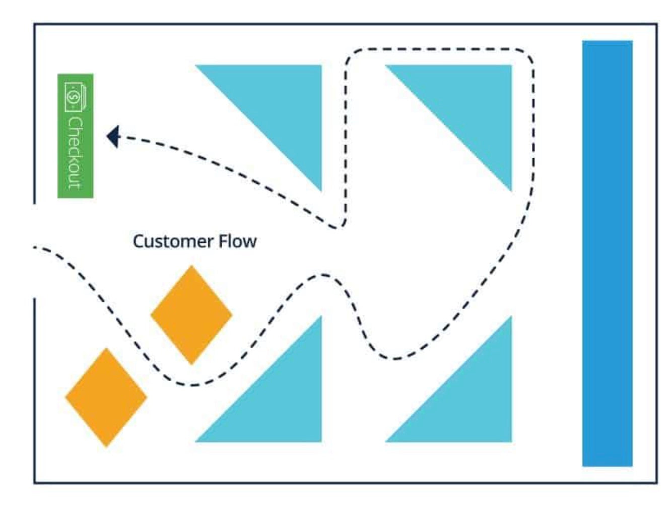
4. Free-flow store layout
The free-flow layout philosophy is almost a rejection of the others. With free-flow, there is no deliberate attempt to force customers through predictable traffic patterns: wandering is encouraged. Therefore, with free-flow, there are far fewer rules, but that doesn’t mean there aren’t any—don’t forget about the commonalities that are based on natural human behavior.
A sample free-flow store layout below demonstrates that exterior signage, window display, and, most likely, the start path and power wall still remain the same. But beyond that, it’s a very creative layout to work within.
Free-flow has been called the simplest store layout, because there’s no defined pattern, but arguably that’s what makes it the most complex. How you organize your merchandise in a free-flow store is limited only by your square footage and your imagination.
With so few rules, it’s easy to go wrong. However, the biggest mistake you can make if you decide to go with this layout is thinking there are no best practices—human preferences and behavior still matter and need to be considered for this layout to be successful for your shop.
Pros
- Great for small spaces
- Also works within areas of loop and spine layouts (more on that below)
- Creates more space between products
- Less likelihood customers will bump into one another
- Better suited to higher-end shops with less merchandise
- Most likely to create an experiential retail space
Cons
- Often less space to display product
- Easy to forget there are best practices that still should be followed; breaking the unwritten rules can turn people off and away from your store
- Can be confusing for customers
Well-designed free-flow layouts can encourage browsing and impulse purchases. They are ideally suited to more creatively focused shops or upscale brands that want to prioritize experiential retail as a key component of what they do.
The flip side is that, because there’s so much variety in free-flow shops, it’s easy to do the wrong things and discourage customers. Setting shelves too close together, not creating enough visual breaks, or putting checkout in the wrong part of the store can encourage departure rather than purchase.
5. Boutique store layout
The boutique store layout, also known as shop-in-shop or alcove layout, is a commonly used type of free-flow layout. Merchandise is separated by brand or category, encouraging shoppers to engage with complementary items in designated areas. Walls, product displays, and fixtures divide areas and create the feeling of small shops within one store.
Pros
- Sparks curiosity in shoppers
- Highlights different brands and product categories
- Helps with cross merchandising and cross-selling
Cons
- May limit the total display space for merchandise
- Shoppers may not explore the entire store
- Customers may be confused
If you carry multiple brands, this type of retail store layout is a great way to use store design to tell a story about each label. One way to reduce the likelihood of shoppers not exploring the entire store is to make sure you don’t close off each section too much. Rather than put up a wall, use shelving, tables, and racks to create alcoves that people can easily flow in and out of.
6. Straight (spine) store layout
The straight store layout, also known as the spine layout, is easy to plan, effective, and creates space for customers to peruse your store. A basic straight design can help lure customers all the way to the back of the store, ensuring that all featured merchandise is seen. This is done with signage, product displays, and strategically placed merchandise to keep customers interested and moving down the main aisle of the shop.
This store design works for small markets, food stores, and department stores that use the spine as a main aisle to connect the various sections on each floor.
Pros
- Customers are more likely to make it to the back of the store
- Shoppers have space to look around
- Allows for space to display merchandise
Cons
- Shoppers may move quickly down the main aisle and merchandise at the front or sides of your store will go unseen
- A straight aisle may not lend itself as well to exploration and discovering new products
7. Diagonal store layout
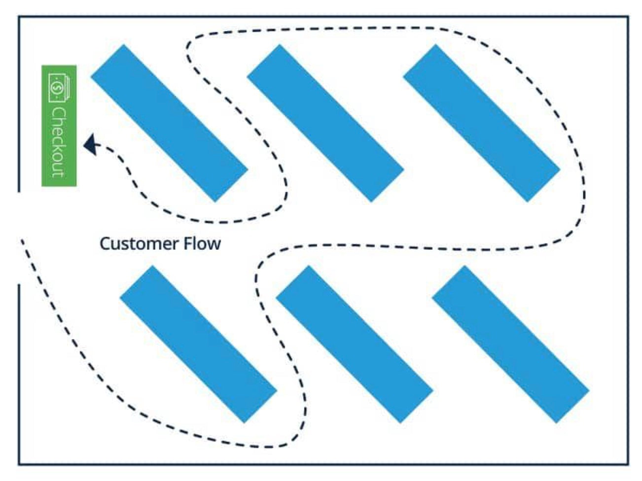
Exactly as the name suggests, the diagonal store layout incorporates aisles placed at an angle to expose more merchandise to customers as they walk through the shop. It’s a variation of the grid layout and can help guide shoppers to the checkout counter. This store design is helpful for space management, making it a good option for retail stores with limited space. It also encourages more movement, so customers can easily circulate through the store and see all of the products you sell.
Pros
- Better customer circulation
- If the checkout counter is located in the center of the store, the diagonal layout provides better security—you’ll be able to see more throughout the store
Cons
- Shoppers cannot take a shortcut to specific products
- Narrower aisles are common in the diagonal store layout
8. Angular store layout
A better name for angular store layout would be “curved store layout.” “Angular” is deceptive, as this store layout includes rounded product displays, curved walls and corners, and other curved store fixtures to maintain the customer flow.
The angular layout uses free-standing product displays and can create the perception of higher quality merchandise, making it a good retail design option for luxury retailers and boutiques.
Pros
- Creates a unique retail store design
- Elevates the in-store experience
Cons
- Rounded displays eliminate wall shelf space
- Less inventory can be displayed
9. Geometric store layout
The geometric store layout is a great way to combine creativity and functionality. It’s commonly used by retailers selling products targeted at stylish millennials and Gen Z. If your shop has a unique interior including support columns, wall angles, and ceiling design, a geometric layout can enhance the look of your store.
You can combine geometric product displays and fixtures in a range of shapes and sizes to make a statement and build your brand identity. Typically, clothing and apparel stores also use merchandising strategies such as artwork, music, and scents combined with a geometric store layout to create an atmosphere that heightens customer experience.
Pros
- Creates a unique store design without a high cost
- Helps make a statement about the products
Cons
- May be too eccentric for less “trendy” products (or an older audience)
- It may not be the best option to maximize space to display merchandise
10. Multiple store layouts
You don’t have to select just one store layout. Some retailers use elements from multiple layouts to create a flexible store design, also known as a mixed layout. A dynamic mix of diagonal, straight, and angular store layouts can help you create a compelling in-store experience where customers naturally flow from one area to another.
You can use one layout type as your starting point and build from there. For example, the loop layout lends itself to more than one option—a loop on the outside and grid or free-flow in the center. Large-sized department stores often use multiple configurations connected by a single power aisle.
Nordstrom, for example, uses several layouts to differentiate between various branded shops that live within the store. The department store transitions from a grid layout Nike store-within-a-store to a free-flow, high-end designer label embedded within the space. It cleverly mixes and matches store layouts to create the feeling of different shops, even though they’re all under the same roof and umbrella brand.
A main corridor acts as a spine connecting each of the shops, while visual décor helps customers understand where one embedded shop ends and another begins.
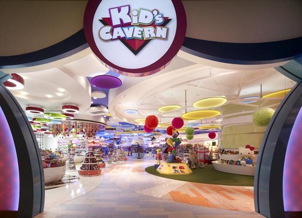
The spine is clearly seen at Kid’s Cavern, which is flanked by free-flow layouts.
Store layout design tips
Humans are highly visual. In fact, 65% of people are visual learners and half of the human brain is directly or indirectly devoted to processing visual information. If you want to get and keep shoppers’ attention, it’s vital to create a visually appealing and stimulating store design.
This is where you can use retail merchandising and store design to attract customers. It’s important to spend time building a merchandising strategy that improves customer experience and boosts sales.
Let’s take a look at a few store layout design tips that will help you draw customers in and encourage them to buy.
Design based on customer flow
You’ll want shoppers to see your best and most appealing merchandise or product displays the moment they walk into your store. For this reason, knowing where people go or turn after entering your shop is key. Do they usually flow to the right or the left? What do their eyes focus on first? These are just a few of the questions you should consider when you’re working on your store design.
In most cases, shoppers enter and almost always turn right, walking counterclockwise. But, it’s also important to consider your location and the common flow of traffic. In fact, studies have shown that in-store traffic flow could be influenced by traffic patterns on the road. Herb Sorensen, author of Inside the Mind of the Shopper, notes:
“The pattern of movement in the supermarket is counterclockwise in the United States, but PathTracker studies in the UK, Australia, and Japan show a much greater tendency for shoppers to move in a clockwise pattern there…traffic patterns in the store may also be affected by vehicle traffic patterns outside. In these small studies, we noted that in countries with right-hand driving, where traffic circles move in a clockwise pattern, shoppers in stores may be more comfortable moving the same direction.”
Depending on where your store is located, you can consider this information to arrange a store layout that embraces the direction most commonly used in your area.
It’s also important to note that you shouldn’t base all of your store design decisions on outside research. Making your own observations will help you assess the traffic patterns of your own customers.
You can use foot traffic tools to evaluate how shoppers flow through your store, or simply pay attention and observe where people go and what they look at when they come into your store.
Start with your window display
Your retail window display is one of the first engagements a potential customer has with your store. It can also be one of the most important store displays to help your business stand out.
You’re not only competing with other local shops, but large retailers as well. A well-designed window display can help separate your business from its competitors and boost in-store foot traffic.
Use store window displays to tell your brand story and get the attention of passersby. With the right window display design, people will be more likely to stop, look, and then walk into your shop, giving you the opportunity to engage and make a sale.
Avoid the decompression zone
As we mentioned earlier, the decompression zone is the first five to 15 feet of your store, where the customer transitions into shopping mode. At this point, people take a broad look at the store, so merchandise in this area usually goes unnoticed.
That’s why it’s important to avoid putting key products or signage near the entrance. Shoppers in this area are still adjusting to their surroundings and tend to overlook merchandise and product displays placed in the decompression zone.
Incorporate breaks or stopping points
If all of your fixtures look the same, it could lead to shoppers glancing over particular merchandise. To avoid products getting skipped over, you can use speedbumps to stop foot traffic.
For example, a shelf stopper can be used to highlight an item on a shelf. The sign sticks out from the shelf, drawing in the customer’s attention and causing them to stop. Once they’ve stopped, they’re more likely to browse all of the products on the shelf. This helps prevent shoppers from skipping over products in your store.
Use the right store layout
Now that you know about all the different store layouts to choose from, using the right one for your space and customer base plays a critical role in managing customer flow. Deciding on the right store design depends on a number of factors, including the products you sell, the size of your store, and your target audience.
Put yourself in the shoes of your customers by evaluating these questions before you decide on your store layout:
- What are your customers like?
- Are they likely to be in a hurry or do they take their time shopping?
- Are they open to discovery or do they prefer efficiency?
- Do they like guidance from sales associates or prefer self-service options?
Display the right amount of product
Determining the right amount of product to display is not always easy. While having more merchandise on the sales floor can help you sell more, displaying too much product can lower the perceived value of the merchandise you sell. This is especially true for high-end or boutique retailers.
So what’s the right amount of stock to display? The bottom line is it depends on the size of your store, the type of customer experience you want to create, and how you want shoppers to perceive your business.
If you own a high-end boutique, it’s better to curate a limited assortment of products and display only a few at a time. Conversely, discount retailers who want to utilize every inch of floor space to sell as much as possible can pack the store with merchandise.
Leave enough space between products and fixtures
Depending on your target market and the type of customer experience you want to create, you may opt for shelves that are filled with merchandise or you might sparsely display products. It all depends on what type of store you have. Most importantly, you need to make sure your customers still have their personal space. They shouldn’t have to squeeze or worry about brushing up against fixtures with their body or belongings.
Spruce up your displays regularly
How often you freshen up your store displays can vary depending on factors such as how regularly you receive new merchandise shipments, whether your products are seasonal, and how frequently shoppers return.
Keeping your product displays and merchandise assortment updated can entice customers to come back regularly to check out new products. You can test different strategies to refresh your displays. For example, rotate products on a weekly or bi-weekly basis to see how it affects sales. You can do this by moving merchandise from the middle of the store to the front and from the front to the back, or however you see fit.
Of course, whenever you receive a new shipment of products, it’s important to display them right away and in an area of your store that has high foot traffic.
The main idea is to make sure customers don’t get too familiar with your store and the merchandise you’re displaying to the point that they don’t even bother coming in anymore.
Incorporate cross merchandising
Cross merchandising, which you may also know as secondary product placement, is a great way to display complementary products next to each other to boost sales.
For example, if you sell jeans, you can display them on a table next to a rack with blouses to help the customer easily find products to complete an outfit. Or, if you sell running shoes, place socks and running shorts nearby.
Cross merchandising helps make the shopping experience more convenient for customers and can also spark ideas or remind them of additional products they need. When you get it right, you’ll enjoy making more sales and increasing your average order value (AOV).
5 real-life examples of good store design
Coming up with a design for your store layout can feel like a lot of work, especially when you’re running a small business and wearing many hats. But it can also be fun and exciting. And, in most cases, you’ll be able to switch things up and test merchandising strategies to see what works best for your business.
Here are five real-life examples of good store design to get you started.
The Pop-up Club uses the straight store layout
The Pop-up Club creates space for small businesses to showcase their products and crafts to customers, removing technology and encouraging human interaction and connection. It does this by taking dilapidated empty spaces and temporarily turning them into beautiful shops where local vendors can display and sell their merchandise.
This is an example of one of its recent marketplaces. The straight, or spine, layout leaves an open path for customers to discover the various brands and makers that are showcasing their products.
Donne Concept Store uses the free-flow boutique store layout
Donne Concept Store is a retail boutique that stocks luxury brands, special accessories, and hosts events to merge the in-store and online shopping experience.
In this example, it’s using a free-flow boutique layout that lets customers wander from one fixture to another and discover each of the brands it carries. The combination of racks that hang from the ceiling (appearing to be floating), tables, and sparsely stocked shelving creates an open space that’s easier for customers to walk through. The store has also done a great job of designing its layout with it’s target market in mind. As we mentioned earlier, displaying fewer items at a time lends itself to high-end retail stores.
Uniquities uses the mixed store layout
Uniquities sells premium denim and designer brands that are curated from around the world.
In this example, the boutique does a great job of using the mixed store layout. By displaying products on a rack, round table, and wall shelving, it’s making use of various shapes, fixture types, and display sizes. Dressing a mannequin next to the rack helps shoppers visualize the outfit and entices them to try it on and hopefully make a purchase.
I Miss You Vintage uses the geometric store layout
I Miss You Vintage is Toronto’s premier destination for luxury designer label resale. It’s not your usual vintage shop where you have to comb through racks and racks of merchandise to find a gem.
Instead, it uses a mostly geometric layout to merchandise products in a colorful way and does a great job of cross merchandising. For example, you can find dresses, shoes, and bags all on one rack, and the outfits are already color coordinated for you.
Hutspot uses the angular and loop store layout
Hutspot is a Dutch retailer offering a unique combination of timeless fashion, innovative design, and local art. Its aim is to help young designers and artists sell their goods alongside established brands.
This example from Hutspot is an angular and loop store layout. By placing a large round fixture in the center of the floor, shoppers can walk in a loop as they peruse the products hanging on the racks around the edges.
Selecting your retail store layout and design
When deciding upon a layout for your retail space, carefully consider your products, desired consumer behavior, and square footage you have available. If you have a lot of dissimilar products, consider the grid. A smaller number of products may work well in free-flow arrangements. If you want shoppers to slow down and browse, consider mixing loop and free-flow styles.
Picking the bones of your store matters a great deal and can directly impact your sales.
What layouts do you prefer for your shop? Let us know in the comments.
