Email marketing can (and should) be so much more than sending your email subscribers a 10% off discount code once in a while.
The best email marketing takes the form of long-term journeys where each email sent builds trust in the brand and demand for the products. After all, you can’t keep the focus and attention of your customers and subscribers if you only send email blasts looking for short-term returns.
Instead, you can create automated sequences to onboard new subscribers and gradually educate them about your company to convert them into customers and repeat customers.
But without subscribing to other email lists and analyzing their approaches, it can be difficult to get a solid view of what an effective automated email marketing strategy looks like.
So I did just that. Over the course of 60 days, I kept a record of every email I got from several successful ecommerce companies to map out their email marketing journeys:
- In an incognito browser, I used a new email address to subscribe to their mailing list.
- Other than the details they asked me to provided upon subscription, all that I gave each brand was the email address. No customer account, previous orders, or browsing their product pages.
This way, instead of analyzing one marketing email in isolation, I can clearly see how they nurture and educate a brand new subscriber over time right from the beginning.
Of all of the brands I subscribed to, I’ve chosen Casper to do an in-depth analysis because of how they nail copywriting, design, pacing, and strategy throughout their email marketing.
Casper’s approach to email marketing
Casper is an mattress company founded in 2014. They sold $1M worth of mattresses in their first 28 days thanks to their innovative product and direct-to-consumer business model.
Mattresses are a significant purchase that people put a lot of thought into—not exactly an impulse buy—so email nurturing programs are essential for winning over customers in a product category like this with a longer sales cycle.
To give you a bird’s-eye view before we dive into each email, here are the emails I received from Casper over the course of 60 days:
- Day 1: Welcome Email
- Day 3: Product Education
- Day 4: Product Education (social proof)
- Day 8: Product Education
- Day 12: Related Product cross-sell
- Day 20: Newsletter
- Day 31: Seasonal Promotion
- Day 32: Seasonal Promotion (reminder)
- Day 43: Partnership Promotion
- Day 50: Newsletter
As you can see, Casper uses a diverse sequence of emails, leaving a healthy amount of space between each one to avoid overwhelming their subscribers’ inboxes. With that said, let’s take a closer look at what they do right with each email.

Free Ebook: How to Grow Your Ecommerce Business with Email Marketing
Whether you're just getting started or dreaming up your next big campaign, this email marketing guide will provide you with insights and ideas to help your business grow.
Get our Email Marketing guide delivered right to your inbox.
Almost there: please enter your email below to gain instant access.
We'll also send you updates on new educational guides and success stories from the Shopify newsletter. We hate SPAM and promise to keep your email address safe.
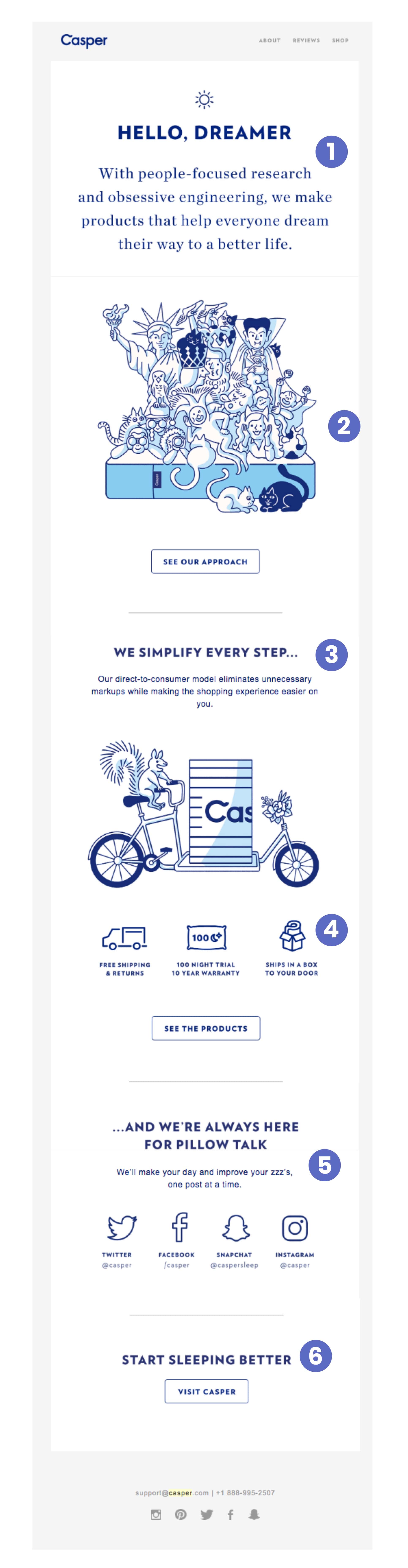
Day 1, Email 1: Welcome email
Subject line: “Welcome to Casper”
Preview text: “We’ll help you dream your way to a better life.”
Date: Fri, Feb 9, 2018 at 2:12 PM (immediately after signup)
Since I just signed up to Casper’s general email list, it’s the perfect time to send along a welcome email. The subject line and preview text are both clear about what it is. They’re also aspirational in tone, greeting me with a promise that they’ll help me “dream my way” to a better quality of life.
This is Casper’s first impression in my inbox, and it looks clean and modern. The length of it feels like a simplified website: a landing page for my inbox. The email is spacious, not over crowded with a ton of content, with obvious sections defined by subheads that make it easy for me to scan:
- Section 1: Welcomes the subscriber with a clear promise of value.
- Section 2: Explains their simple purchase process (one of their key differentiators).
- Section 3: Offers support and community if you're looking for it.
The illustrations and short, punchy copy are all that’s needed to drive home the important points about the value and experience Casper is looking to create.
Teardown:
1. Friendly welcomeCasper’s welcome email immediately establishes their brand: they put people first, they do things differently and they enjoy sleep-related wordplay.
This first paragraph expands on the subject line's friendly welcome by introducing new subscribers to a shared identity (“Hello, Dreamer”). The copy here is also strongly "people-focused” to reflect one of their core values. Casper is immediately letting me know that they put their customers (me) at the center of everything they do.
2. Unique illustration
The illustration style is a departure from the photos you might usually get. This sets the tone for the brand style and the youthful personality you’ll see come up again and again.
3. Transparent explanation of benefits
This is a key section as it begins to dive into Casper’s value proposition and the benefits of buying from Casper.
It’s important to consider that a significant portion of Casper’s target audience may be buying a mattress for the first time, or at the very least they’ve probably never bought one online. So the copy here quickly educates them on how it works, while reinforcing how simple and safe it is. “We simplify every step” instills buying confidence and starts to explain the high level process of buying a mattress.
This section makes it easy to understand why the “old” way of buying a mattress just doesn’t make sense.
4. Icons to represent core benefits
The unique icons used (a delivery truck, a pillow, a shipping box) reflect the reasons that make it easier to buy from Casper (free shipping, a 100 night trial, delivered to your door).
5. Community and social channels
This section starts to shine a light on the fun personality of the Casper brand and their tendency to weave their product/industry into their marketing.
“Here for pillow talk” and “improve your zzz’s” are clever, on-brand, and not too cheesy.
6. Strong call-to-action
This last section is powerful in its simplicity.
Casper has calls to action throughout, but the last thing Casper tells you isn’t to “Shop for mattresses” but to “Start Sleeping Better”. And the call-to-action button “Visit Casper” makes it sound like a friend is inviting you over.
Key takeaways:
- You can make use of the rule of three (i.e. things are better in trios) throughout an email—three main sections, three icons explaining features—for a clean design.
- Your welcome email is best used to introduce your brand and core benefits, and set the tone for new subscribers.
Day 3, Email 2: Product education
Subject line: “Meet the rest of the Casper set”
Preview text: “Outrageously comfortable Casper mattress.”
Date: Sun, Feb 11, 2018 at 5:43 PM
Casper’s second email arrived on Day 3—two days after the welcome email. I haven’t forgotten about Casper (yet), and they are respecting my inbox.
However, the delivery time on this email was a Sunday right before dinner (for most people). Interesting timing—they're probably hoping to catch folks who are going to be planning their Monday’s by checking emails Sunday nights.
Once more, Casper makes a personal, introduction-style impression in their subject line and preview text. “Meet the rest of the Casper Set” almost makes it sound like I was missing out on something before, like they had held something back until I was ready and there is now more to discover.
The preview text also jumps out at you with the use of the word outrageously: an eye-catching choice, especially in an inbox where a lot of the copy features tamer language that follows a predictable style.
And again, there is no wasted space here.
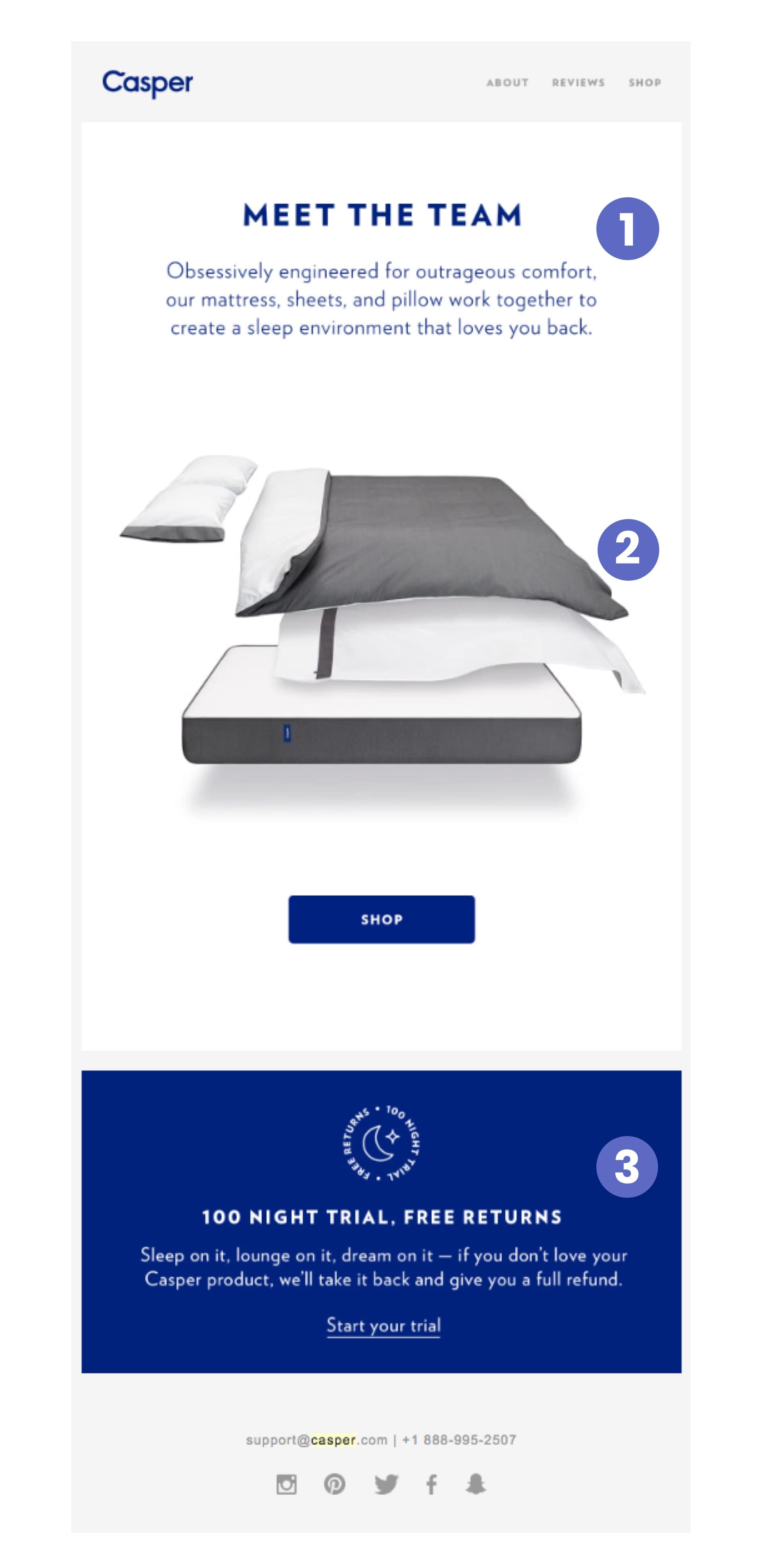
Teardown:
1. Clever introduction
As I open the email, I’m instantly met with the headline “Meet The Team”. But a quick glance at the image shows some of Casper’s products instead of people.
Ah, their products work together—like a team.
This is Casper’s clever way of introducing you to their range of products that are part of both Casper’s team and mine all at once. The copy below the headlines serves to repeat the tone and energy set with the subject line and preview copy.
Continuing to shy away from weak words, they use “obsessively” to communicate the degree of love and quality put into the products.
2. One product image that speaks for itself
This section proceeds to introduce me to “the team”: the mattress, sheets, and pillow.
It visually presents a “sleep environment” made up of a combination of Casper products. The style is similar to what you might see for a tech product or a car, deconstructing the final product to show off the quality of the individual parts and how they come together.
The button below is the only call-to-action and simply says “Shop”, inviting you to get to know their products better by visiting their store.
3. Highlighting the return policy softens the CTA
Casper balances the bold “Shop” CTA by dedicating almost 25% of this email to reassuring you with their “100 nights free trial and free return”. Casper is trying to reduce the risk of buying a mattress, keeping in mind that this is a big purchase, a big part of your life, and a product that wasn’t traditionally bought over the internet.
Casper is presenting their product like a high-end sports car, and then layering that with an entirely new way of buying. By putting the question of the brand's promise (Will I really get those benefits?) in close proximity to the risks associated (Am I going to be stuck with it?), they are making it as easy as possible for the prospective customer to at least take a chance.
Casper writes “Sleep on it. Lounge on it. Dream on it”—more clever sleep-related wordplay. It both gives me space to consider the purchase decision, while also describing to me what I can do with a Casper mattress.
There is no big bold call-to-action button here to end the email. Rather, you get a more subtle “Start your trial” that echoes the low-risk buying process.
Key takeaways:
- If you have a product with a longer sales cycle, you should build demand over time. Difficult purchase decisions shouldn’t be rushed.
- Regularly highlight the policies and trust building benefits you have on offer (free returns, free shipping) to prospective customers.
- Invest in unique visual assets just for email that show off your products and brand. These are automated emails that every new subscriber might see, so it’s worth taking the time to go above and beyond.
Day 4, Email 3: Product education
Subject line: “Easy as 1, 2, ZZZ”
Preview text: “See how easy it is to try the award-winning Casper mattress.”
Date: Mon, Feb 12, 2018 at 10:21 PM
This email hits my inbox with another playful, on-brand subject line. The preview text also does a great job of helping to catch my attention with “award-winning”.
The subject line reinforces the narrative that Casper is developing in each email: that buying from them is easy. But now, Casper is starting to support their main message with a secondary one that says I will get better sleep with their mattress because it’s so good.
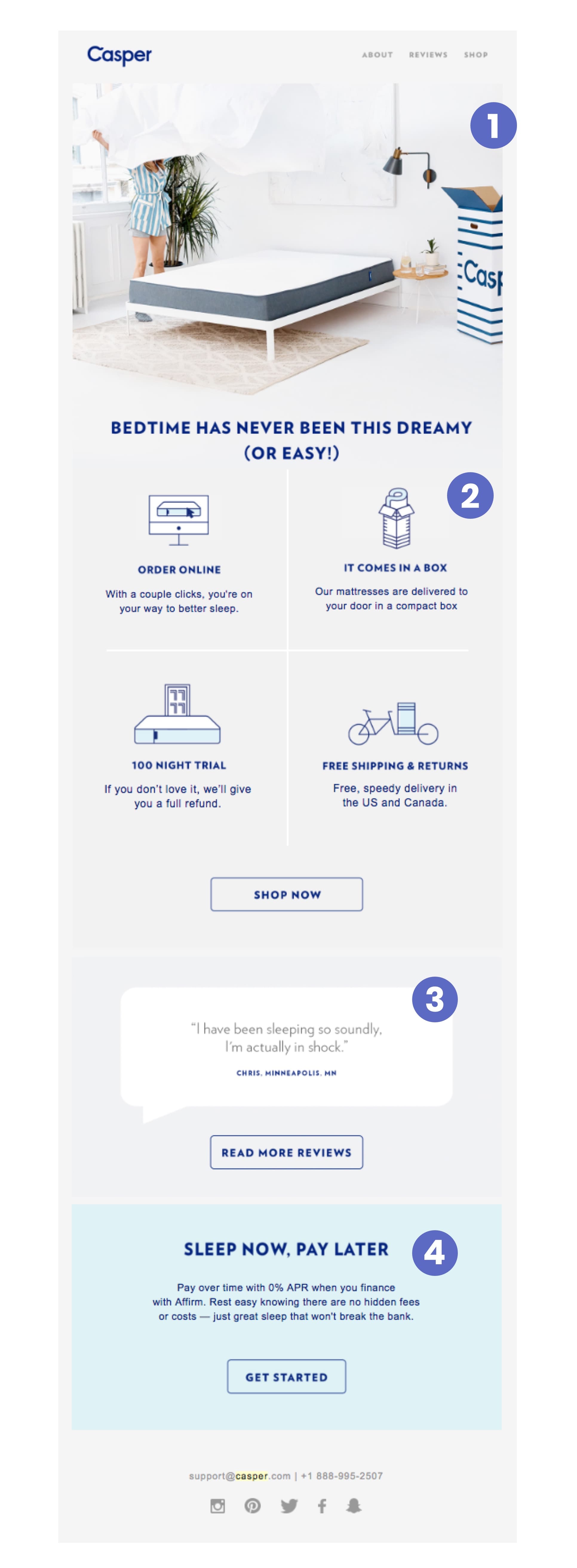
Teardown:
1. A photo that's worth a thousand wordsAs this is only the 3rd email, we don’t have an established frame of reference for what Casper emails always look like. While this one does present the familiar header, this is the first time we’re seeing photography.
This photo, however, does a lot for the storytelling and brand marketing with a modern setting, during spring or summer, and a Casper box indicating a customer setting up their new bed on their own.
2. Breaking down the customer experience
This section starts off with a familiar message about how simple it is to try a Casper Mattress. Casper also uses four new icons (original and on-brand) to communicate key information I need at this stage: the buying process. It’s simple to read and looks great.
Casper uses these small icons to communicate the key features of their customer experience and the parts of their value proposition that sets their brand apart.
3. Introducing social proof
This section features a testimonial from an actual customer with the option to read more via reviews. This is the first time we’ve seen this type of social proof in Casper’s email marketing.
The testimonial is short, feels authentic and was selected to reinforce Casper’s message through the voice of a customer.
4. Contrast creates a call-to-action that pops
Though it’s the last element in the email, it’s not easy to miss. The light blue background of this section creates a stark contrast from the rest of the email. It’s soft, but maintains the same friendliness of the leading photo while pulling my attention there.
The heading copy here of “Sleep now, pay later” is terrific. It surfaces Casper’s option to pay in instalments (mattress are expensive) to address a different obstacle to purchase this time around: price, rather than quality.
It’s reminiscent of the casual “start your trial” messaging of the last email and emphasizes the simplicity and low risk of the shopping process.
Key takeaways:
- Like Casper did in this email, you can repurpose reviews into testimonials for your emails to harness the voice of your customers to sell your products.
- Use contrast to draw the reader’s eye to your main call to action.
- Don’t just repeat the same value proposition in every message. Try to focus on different objections across your product education emails.
Day 8, Email 4: Product education
Subject line: “They said we couldn't do it…”
Preview text: “Introducing the Casper Wave.”
Date: Fri, Feb 16, 2018 at 10:21 PM
This is the 4th email in 8 days. Any more frequent and a business might need to be worried about flooding their subscriber’s inboxes.
It only features two sections and primarily serves as a teaser, from the daring subject line to the sparse information about the product that entices you to click through to the website to learn more.
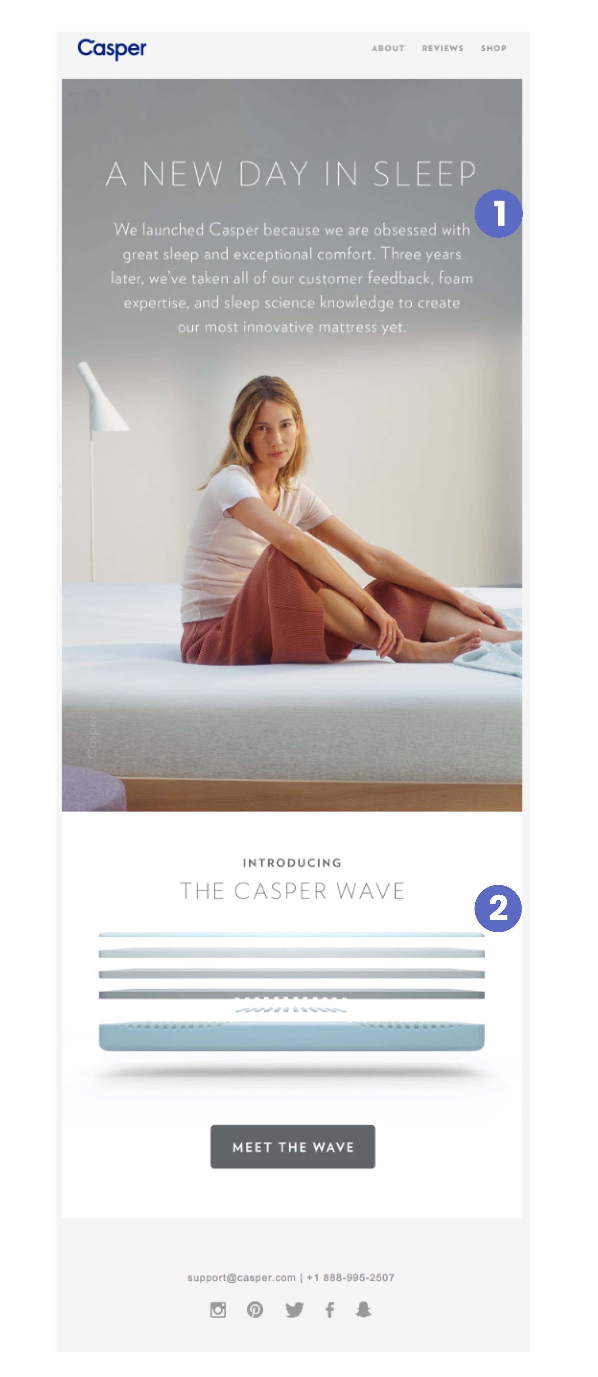
Teardown:
1. Speaking directly to customersFor the first time, we see Casper speak to us as a business, directly addressing their commitment to innovation and their passion behind the products. This makes me (a prospective customer) feel like the product has undergone a lot of work and iteration to get to where it is.
But bringing it all back to the intimate space that is my bedroom and personal life, is the human element presented by the photography used, which communicates a feeling of comfort.
2. Technical product visualization
This is the second time we’ve seen this deconstructed style of presentation used in Casper’s email marketing. It’s the typical style used to showcase advanced technology and complex engineering, sorta like the presentation you often see on TV for cars, luxury watches, or advanced electronics.
The copy is light, but continues to play up the friendly way they personify their products (“introducing”, “meet the wave”). This makes this advanced piece of technology feel friendly and approachable.
Key takeaways:
- Less is more and can actually entice your subscribers to click through to your website to get more information. Create curiosity.
- Imagery can help you position your products as technically advanced, part of a lifestyle, or even both in the same email.

Shopify Academy Course: Ecommerce Email Marketing 101
Ecommerce expert Drew Sanocki shares his method for launching automated email marketing campaigns that build relationships and make sales.
Enroll for freeDay 12, Email 5: Cross-sell
Subject line: Meet the Casper dog mattress.
Preview text: “You barked, we listened.”
Date: Tue, Feb 20, 2018 at 10:21 PM
This is the 5th email in an almost 2 week period since signing up and there is definitely a pattern of 10:30 PM bedtime emails.
The copy for the subject line and preview text were unexpected and caught my attention. So far their emails have been focused on products for humans, and since I haven't bought anything, this was an interesting email to get.
But even if I don't own a dog and I'm the wrong audience for the product, the subtext of the email is still relevant: Casper believes everyone deserve great sleep.

Teardown:
1. Funny GIFThe main image used here is actually an animated GIF of a sleeping dog dreaming of a squirrel while sleeping soundly on the Casper dog mattress. Not many brands use GIFs in emails, so this is refreshing even when you consider the variety of emails we’ve seen so far.
2. Passionate copyCasper isn’t calling it a “dog bed”. It’s a mattress. The same mattress that you presumably chose to sleep on and love, now for your dog: your favorite little friend, a big part of your daily life, and part of your family.
The sales pitch here isn’t overly complicated either. There is no breakdown of all the advanced features or benefits. It’s a more emotionally-driven sales pitch: you care about your furry little friend, so here’s a quality mattress made just for them.
Key takeaways:
- Not every product email will be relevant to every customer, but you can always weave an underlying brand message that is applicable to every reader.
- You can make familiar product lines (dog beds) more intriguing by giving them an unexpected spin (dog mattress).
Day 20, Email 6: Newsletter
Subject line: “You might want to lie down for this”
Preview text: “Your Casper update, full of snooze-happy news.”
Date: Wed, Feb 28, 2018 at 1:09 PM
The subject line definitely made me do a double-take—it sounds serious, but then you quickly realize it’s more fun than urgent.
The preview copy then makes it more obvious that this is going to be a newsletter via “snooze-happy news”.
This is also our first exposure to their newsletter design. Like the rest of the Casper email marketing lineup, it’s functional and clear.
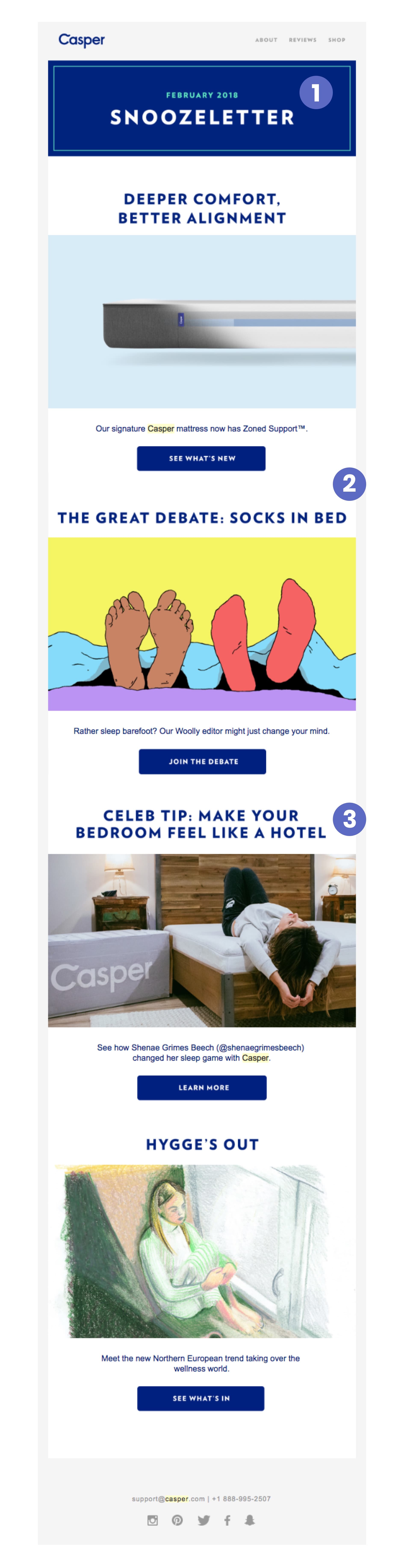
Teardown:
1. Creative newsletter nameThe “Snoozeletter” is a punny and playful approach to the newsletter. And each of the blog post images do an effective job of pulling your eyes towards them, while giving structure to the email.
2. A varied recap of the month’s contentThe format of the newsletter is pretty simple: a curated list of various blog posts as a way to keep up-to-date with content from Casper’s blog without being hit with a dedicated email for every new post.
3. Customer featuresThe celebrity case study makes me want to read more even if I don’t know who the influencer is. What’s more, it’s another way to add social proof in an email by linking to an interview on their blog rather than just featuring another testimonial.
Key takeaways:
- Creating a monthly recap like this one can be an effective way to drive more traffic back to your website, while letting you educate your customers and diversify your emails.
- Your blog can be used to house dynamic storytelling that showcases your brand and complements your email marketing.
Day 31, Email 7: Seasonal promotion
Subject line: “You lost an hour of sleep! Have 10% off.”
Preview text: “Casper Take 10% off any order with a mattress.”
Date: Sun, Mar 11, 2018 at 9:01 AM
Email breakdown:
This is the 7th email that I’ve received from Casper in the first month since I joined their email list. So far, it’s been an efficient process bringing the prospect up to speed with the brand.
This email, however, was delivered on a special date and time compared to the others: the start of Daylight Savings time. This email hit my inbox at 9am, potentially the time some people might be in bed on a Sunday, scrolling through their phones before starting the day.
The subject and preview copy are in-line with the time and make me want to open this email.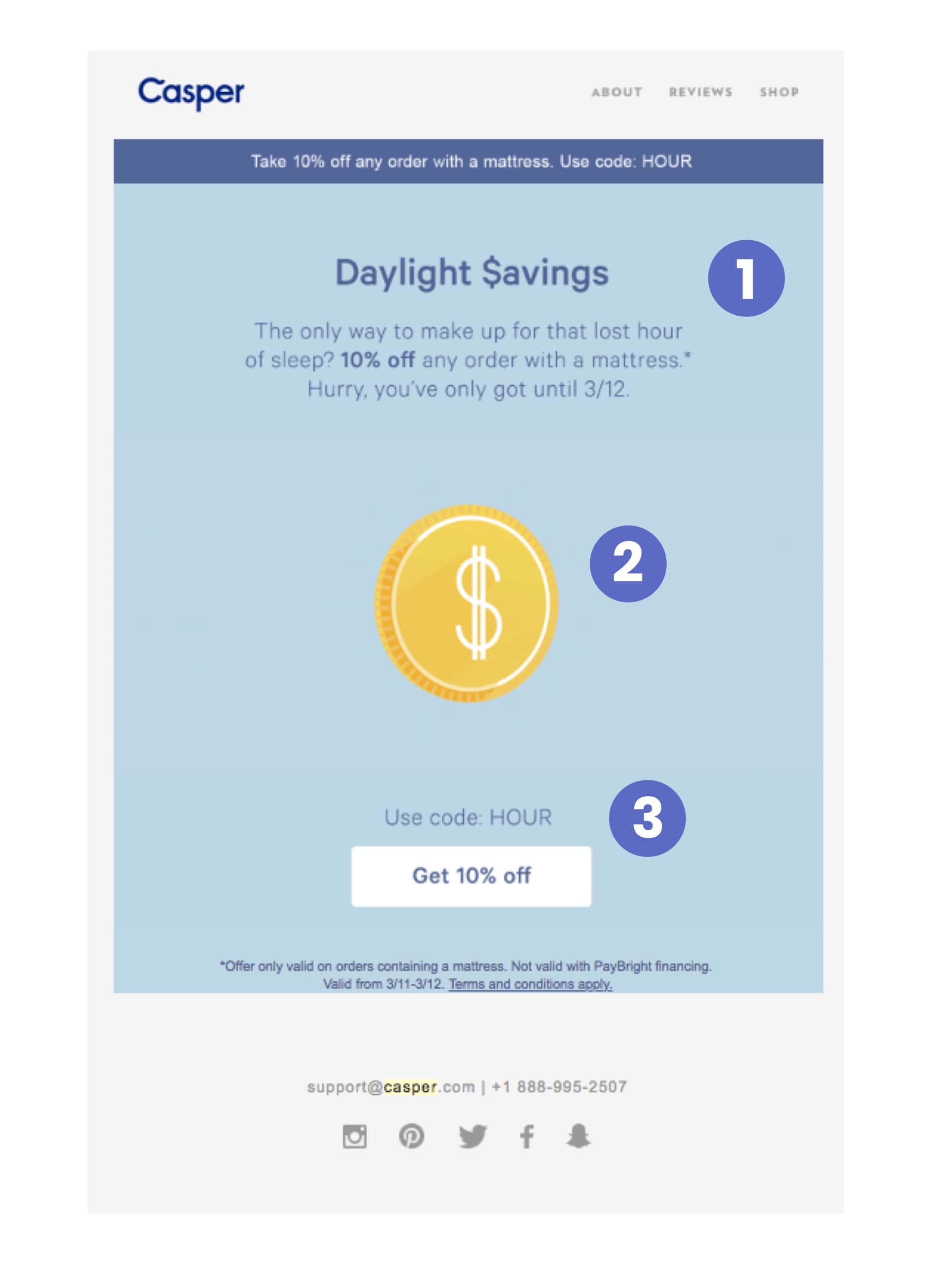
Teardown:
1. Summarized offerThis email is the first one to use a top banner, and it effectively summarizes the offer in a single sentence that gives me all the most important information.
The copy below isn’t too much to handle first thing on a Sunday morning. In fact, it’s pretty funny since Casper is trying to make up for that lost hour of sleep.
This is also the first time we’ve seen any use of an urgency trigger for an offer. All the previous Casper emails did the opposite—encouraging you to take your time. But this time, because of the occasion of daylight savings, they are only offering the deal for 24 hours.
2. Fun illustrated GIFThe typical graphic is now a GIF of the sun (on one side of the coin) and dollar sign (on the other). It visually ties everything together while drawing my eye to it in the center of the email.
3. Clear call-to-actionThis final section is makes the next step clear. Casper repeats the discount code above the button and the copy there is direct: “Get 10% off”.
There is a final sentence below—in a smaller font—with a brief explanation of the conditions, but it doesn’t get in the way or distract the reader.
Key takeaways:
- It’s important to align your marketing with any key industry or calendar events that are important to your potential customers.
- It’s not too often you see a “Daylight Savings Time Sale,” but it actually aligns in a fun and playful way with the Casper brand. So don’t be afraid to create and plan special, limited-time offers around real-world events, especially if they relate this well to your products.
- In promotional emails like this where urgency is a factor, don’t be afraid to repeat the offer in your subject line, body copy and even button copy to get the message across.
Day 32, Email 8: Seasonal promotion (reminder)
Subject line: “Last chance for 10% off.”
Preview text: “Casper Take 10% off any order with a mattress.”
Date: Mon, Mar 12, 2018 at 12:01 PM
This email came the very next day. It's a standard reminder email about the limited time promotion, a simple ecommerce email marketing tactic that a lot of companies forget to do.
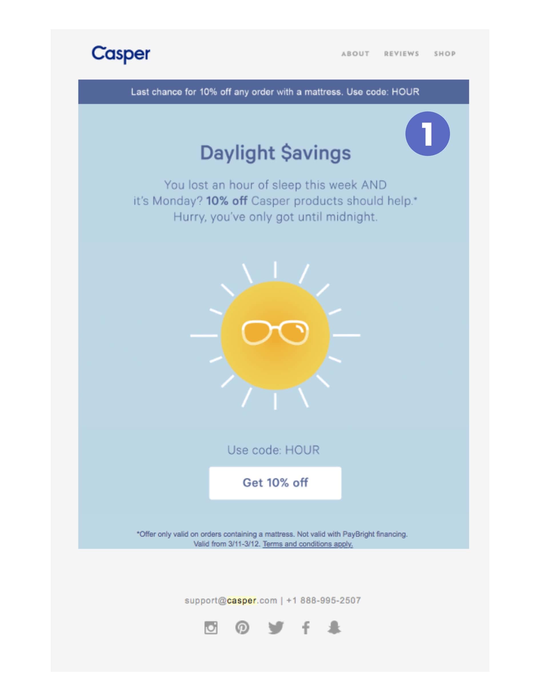
Teardown:
1. Twice the urgencyThis is an almost-exact copy of the email I received the day before for the Daylight Savings Time offer. However, only part of the copy has been updated in order to both catch my attention and bring me up to speed if I didn’t catch the previous email.
We now see the header bar lead with “Last chance”. And the short paragraph below has been updated with: “Hurry, you’ve only got until midnight”.
Key takeaways:
- If you’re running a limited time promotion, always send a reminder email. It’s a very simple way to increase your sales, especially for the procrastinators out there.
Day 43, Email 9: Partnership promotion
Subject line: “Last Chance: Get $65 off a mattress + $100 in your Wealthsimple account”
Preview text: “Two things to help your sleep better”
Date: Fri, Mar 23, 2018 at 12:01 PM
This particular email came at a bit of a lull in the relationship. It had been 11 Days since I’d last received something from Casper, and now we have very special promotional email that might get me, a subscriber who has yet to convert, to finally take the leap.
This email’s subject line is powerful: “Last Chance” draws my attention to the idea that I may permanently miss out on a special deal. The preview copy then follows through on supporting the high-level offer, setting the stage for the purpose of the email.
The offer is explicitly spelled out for me in simple math: $65 off Casper + $100 in Wealthsimple. Even if I’m not familiar with Wealthsimple, I can be sure that a similar email is waiting for their subscribers as a result of this co-marketing campaign.
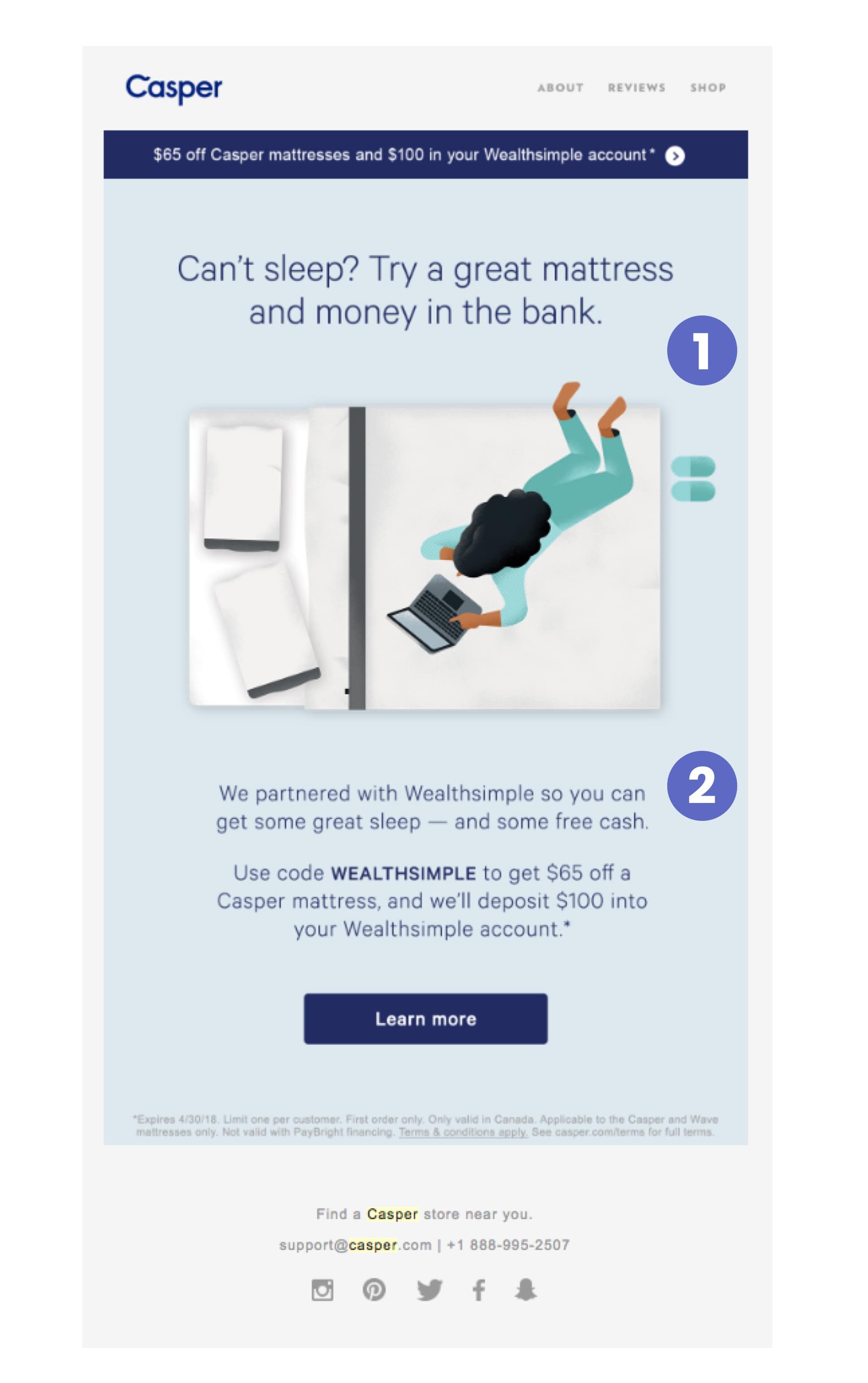
Teardown:
1. Action-focused emailInstantly, we see the same offer bar at the top of the email that we saw 11 days ago with the Daylight Savings Offer.
We’re also drawn to the hero image here as well as the call-to-action button at the bottom since it balances the longer bar at the top. Once again, it recaps all of the most important information about the promotion and partnership.
2. On-brand for both partnersFrom a design perspective (and being familiar with Wealthsimple), it’s clear that the brand alignment is pretty solid in the illustration. We can see recognizable Casper products (real) and the cartoon-y woman and computer (very Wealthsimple).
There are two short paragraphs here to give me a bit more context (without making anything super complicated)
The main button (call-to-action) goes back to the typical friendly, low-pressure Casper we’re used to, inviting us to “Learn more”.
Key takeaways:
- Sharing email lists is a great approach to reach new, related audiences.
- Explore ways to co-market with non-competitors to offer unique value. Casper and Wealthsimple share a similar core target customer group and aren’t competing products so this relationship and cross-promotion makes sense.
Day 50, Email 10: Newsletter
Subject line: “You may want to lie down for this...”
Preview text: “Your monthly Casper update, full of snooze-happy news.”
Date: Fri, Mar 30, 2018 at 12:05 PM
As soon as this email comes in, we’re now familiar with Casper’s newsletter style. It immediately feels familiar, delivered with the same fun wordplay we've come to know to at this point.
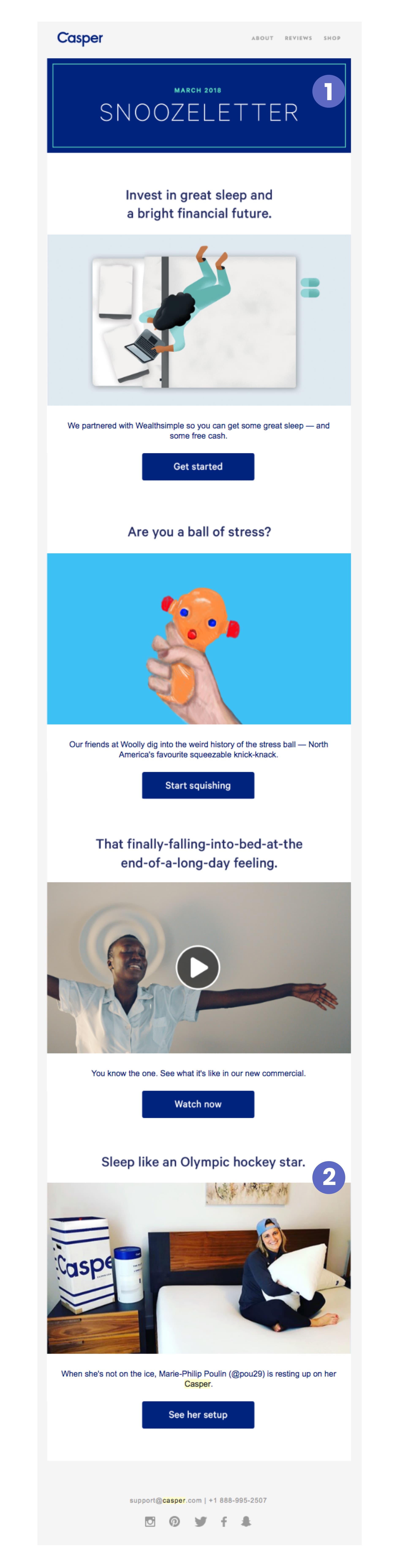
Teardown:
1. Consistent newsletter formatThis is clearly the same newsletter template we saw before. However, the content has now been updated win more recent blog posts and partner announcements. Notice how, this time too, the content covers the same bases (sales, case study, lifestyle).
2. Promotional content that isn't too salesyOnce again, there’s a variety of content—from special partnerships, to brand marketing & a special profile of an Olympic hockey star—so there’s a little something for everyone to check out. They even re-promote their Wealthsimple partnership here from the last email.
Key takeaways:
- Consider whether or not you can adapt your newsletter to fit holidays or other current events. Sometimes these events can have an impact on your open and click-through rates as your subscribers might be more likely to completely miss these emails.
- With a template, newsletters can be easy to execute on a recurring basis as long as you’re already publishing or curating content for them.
Instant replay: Lessons from Casper’s email marketing
Sometimes marketing feels like it’s crammed into an email, not designed for the email. That’s not the case here. Throughout these emails from one noteworthy brand, we’ve seen some pretty effective marketing tactics adapted incredibly well to the email format.
So, let’s quickly recap the most noteworthy tactics that Casper has leveraged across the emails we looked at:
- Take a human approach to copywriting and the problem you are solving
- Flesh out your value proposition in the first few emails.This will help shape the mental image of the brand in your prospective customers' minds.
- Focus on different objections throughout your emails—put things like return policies, social proof, and customer testimonials front and center to make it easy for customers to trust you.
- Form smart partnerships and tie-ins to real world events and other companies to find new ways of being relevant to subscribers beyond the products you offer.
- Define your tone and templates for different email types. For example, product emails (intimate, human photography or friendly illustrations) should have a distinct look and feel compared to newsletter emails (simple, big image blocks) or even promotional emails (blue banners with the key information about the offer over a hero image and a single CTA button).
This is just the start of what you can do with email. Keep an experimental mindset and measure the results of whatever you try.
Email marketing—like all marketing—is about always evolving and growing to meet your customers' needs and expectations.
Do you have a favorite email marketing tip or trick that was (or wasn’t) covered here? Or are there any other brands you think deserve to be analyzed like this? Let me know in the comments below!