Building a brand identity isn’t just about the visuals—but nailing your graphics can add a layer of polish that screams “pro” to your audience.
That’s something you want no matter what you’re building, whether it’s a blog, a Youtube channel, a store, or something else entirely. It’s also important if you’re updating your brand, or even just your visual assets. (Holiday-themed social media profiles, anyone?)
Plus, it’s way better to stand out as the hot new YouTuber with the killer graphics than it is to stand out as the YouTuber who has no idea how to rock a thumbnail image, you know?
Luckily, these days you’ve got options. If you’re not ready to invest in a professional designer, and the thought of learning Photoshop makes you cringe, you can still build a great visual brand for any project or platform.
Whether you’re updating an existing brand, or launching a brand new project, make sure your visuals are on-point. Here’s how, using tools that are built to be beginner-friendly.
Introducing Hatchful

Hatchful is a mobile app that helps you build a visual identity from scratch from the palm of your hand.
All you have to do is answer a few questions about your business, and Hatchful will suggest logos from hundreds of templates available. From there, you can customize your brand’s colors and fonts, and download all the brand assets you need—including perfectly-sized images for all of your social media platforms.
Hatchful is free to use whether you’re a Shopify merchant or not. (There are premium logo templates you can buy within the app, and you’ll only be charged when you download them.)
Brand strategy overview
Before you can really dive into your visuals, you need to take a more holistic view of your brand. It’s not just about your fonts, colors, and logo, after all, as important as those things are.
The foundation of your brand is who you are, what you stand for, and who you serve. Once you know that, the details get a lot easier.
The foundation of your brand is who you are, what you stand for, and who you serve.
To help you get a better sense of your brand, try answering the following questions.
- What do you do?
- Why do you do it?
- Who do you serve?
- What do they need?
- What makes you different?
And remember—you can’t be everything to everyone, and you shouldn’t try. The best brands are the ones that stand for something, so don’t be afraid to put a stake in the ground.
This might even mean adding some questions to the list:
- What do you not do?
- Who do you not serve?
For example, if you’re in a traditionally male-dominated industry or niche, but your brand focuses on a female audience, that’s an important note. Or maybe you’re a yoga brand, but you're for people who never thought they'd be a "yoga person."
It’s a lot easier to make choices when you’ve got a solid foundation in place, for all aspects of your brand—not just visuals.
FURTHER READING: Need to nail down every part of your brand? Check out this seven-step guide to building a brand.
Building a visual brand identity
Now that you’ve got a good foundation, it’s time to get down to the visuals.
Companies with strong visual brands have a leg up on the competition, because most of the time, you can recognize an ad or a post from them without even seeing their logo. That’s because they’re consistent with their visuals, from the fonts they use to the treatment of their images.
Here’s an example. Who do you think made this ad?

Or this one?

You probably knew immediately that the first ad is from Apple, from their long-running iPod ad style, and the font in the second ad screams Nike. That’s the power of consistent visual branding, including consistent logo use, font use, and product design.
You can build a brand that’s as identifiable as these big brands by adding consistency to your visuals too, so that any time they see a pin on Pinterest, or a Youtube cover image, they know it’s from you.
One brand that does it well is The Financial Diet. Here are some images from their Youtube page, their website, and their store, all of which are clearly part of the same consistent brand. As soon as their fans see an image, they can tell it’s from TFD.
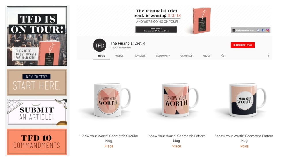
Consistent branding is one more way to help your future fans and customers find you, and over time, those visuals will clue them in that they can expect the same high-quality content or products they’re used to from you.
As you make decisions about what you’re going to use for your brand, make sure to write down what you’ve chosen for:
- Fonts: which ones will you use for headings? Which ones will you use for body text? Do you use any fonts for emphasis?
- Colors: what colors feel right for your brand? How many colors will you use? As you choose them, make sure to record the hexadecimal codes for each one, which will look something like #5c6ac4. That’s how most web platforms will make sure they’re using the exact color you want.
- Patterns: do you use stripes? Polka dots? No patterns, ever? Make a note of it, and save any examples you love.
- Image Treatments: are all of your images black and white, or do you go for vivid colors? Do you always have people in your images? Do you only want to use illustrations?
- Logo Variants: what are the different ways you’ll use your logo? Do you have a text-based logo, an icon, or both?
This is where a brand style guide can come in handy. It can help you keep track of all the decisions you’ve made about your brand, so that the next time you need to create something, it will look like it came from you.
A style guide can also be helpful if you’re handing off graphics creation to a virtual assistant (or other employees as you grow), and keep you on track if you’re using an app to build your graphics.

Create a logo
Designing a logo can feel tough when you’re up against icons like the Nike swoosh, but there are a few simple rules that can help you create a logo that does everything you need (and a little more).
Keep it simple
If this is your first logo rodeo, you might not realize how many different sizes you’ll need, but it’s more than you think. At the smallest, you’ll need some variation of your logo to work for your website’s favicon, which is the teeny image you see in the URL bar or the tab in your web browser.

The easiest way to make this work is to keep your logo simple.
Very detailed logos might look great on a full webpage, but end up looking cluttered, busy, or just plain bad when scaled down to the smallest sizes you’ll need. Even scaling down to an Instagram avatar or Twitter profile picture can be rough with a detailed logo.
Simple is your friend.
Create variations
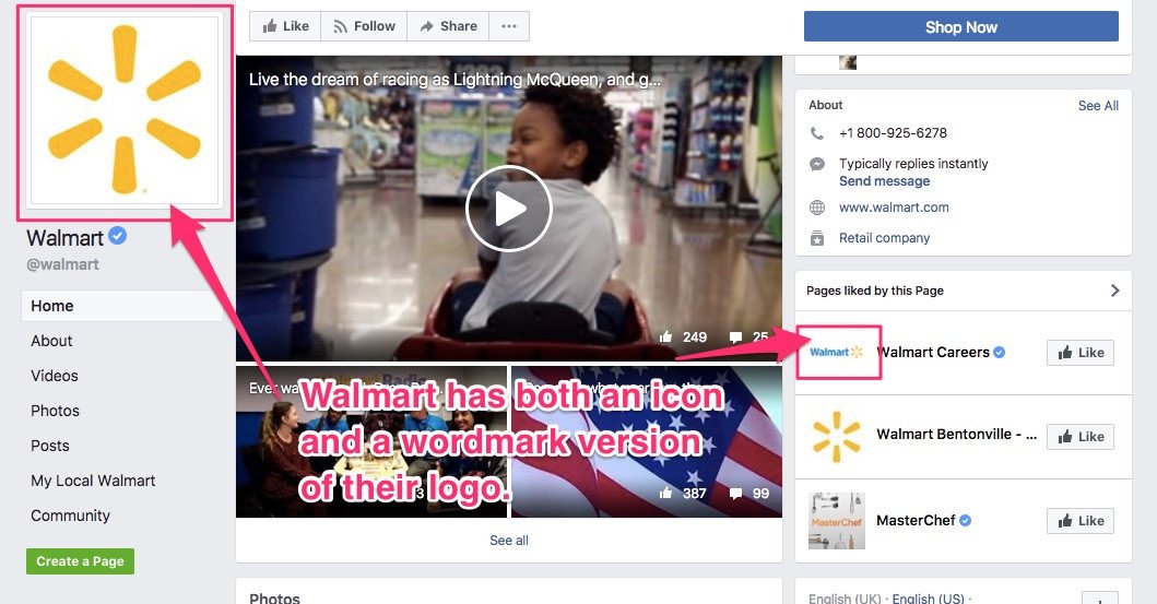
All of the examples we’ve touched on so far are square images, but what about your website header or your Youtube banner image? Those both usually give you much more horizontal space, and a rectangular logo or wordmark might be a better fit.
Here’s an example from Walmart. They use a square icon in their Facebook profile photo, but they also have a rectangular wordmark—that incorporates the icon for consistency—that they use in other places.
Consider context
You might have specific items or shapes that are commonly understood to be part of your industry. Think dollar signs for finance, makeup brushes for cosmetics, that kind of thing. There might also be common colors used in your industry.
Whether you want to lean into it and use those common symbols, colors, or conventions, or avoid them entirely is up to you. Just make sure you’re making the choice intentionally.
How to create your logo
This is where you’re probably getting nervous, thinking that this is a lot to remember—and hey, wasn’t the promise that you didn’t need to know Photoshop to do all of this?
You’re right. That’s where apps come in that can do the heavy lifting for you.
Hatchful is an app for iOS and Android that takes the guesswork out of logo design for you. It was built with all of this in mind, and with a bit of input from you, it helps you choose the best logo template from hundreds available.
You can tweak colors, fonts, and more, and download all of the variants and assets you need. It’s free to use, and there are premium logo options if you want to invest a bit of money in a design you really like—but you’ll only pay when you’ve finished your edits and you’re ready to download your new logo and brand assets.
FURTHER READING: Here are five other logo generators that can help you create a logo (plus additional advice about how to make a great one).
Branding your platforms
These days, it’s not enough to brand your website and call it a day—and depending on your project, you might not even have or need a website yet.
But no matter where you’re starting to build a brand (your website, Youtube, Instagram, you name it) you need to pay attention to your visuals everywhere.
That means you need branded social media images, in the right sizes, with the right colors, for every platform you’re on.
You need branded social media images, in the right sizes, with the right colors, for every platform you’re on.
We could share a whole laundry list of each image size for each platform, but not only would that make this a very long list, it would also be out of date as soon as one platform changes their layouts or preferred image sizes. (If you are looking for the sizes, Sprout Social does a great job of keeping them up to date in this post.)
But why not use tools that will handle all that image-size-knowing for you?
Hatchful will build you on-brand social media images for Youtube, Facebook, Instagram and more, and you can download them all directly from the app. Your images will be formatted and sized appropriately for each platform.
All you have to do is upload each image to your social media platforms, and bam—you’re branded.
And when you need to add images to your tweets or rustle up a great quote image for Instagram, there are tools for that.
Canva keeps track of the recommended social media image sizes for you, so all you need to do is select a Pinterest graphic, a Twitter image, a Youtube thumbnail, or any other pre-sized social media image. All you’ll have to do is make sure the fonts, colors, and the layout match with your existing branding.
You can also create images optimized for social media posts using Pablo, an image editing tool from Buffer that’s specifically designed to help you create great social media images in a snap.
Branding your site or store
At some point in your project, you’ll probably want to build your own branded website.
Sometimes it’s the first step, sometimes it’s the last, but having a place to call your own on the internet gives you full creative control—and can be a big factor in generating revenue from your project.
FURTHER READING: Here’s a comprehensive look at how you can make money on Youtube. Spoiler alert: some of the ways involve having your own website outside of the video-streaming site.
This is where consistency becomes even more important, because you’ve got more visual flexibility than on any other platform. You’ll need to consider how you’re going to use:
- Theme
- Images
- Fonts
- Logos
- Colors
- Theme
Theme
Your site’s theme is the basis for most other decisions when it comes to your visual brand. Think of it like the foundation of a house: it gives you the basic framework to get started, and you can customize it to suit your tastes from there.
And no, we’re not talking Property-Brothers-style, take-down-walls customizations. That’s why you need to choose a theme carefully, to make sure the digital walls—aka the layout of your pages—is close to what you want from Day 1.
If you’re building a Shopify store, start at the Theme Store. You can sort the themes based on what you’re looking to build, by price, and more.
FURTHER READING: Need some help picking a theme? Here’s everything you need to know to pick the perfect theme for your project.
Images
Your site’s images includes everything from your header images, blog post images, sidebar images, product images, and more. It turns out, websites tend to have a lot of images, which is why they’re an important part of your brand.
When you’re choosing images, try to pick a consistent image type, so they all look cohesive. If half of your images are cartoons, and the other half are classic black-and-white images, you might not be creating the right impression (unless, of course, that’s what you’re going for).
NEED IMAGES? Burst can help. It’s a collection of free stock images you can use for your project or your store.
Fonts
Since you’ve already chosen your brand’s fonts, and you have a record of them in your style guide (right?!) adding them to your theme should be as easy as selecting them in your theme’s editor.
Most themes and most platforms will make this as easy as selecting from a drop-down list. As long as you see your fonts as options, you’re all set.
And if you’re not seeing your selected font as an option, it's time to dig into the theme’s code. If that’s outside of your comfort zone, it might be time to outsource to an expert. If you’re on Shopify, you can find an expert to help you out with small tasks like theme customization.
Logos
Remember when we talked about logo variants? You’re going to be happy you have them when it comes time to get your site set up.
Your smallest variant, if you have one, will be a great addition as your site’s favicon, and you can add a wider version to your site’s header. You can also add your logo to any other site elements that make sense.
For example, if you’re building a Shopify store, you can add your logo to all shipment notifications, so every email that comes out from your brand is, well, branded.
Here’s one example from Province of Canada, telling a customer their order has shipped.

Colors
Once you’ve got a theme in place, you can usually customize some of the colors. You’ll want to look back at the specific colors you’ve already chosen, and make sure they’re used consistently on your site.
This is where those hexadecimal codes you wrote down will come in handy to make sure your brand colors are pixel-perfect on your website.
Building a memorable brand identity
You can create a great visual brand with a few beginner-friendly apps these days—and solid visuals are an important part of making your online project or store a success.
To make a logo and get all of your social media platforms branded ASAP, Hatchful is your best bet. Get the app for iOS or Android now, and you’re well on your way to a fully-branded (or re-branded) online presence—no Photoshop required.
On top of that, all of these tools apply any time you’re looking to update your social media profiles or your website as a whole. That might be the case for seasonal businesses, the holiday season, or even a themed product launch that calls for pulling out all the stops.
Whatever the reason you’re updating your branding, you’re ready to rock.
