In an online store’s early days, it’s not uncommon to draw hundreds, even thousands of visitors, but for some reason... no sales.
Assuming you're driving the right traffic, figuring out exactly what is stopping these potential customers from making a purchase can feel like solving a mystery with few clues.
There are a number of factors that play a part in a customer’s decision to make a purchase, from details as small as the color of your "Buy Now" button to choices as big as the way you weave your brand story.
Like any diagnosis, you need to objectively evaluate every potential cause in order to root out the actual problems before you can fix them.
So take a step back from the online store you’ve poured hours into building, look at it with fresh eyes, and ask yourself the following questions:
- Is your main navigation easy to use?
- Can you move any non-essential pages to the footer navigation?
- Does your visual brand look professional?
- Does your homepage have a clear call to action?
- Does your website copy speak to your target audience?
- Does your website look just as good on your mobile phone?
- Does your business seem trustworthy?
- Are shoppers adding products to their cart?
- Are shoppers abandoning their cart?
- Is price or payment options stopping them from checking out?
- Are you remarketing to your website visitors?
- How are visitors scrolling, clicking, and searching your website?
- What else could be stopping you from making sales?
Navigate your store like a new customer
Your website won’t be the first experience your potential customers have with online shopping.
Much in the way you expect the fitting rooms in a brick-and-mortar clothing store to be located at the back of the shop, there are certain conventions that users have come to expect from a website. While some may seem obvious, a misstep can easily result in lost sales.
Is your main navigation menu easy to use?
In most cases, users find their way from your homepage to your product page to your checkout by using your navigation menus. These are typically found at the top (the header navigation) and bottom (the footer navigation) of your website.

Look at examples from large online retailers like Bailey Nelson, Knixwear, and Kylie Cosmetics, and you will quickly spot the common elements that customers are used to.
Header navigation menus often feature a Shop button, which usually either leads to a collection page featuring all of a brand’s products or a drop-down menu to sort products into further categories, like sweaters, t-shirts, and shorts.

Depending on your business, you can also include links to other pages customers might want to visit before making a purchase, such as:
- About Us, for customers who want to learn more about your business or your founder story
- Contact Us, so customers can reach out to you with any questions or concerns
- FAQ, to answer some of the most common questions customers have about your products
- Shipping, so customers know how much they’ll have to pay on top of the price of their purchase
- Size Guide, to help shoppers confidently order the right size and reduce returns for yourself

Can you move any non-essential pages to the footer navigation?
Even though it’s tucked away at the bottom of your website, visitors frequently consult the footer navigation to find out more information about a company.
Footer navigation menus are another best practice for online stores. The links found here are different than those found in your header. Links to secondary information, like your returns and exchange policy, customer reviews, privacy, and terms and conditions, all belong in the footer of your website, and not the header.

Make sure both your header and footer links are working correctly. Test each one to make sure the title matches the page it links to. A broken or incorrect link is an easily fixed mistake that could be hurting your sales.
Be honest about your homepage
Your store’s homepage is like the display window of a physical store. It needs to simultaneously reflect your brand in the best light, while also encouraging customers to enter and start shopping.
While the Shopify theme you choose will play a big role in the look and feel of your store, there are many other factors to consider as well.
Does your visual brand look professional?
Your brand is on display on your website homepage—everything from the font you choose to your color palette is used by shoppers to understand who you are as a company and whether they should become your customer. Ask yourself:
- Do you have a professional logo?
- Do you build a strong visual brand identity with consistent colors and fonts?
- Are your images high quality and clear (avoid blurry or pixelated pictures)?
- Is your text easy to read and, more importantly, scan?
Luckily, piecing together these visual elements of a brand doesn’t need to be complicated. Even if you already have a logo, you can use Hatchful, Shopify’s free logo maker, to generate a visual guideline you can apply to the rest of your website.

Take the professionally chosen complementary colors of your Hatchful logo and, when in doubt, use them in your store template to create a seamless branded look that will instill trust in prospective customers.
The same can be done with product photography. Your photos will be used by shoppers to judge the quality of your products, which shoppers won’t be able to see in person. Invest in them accordingly.
For lifestyle photos, you can shoot your own or use the free professional stock images available on Burst. Most of the images on Burst have been curated for ecommerce, so you’re likely to find something that can reflect your brand.

When it comes to creating your own high-quality product photos, use simple and affordable tools like:
- A homemade photo studio
- Remove.bg, which can easily remove the background on your product photos if needed
- Free photo editing software
If your current website doesn’t use professional and clean-looking photography, it could be turning customers away.
Does your homepage have a compelling call to action?
Just like a navigation menu, having the right calls to action on your homepage can help orient customers and direct them from the front of your store to the checkout page. A call to action is a strong line of copy supported by a clickable button. They work together to draw attention and encourage action from a website visitor.
Ecommerce stores typically feature their main call to action through their homepage banner. The main banner typically catches a customer’s eye first and is used to promote your best-selling product or most compelling collection.
Beauty brand Vanity Planet has all the necessary elements of a strong homepage banner on its website:

Its homepage banner takes center stage and contains a single clear message that speaks directly to their target audience, compelling them to click through to shop. If your own homepage doesn’t have a strong banner image, or if it contains too many competing messages upon first glance, you could be confusing customers and losing them as a result.
If you have a secondary message to promote, like free shipping or a discount on certain items, the best place to surface that call to action is often with an announcement bar. Announcement bars typically show up at the very top of your website page in small text, so as not to compete with your main banner.

The announcement bar used by Outdoor Voices on its website doesn’t distract from its banner image. It does, however, tell customers about an important chance to get free shipping and returns when they spend a certain amount. Integrating special promotions like this into your homepage through an announcement bar can help you surface a secondary call to action, such as an offer that caters to price-conscious shoppers.
Does your website copy speak to your target audience?
Another important element of any good homepage is the copy—the text that persuades and directs visitors to shop with you.
Copy should be persuasive and to the point. Unnecessarily long sentences or big paragraphs can make users lose interest in what you’re trying to sell. Most big online retailers tend to keep their homepage copy to a minimum.

Even when telling its brand story, Mejuri keeps its homepage copy tight, with only one to two sentences. Users who want to learn more are encouraged to click through to read its About Us page, but the company is mindful not to clog up its homepage with an entire origin story.
One of the most common copywriting mistakes is not having an ideal audience in mind. Your target customer should be able to land on your homepage and say, “This site is for me.”
If your homepage copy tries to speak to everyone, then it speaks to no one.
Selling online is all about trust, and nothing looks as unprofessional as a glaring typo on a website’s homepage. Even if you’ve proofread your own website, it’s worth borrowing a friend’s fresh eyes or even hiring a copywriter or editor from Upwork to elevate your copy.
Does your website look just as good on your mobile phone?
The problem with troubleshooting your own website is that you’re likely not seeing it on the same screen as your potential customers. The majority of ecommerce website traffic now comes from mobile devices, where your website can look very different than it does on a desktop.
Load your homepage on your own mobile phone, as well as any other devices you have access to, in order to make sure it looks good and functions properly on each one.
If you don’t have access to popular devices like Androids or iPhones, you can use the Inspect tool on your browser to view your website as it would look on different devices:

Does your business seem trustworthy?
Building customer trust when you have zero sales can be challenging, but it’s a necessary step in converting website visitors into customers. Since your visitors can’t get to know you in person, you’ll need to make sure your website is inviting and makes every visitor feel secure.
There are a number of ways you can do this.
1. Chat with customers live
Even though you can’t be physically present in your store, you can still introduce yourself and build a one-on-one connection with every visitor through live chat. A live chat function can be added to your website using apps like Shopify Chat and Tidio, or through Facebook Messenger.

Live chat can let you greet visitors while they’re still looking around and answer any questions they might have about your products. Some live chat apps can even be programmed with automated messages and responses. This lets you stay available even during off-hours, so visitors can ask questions 24/7.
2. Use social media to build relationships
Social media accounts are a key component of a brand’s online presence. If your website visitors didn’t discover you on Instagram, it’s likely they’ll check out your brand’s social profiles at some point in their decision-making journey.
While you don’t need to be on every social platform, you should maintain a presence on the ones your customers use. This requires you to regularly update your social profiles with content to show that your business is active, and engaging with customers in comments or even direct messages.

If you have a thriving Instagram account, for example, consider embedding an Instagram gallery on your site to incorporate your social media presence into your online store.
3. Source and feature user-generated content
If you don’t have any customer photos or reviews to leverage on your store or in your marketing, consider giving your product to friends, family, or influencers in exchange for user photos or reviews. You can also run a contest or giveaway where entries are based on creating content that you can share.
These images can be used in paid ads, on your website, or on your social media profiles, making them valuable assets in building consumer trust.
4. Craft your story and share it with customers
People like to buy from people. That’s one edge you have over big-box retailers. If your brand is missing that personal element, consider incorporating your story or mission into your homepage or on an About Us page to connect with new visitors and encourage them to give you a shot.
Look at your data to see where you're losing shoppers
Once you’ve made sure your website is following the best practices most shoppers look for when evaluating a brand online, take a closer look at your website data.
Each store is different, and reviewing your analytics can point out specific areas where your users are struggling. This data can be found in your Shopify dashboard or through Google Analytics.

The percentage of website visitors who make it to the purchasing stage is referred to as your conversion rate. While your overall conversion rate is important, breaking it down into purchasing milestones like "added to cart" and "reached checkout" will help you pinpoint specific drop-off points from the first visit to checkout.
Are shoppers adding products to their cart?
Looking at how many of your website visitors are adding products to their cart is a good way to evaluate changes you might need to make to your store.
Look at your online store conversion rate in your Shopify analytics dashboard to see how many visitors are adding your products to their cart.

- Offering a variety of multiple photos to browse through
- Increasing the size or changing the color of your Add to Cart button
- Make sure your Add to Cart button is easy to find on both the desktop and mobile versions of your site
- Removing unnecessary or long product copy pushing your Add to Cart button too far down the page
- Using bullet points, bolding, and other formatting options to make your product page easier to scan
- Applying these best practices to your product page

Are shoppers abandoning their cart?
One area where conversion rates most frequently struggle is abandoned carts. You can see if you have any abandoned carts under Abandoned Checkouts in Shopify.
Luckily, there are several ways to recover abandoned carts and bring users back to your website to complete their purchase.
Here are some of the top ways to reduce abandoned carts:
- Customize your abandoned cart email, either within Shopify or through an email marketing platform like Klaviyo
- Consider adding a discount code to your abandoned cart emails to help recover lost sales and improve your conversion rate
- Send multiple abandoned cart emails, set up in an automated sequence, giving you more chances to persuade customers to complete their purchase
- Consider removing the Review Your Cart page and have a slideout cart with a button that takes customers immediately to checkout after adding products to their cart
- Add a Buy Now button to your product page using dynamic checkout, which lets customers skip ahead to checkout if they are ready to purchase

Is price or payment options stopping them from checking out?
If your conversion rate is strong from product page to checkout, but you are losing people at the final point in their purchasing journey, you may need to do the following:
- Revaluate some of your pricing and shipping costs to be more attractive to shoppers
- Create a free shipping threshold to encourage shoppers to buy more
- Provide a wider choice of shipping rates, from inexpensive standard shipping to a more costly express post
- Give customers more options for paying at checkout by adding mobile payment options like PayPal, Apple Pay, or Google Pay
- Offer new customers a first-purchase discount code through a pop-up app such as Privy that they can apply at checkout

The easier you can make the checkout process, the higher your chances of increasing your conversion rate. If customers make it to this final step in their shopping journey, it is up to you to make the checkout experience frictionless.
Are you remarketing to your website visitors?
It’s important to keep in mind that not all consumers are ready to make a purchase on their first visit to a store. Depending on your product and price point, their decision might require multiple trips back to your store, more time, and further consideration.
Remarketing targets previous website visitors based on the actions they took, like abandoning a cart or browsing a certain product page. It’s an effective strategy to keep your brand top of mind for website visitors who aren’t yet ready to buy yet.
Remarketing usually takes the form of email marketing (such as sending out a discount code to shoppers who abandoned their carts) or retargeting visitors with paid ads.
It may take some setting up, but retargeting is a powerful form of advertising because it can dynamically show ads to visitors for the products they viewed on your website. One of the most popular ways to retarget shoppers, if you’re willing to learn how to create campaigns yourself, is with Facebook ads.
How are visitors scrolling, clicking, and searching your website?
If it isn’t immediately clear where customers are struggling to understand your brand or product, consider watching a few recorded sessions of actual users. This can be done using Hotjar or Lucky Orange, two apps that create recordings of sessions on your website that you can watch as videos.
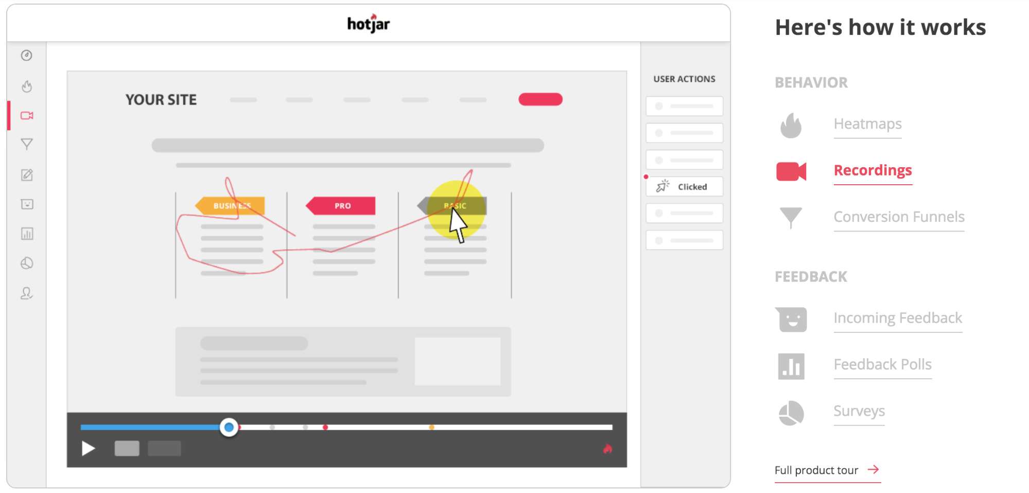
Seeing someone struggle to find what they’re looking for or unable to navigate through your website is a humbling lesson on user experience. Hotjar also creates "heat maps" that show you where most customers are clicking and dropping off, and allow you to map out and improve their journey to checkout.
To understand where your users might be getting lost, and what your own main navigation is lacking, it’s a good idea to enable the search function on your site. Once you have a search bar on your homepage, you can check out your Shopify reports for top online store searches. This report will give you a glimpse into the minds of your shoppers and an idea of what they’re struggling to find on your website.

Adding popular search terms to your main menu can aid your store navigation and improve your conversion rate.
What else could be stopping you from making sales?
Looking at your website data can quickly reveal the holes that potential sales are leaking through, while paying attention to best practices used by most ecommerce brands can help elevate your overall store experience. If you're confident in your business idea, these small changes are often what you need to start earning your first sales.
However, if your efforts to drive traffic still aren't converting, ask yourself:
- Are you selling the right products to the right audience?
- Have you tried focusing on a niche?
- Are you driving high-quality traffic?
- Are you capturing emails to nurture into customers?
- Have you asked for feedback from others (such as the Shopify community)?
Keep in mind that your store will always be a work in progress. By doing a regular audit of your performance, you can make it better over time.
Illustration by Rose Wong